Nitty Gritty
The nitty gritty of property management or Nitty Gritty needed a logo design and received 10 Serious, Professional, Property Management logo designs from 4 designers
Designs
Designers
Budget
This is what The nitty gritty of property management or Nitty Gritty was looking for in their logo design
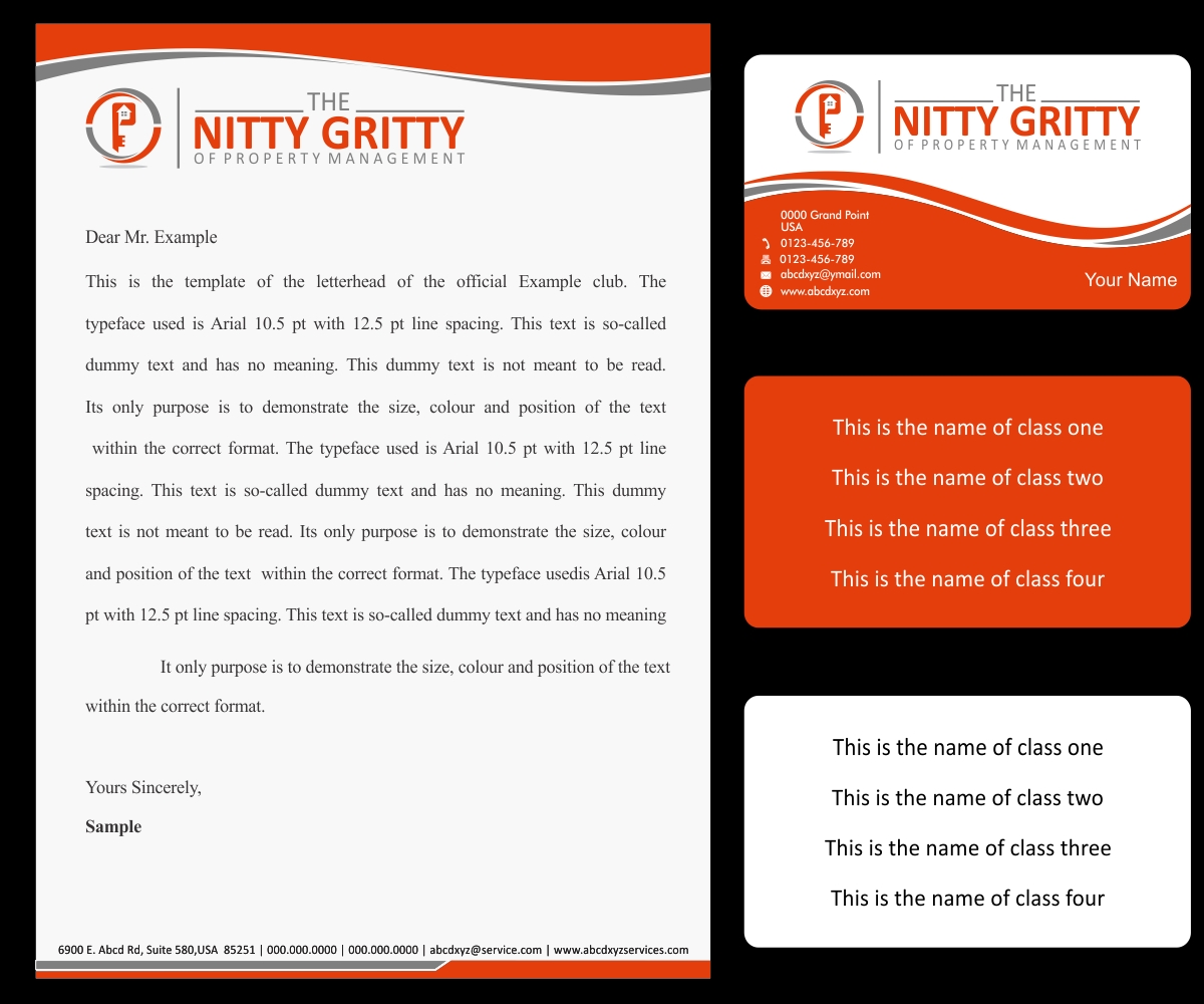
I need a logo design advice as well as a logo for a new property management training company. The name of the training class is "The Nitty Gritty of Property Management" which is a series of training classes. This is the name that will appear on training materials inside the classroom and everywhere else. The colors that I am amenable to are orange,blue, grey and green. The specfic microsoft coordinates for the orange that I prefer is (Red:227; Green: 62; Blue: 11) The blue coordinates that I prefer are (Red: 15; Green: 2; Blue: 114). The Grey coordinates that I prefer are (Red: 77; Green: 62; Blue 11.. The green coordinate that I have been using but not quite married to is (Red: 84; Green 130 Blue: 53. The coverpages on the attachments are, in my opinion, "plain Jane".. If your team has any suggestions on how to improve them, I would be open to it.
Additional notes: I prefer the font "calibri -body". If that isn't possible, then do your best with the font closest to th…
Read more
