Nitty Gritty

Want to win a job like this?
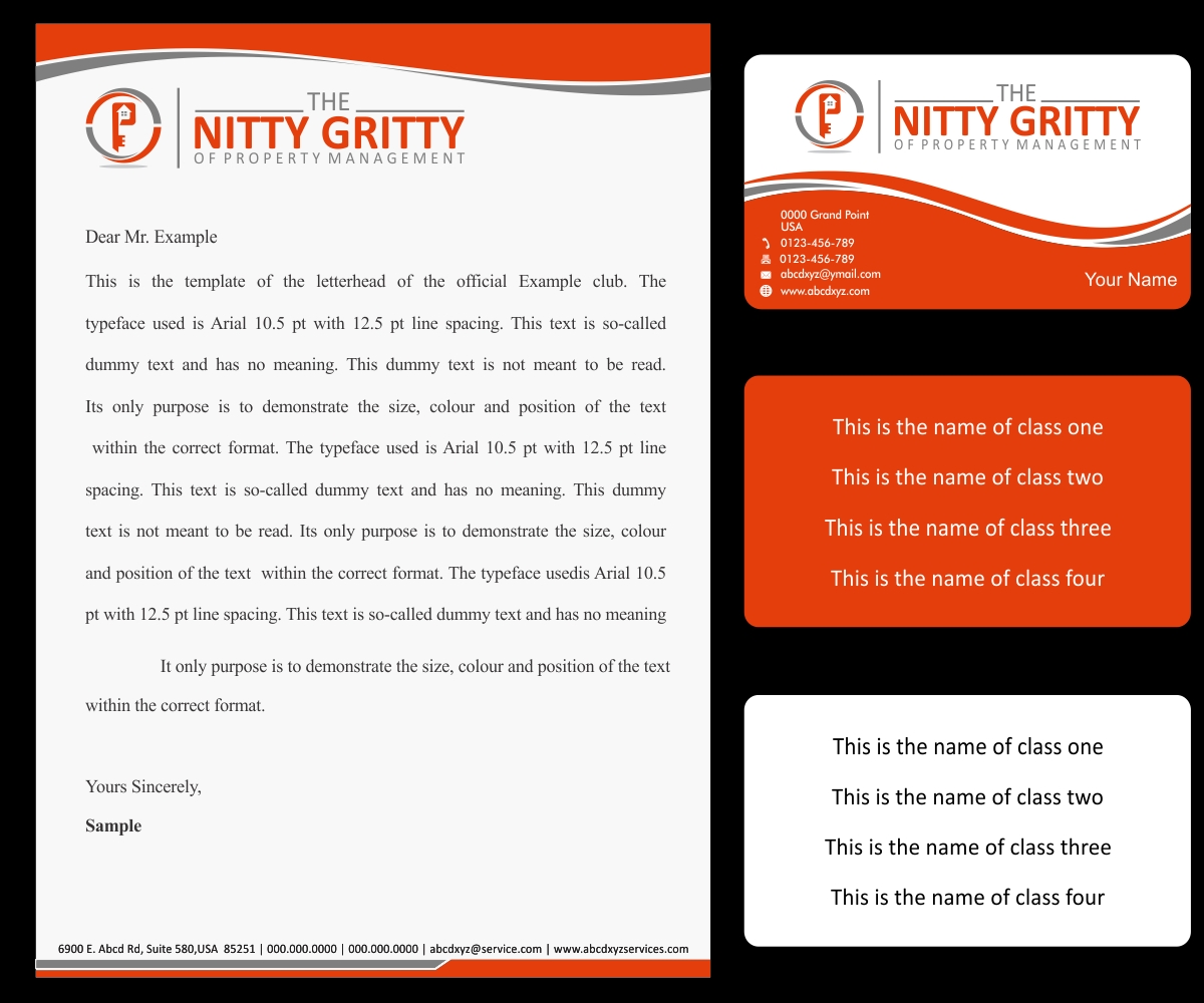
This customer received 61 logo designs from 17 designers. They chose this logo design from Well Being as the winning design.
Join for free Find Design JobsLogo Design Brief
I need a logo design advice as well as a logo for a new property management training company. The name of the training class is "The Nitty Gritty of Property Management" which is a series of training classes. This is the name that will appear on training materials inside the classroom and everywhere else. The colors that I am amenable to are orange,blue, grey and green. The specfic microsoft coordinates for the orange that I prefer is (Red:227; Green: 62; Blue: 11) The blue coordinates that I prefer are (Red: 15; Green: 2; Blue: 114). The Grey coordinates that I prefer are (Red: 77; Green: 62; Blue 11.. The green coordinate that I have been using but not quite married to is (Red: 84; Green 130 Blue: 53. The coverpages on the attachments are, in my opinion, "plain Jane".. If your team has any suggestions on how to improve them, I would be open to it.
Additional notes: I prefer the font "calibri -body". If that isn't possible, then do your best with the font closest to that style.
Please the see the uploaded coversheets. These are things that I designed. I would like for your designs to enhance these as I don't want to change my current "look" entirely. If you could blend you ideas with mine- that would be great.
Target Market(s)
Beginner Investors, real estate investors, Realtors, Property Management Companies
Industry/Entity Type
Property Management
Logo Text
The nitty gritty of property management or Nitty Gritty
Logo styles of interest
Pictorial/Combination Logo
A real-world object (optional text)
Abstract Logo
Conceptual / symbolic (optional text)
Font styles to use
Other font styles liked:
- Calibri
Look and feel
Each slider illustrates characteristics of the customer's brand and the style your logo design should communicate.