Community Bank Web Design
Want to win a job like this?
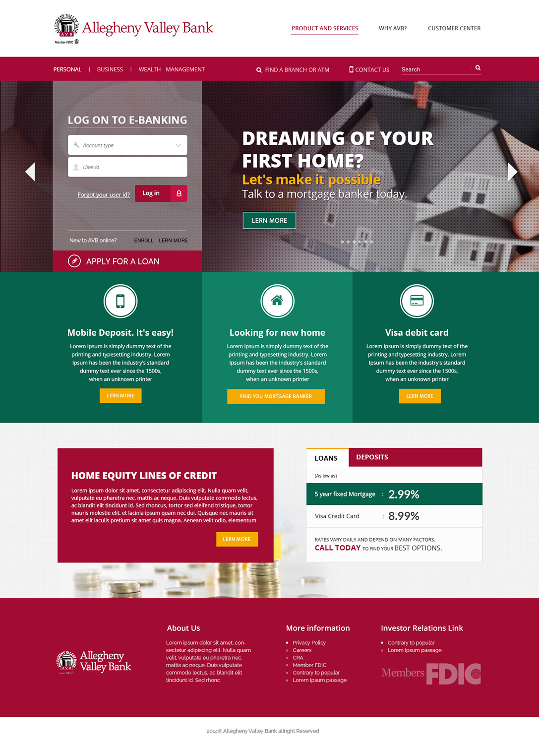
This customer received 72 web designs from 8 designers. They chose this web design from Akhilwebfolio as the winning design.
Join for free Find Design Jobs- Guaranteed
-
 US$500
-
 72 designs
-
 8 designers
Web Design Brief
Design a homepage and internal product page for a community bank. Needs to be mobile friendly, minimal scrolling on home. Create the homepage look & feel, then use the same aesthetic to create the product page for the personal checking account page.
Wireframes, logo variations, and color scheme attached.
New brand identity:
• Open, Fresh, Younger, Bright, Bold, New, Innovative.
• Inviting, approachable, friendly, trustworthy.
• Imagine a young family purchasing their first home as the target audience.
You do not have to stick to the exact layout of the wireframes, as long as all of the elements are present.
All navigation elements are specified in wireframes. There are three versions of the homepage – Personal Home, Business Home, Wealth Management Home – you may design whichever version you prefer.
For internal page – please design the Checking product page, included in wireframes.
NOTE: Submit your homepage design first. I will provide feedback on your design direction, then you can use that to move forward with the internal page design.
Design direction--
Some banking / financial sites we like for their fresh/bold/open look:
comerica.com
libro.ca
gtefinancial.org
bnz.co.nz
gobank.com
johnsonbank.com
asb.co.nz
Updates
Hi everyone,
Here is a link to a "live" version of the wireframes -- on moqups.com: https://moqups.com/skirk/VZR0qyB5/
I took out all of the excess pages, so that you can just see the important pages, and it will be easier for you to view the wireframes in a browser. I also added some notes to the wireframes.
In addition, I created a final duplicate homepage with a "grid overlay" to illustrate what I mean about needing the design to be mobile-friendly. I will not need mobile layouts. Just the normal desktop layout. However, we will be developing using a method many of you have probably seen -- where widths are based on columns of the page. So your design should have each element align with a number of columns. That is what I mean by "mobile-friendly."
I will be reviewing designs and posting individual feedback on the designs submitted so far by tomorrow morning.
Thanks!
Added Saturday, June 28, 2014
It is not necessary to submit several versions of your design, with different photographs in the large graphic.
If you do submit different versions with different photos, please also consider changing other elements on the page (full-width photo, vs "boxed" width, different use of colors, gradient, transparency, borders, etc), so we can see your creativity as a designer and provide feedback on which design direction we think works best.
Added Saturday, June 28, 2014
Project Deadline Extended
Reason: Unexpected travel has delayed my providing feedback on the latest designs. I will get back to each of you shortly!
Added Tuesday, July 01, 2014
Project Deadline Extended
Reason: We are down to our final considerations, but still need to see the internal page and want to give designers sufficient time to submit an internal page.
Added Sunday, July 06, 2014
For designers who still have a design under consideration -- please review the original design brief. We would like to see one internal page for the checking account page, matching your homepage look & feel. This does not have to be as big / bold as the homepage, but should match the design feel that you created for your homepage.
Added Sunday, July 06, 2014
Hi to all designers --
We really like the internal designs that each of the finalists have submitted, so we will be having a difficult choice regarding the winning design. We are considering all of the submissions carefully - both homepage and checking account page together - and will make our decision tomorrow. Thanks for all of your efforts! We will get back to you with feedback and our decision shortly.
Added Wednesday, July 09, 2014
Project Deadline Extended
Reason: Hi designers,
I am extending the deadline by 1 day. This will be the FINAL extension.
My team and I are still reviewing the final submissions. Each designer who is CURRENTLY a finalist with designs under consideration may submit ONE last design during this extension.
PLEASE NOTE !! TO BE FAIR TO EVERYONE --- YOU MAY ONLY SUBMIT ONE FINAL DESIGN. Anyone who submits two or more additional designs during the extension will be disqualified. We just want to give everyone a last opportunity to respond to the feedback they have received on their homepage or internal page -- as we have been slow to provide feedback.
We apologize for the delays. Thanks!
Added Wednesday, July 09, 2014
Target Market(s)
The target market for the personal homepage varies. Adults in the midwest, 25 - 60, who are striving to build their savings and manage their money. Often buying homes or refinancing their homes to make renovations, or planning for retirement.
For the business homepage, the target market are small to mid-market business owners striving to grow their business and manage their company.
Industry/Entity Type
Financial
Look and feel
Each slider illustrates characteristics of the customer's brand and the style your logo design should communicate.
Elegant
Bold
Playful
Serious
Traditional
Modern
Personable
Professional
Feminine
Masculine
Colorful
Conservative
Economical
Upmarket
Requirements
Must have
- colors: CRIMSON #a20c33,
FOREST GREEN #004f38
GOLD #e6a513
File format for design submission must be layered PSD (Please organize layers into recognizable folders like "menu" and "footer")
To make the design "mobile friendly" please create a grid-based layout. http://www.welie.com/patterns/showPattern.php?patternID=grid-based-layout
http://www.smashingmagazine.com/2007/04/14/designing-with-grid-based-approach/