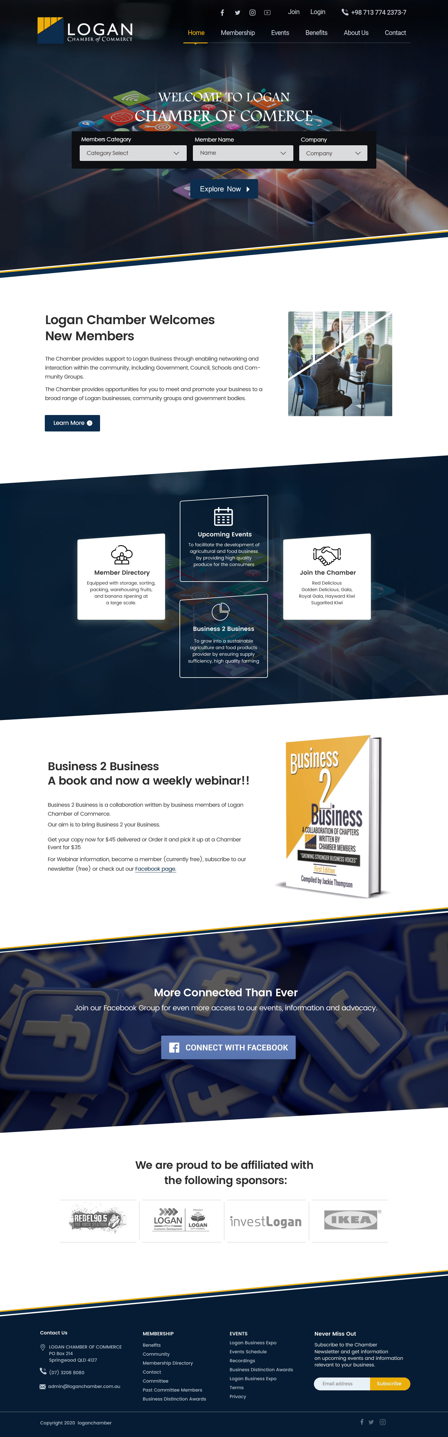
Logan Chamber Home Page - Make it more modern a little bit futuristic
Want to win a job like this?
This customer received 27 web designs from 6 designers. They chose this web design from Shijo John as the winning design.
Join for free Find Design Jobs- Guaranteed
-
 A$140
A$140
-
 27 designs
-
 6 designers
Web Design Brief
Take existing site and make it more modern and a little bit futuristic.
Design of new homepage with slightly more futuristic feel.
I don't the current design. There has recently been a change of direction of the chamber partly driven by COVID to move more meetings online instead of face to face. We want to inspire our members to embrace technology. We also want to position our city as a great modern place to business. We want to do that by featuring our great members on the home page. We also want to promote events on the home page. We also want to convert new visitors to members.
Members should be able to login to manage their membership. Visitors should be able to search for members by category, member name, member company.
It should look premium corporate but more futuristic and forward looking than the neighbouring Chambers:
https://www.goldcoastcentralchamber.com.au/
https://www.redcliffepeninsulachamber.org.au/
https://ipswichchamber.org.au/
https://redlandscoastchamber.org.au/#!event-list
https://directory.businessmoretonbayregion.com.au/businesses/n-t/pine-rivers-chamber-of-commerce
Target Market(s)
Modern small businesses owners
Industry/Entity Type
Business
Number of Pages Required
1 page
Font styles to use
Look and feel
Each slider illustrates characteristics of the customer's brand and the style your logo design should communicate.
Elegant
Bold
Playful
Serious
Traditional
Modern
Personable
Professional
Feminine
Masculine
Colorful
Conservative
Economical
Upmarket
Requirements
Must have
- Appeal to small business owners
Responsive down to mobile
Nice to have
- Draw a focus to members from directory
Either a white background or black background
I really like the San Francisco Chamber home page at: https://sfchamber.com/
Should not have
- Must look more modern than their existing site at: https://www.goldcoastcentralchamber.com.au/
No significant changes to logo
Don't like the light blue on existing site.