Cashflow Mastery Logo Design
Cashflow Mastery needed a logo design and received 20 Financial logo designs from 10 designers
Designs
Designers
Budget


-
 Previous page
- You're on page 1
- Page 1 of 1
-
 Next page
1 - 20 of 20 logo designs submissions
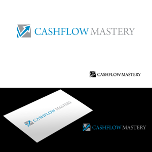
This is what Cashflow Mastery was looking for in their logo design
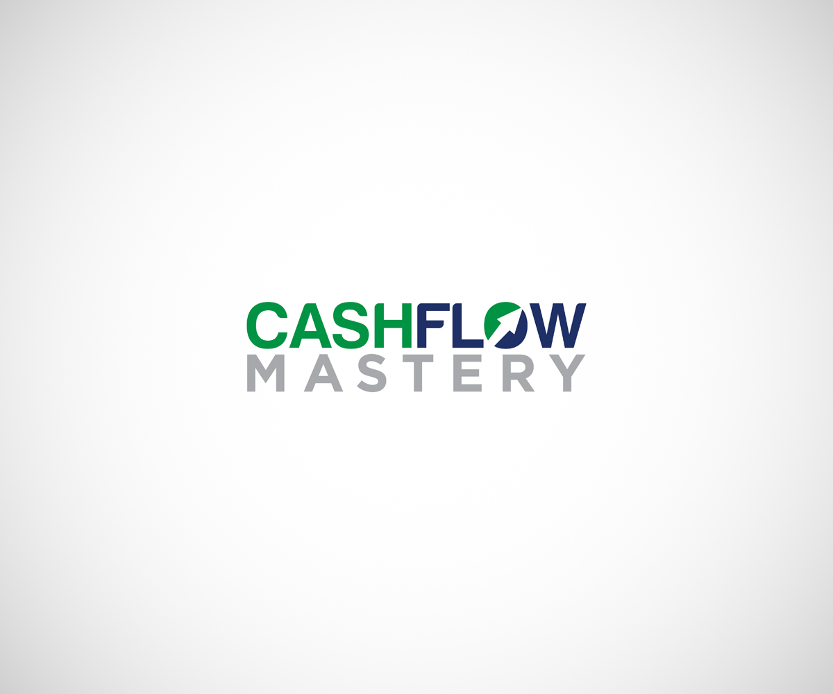
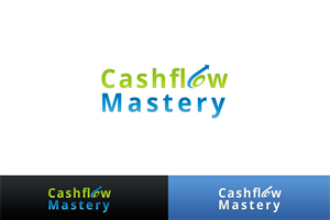
Overview updated - see current leading logo design below submitted to us. We like it for:
1. It projects integrity.
2. It looks very professional.
3. It is fresh with careful use of colour.
4. The wording says it all without the need for the arrows and dollar signs.
5. The inclusion of the arrow within the letter ‘o’ is smart and subtle.
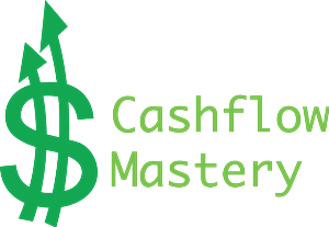
A simple arrow style logo that should communicate financial stability and growth. I have added two examples we like. The colour should be a "money" colour such as Platinum, Silver, Blue, Green, or Yellow. Our product will be used by business coaches and Accountants to improve their clients' cash flow
Read more