KwikMoto logo (PREFERABLY IN TWO LINES)
KwikMoto needed a logo design and received 115 Elegant, Playful logo designs from 63 designers
Designs
Designers
Budget


1 - 20 of 115 logo designs submissions
This is what KwikMoto was looking for in their logo design
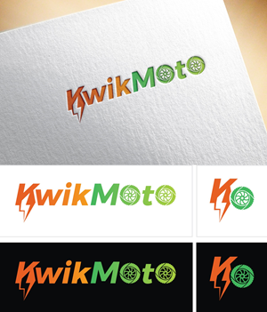
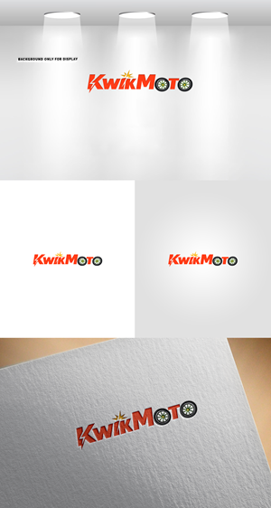
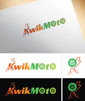
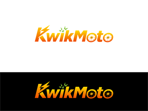
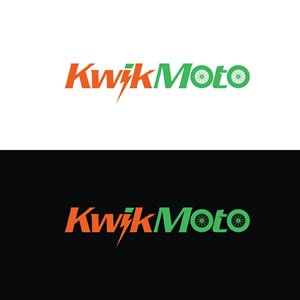
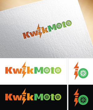
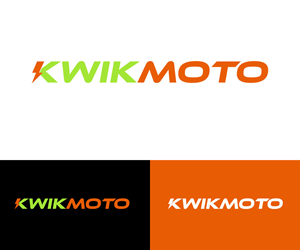
The word is KwikMoto — one word, capital K and M.
There are two critical creative elements that MUST be in the logo:
1. The two O's in M-O-T-O must be designed as motorcycle wheels.
The letter O appears twice in "Moto" — next to the M and next to the T. Both O's should be stylized as motorcycle wheels with spokes or a hub design. They should feel like natural parts of the word — same visual weight, same baseline, same spacing as the other letters. NOT bolted-on circles that look out of place. The wheels should be clean, modern, and instantly recognizable as motorcycle wheels at any size.
2. The "KWIK" portion must incorporate an electricity/lightning element.
"Kwik" means FAST. The letters K-W-I-K should somehow convey speed and electric energy. This could be a lightning bolt integrated into the K, a spark between letters, a speed-line effect, an electric arc, or the dot of the "i" as a spark. Be creative — but it must feel electric and fast, not generic.
Addit…
Read more