Full Quiver Enterprises, Inc branding
Full Quiver Enterprises, Inc needed a logo design and received 15 Traditional, Conservative, Truck Transportation logo designs from 3 designers
Designs
Designers
Budget


-
 Previous page
- You're on page 1
- Page 1 of 1
-
 Next page
1 - 15 of 15 logo designs submissions
This is what Full Quiver Enterprises, Inc was looking for in their logo design
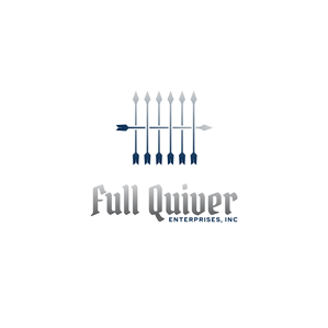
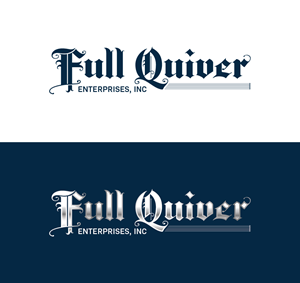
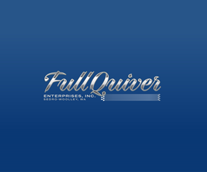
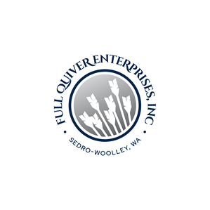
The logo features a stylized arrow quiver with 7 arrows, representing the idea of being fully stocked or loaded, which aligns with the essence of a trucking company. The bold, clean font choice for the company name adds a professional touch, while the arrows in the quiver subtly hint at movement and direction, reflecting the forward momentum and reliability of the company's services. The color palette chosen is a combination of deep blue and silver, conveying trustworthiness, stability, and professionalism. optional: The tail of the Q or the quiver itself is designed to resemble a highway stretching into the distance, symbolizing the transportation aspect of the business.
We deliver the highest quality health food and products directly to local co-ops, churches, and neighborhoods for less than you can pay at the store.
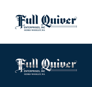
Of the two, we like the font on the blue truck better. Our new trucks will all be blue.
We would like artwork that can be used in all forms…
Read more