trak Diet
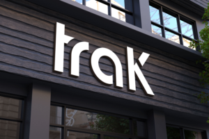
traK needed a logo design and received 53 Bold, Modern, Weight Loss & Health Industry logo designs from 20 designers
Designs
Designers
Budget
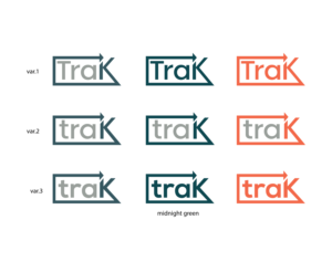

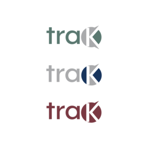
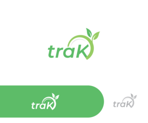


1 - 20 of 53 logo designs submissions
This is what traK was looking for in their logo design
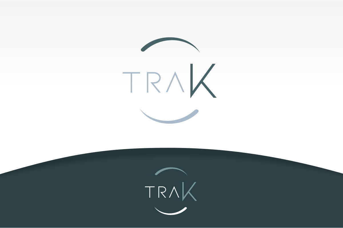
Logo description:
1/ We are a weight loss company that offers its program to dieters through a network of licensed healthcare professionals (B2B2C business model).
2/ We are located in both Canada and the USA.
3/ The design must look clean, sharp and professional (as our protocol is medically supervised). It must convey trust and a focus on outcomes.
4/ Why traK? 1/ We help people get back on track and take back control of their health 2/ The K is capitalized to emphasize the ketogenic nature of our weight loss protocol
5/ The design must NOT look cluttered, messy - no train or railroad tracks of any kind.
6/ The logo should look and feel timeless - it could feel contemporary provided that it does not look gimmicky.
7/ Within the design - the first 3 letters (tra) must be lowercase and the K must be capitalized.
8/ The logo should be gender-neutral
9/ Please keep in mind that this logo will not only be used on our different documentations, banners…
Read more