LyraPay - Payroll Bureau needs a logo
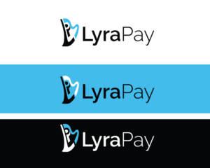
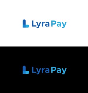
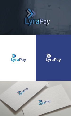
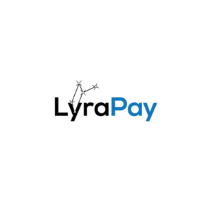
LyraPay / lyrapay / LYRAPAY needed a logo design and received 38 Bold, Professional logo designs from 23 designers
Designs
Designers
Budget


1 - 20 of 38 logo designs submissions
This is what LyraPay / lyrapay / LYRAPAY was looking for in their logo design
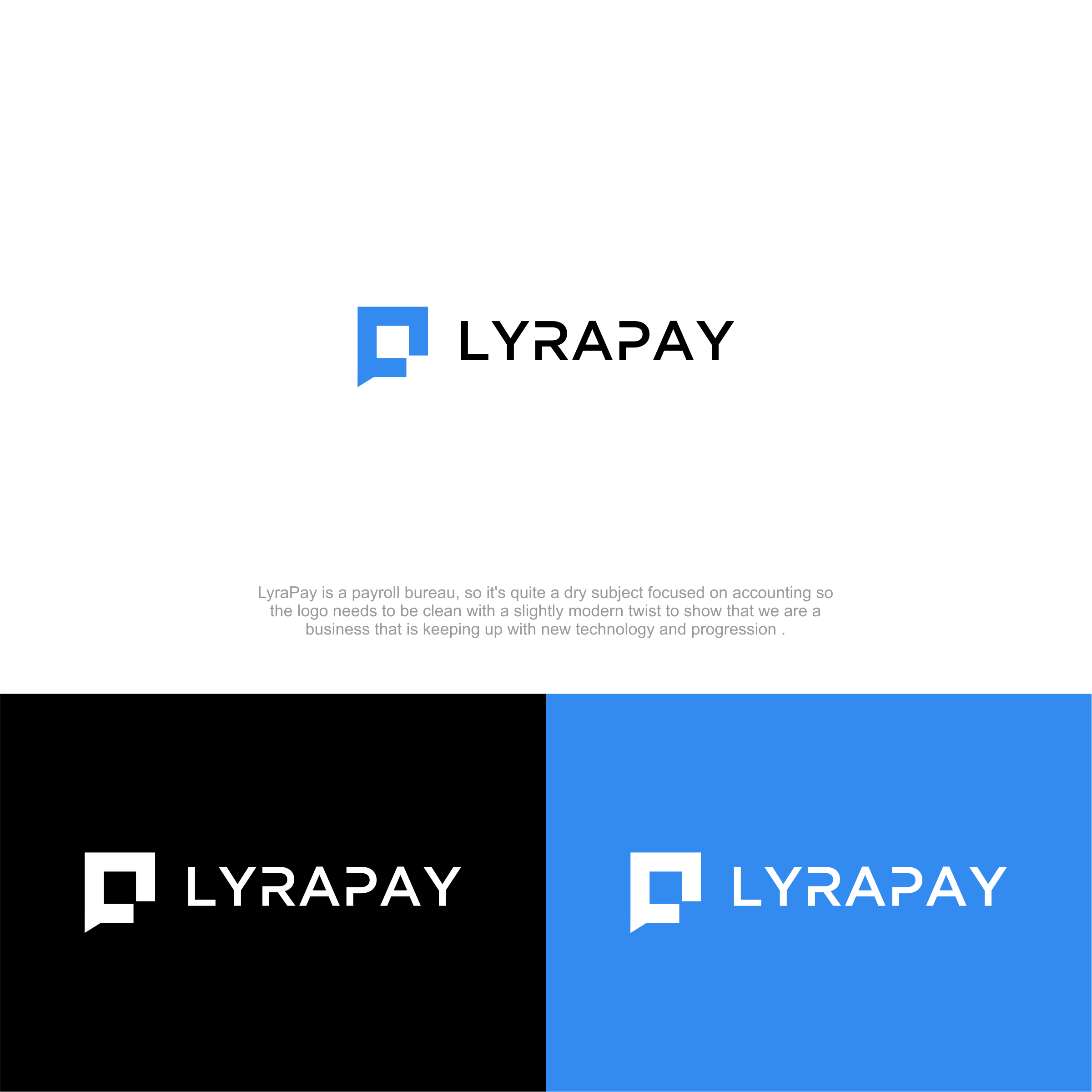
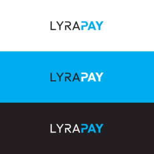
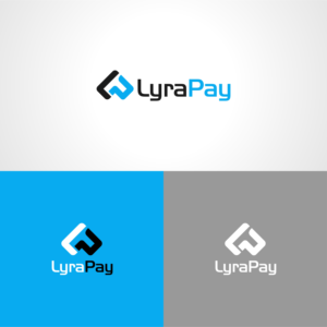
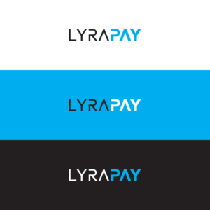
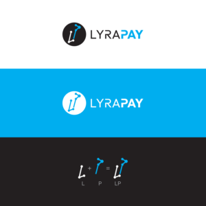
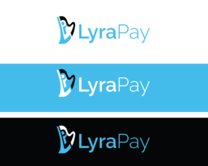
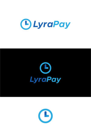
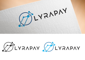
LyraPay is a payroll bureau, so it's quite a dry subject focused on accounting so the logo needs to be clean with a slightly modern twist to show that we are a business that is keeping up with new technology and progression . The text can be uppercase, lowercase or a mix of both but the focus will be primarily on the font and perhaps a small logo emblem. I've included some examples from this site of projects that I like. I particularly like anything with a customised font feel. If you are adding a logo emblem then this should be the initials (LP) or something to do with either a 'lyre' instrument which is a type of harp or something to do with stars or constellations as in the constellation lyra. Ideally the logo needs to be in black lettering and blue for any emblems but i'm open to different colours or ideas. Read more