Review/Re-Design Supermarket E-Commerce website
Want to win a job like this?
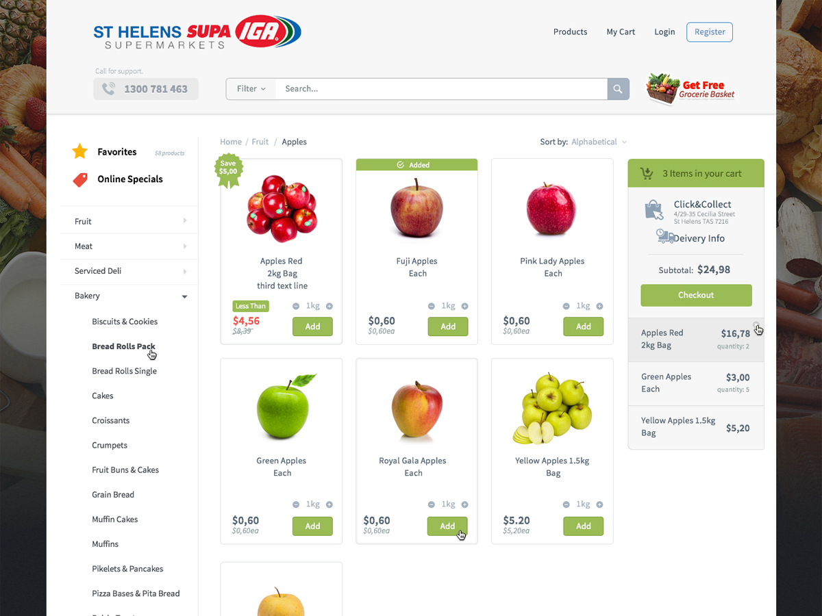
This customer received 78 web designs from 30 designers. They chose this web design from next1 as the winning design.
Join for free Find Design Jobs- Guaranteed
-
 A$410
A$410
-
 78 designs
-
 30 designers
Web Design Brief
We have launched our Supermarket E-commerce Website but feel it is lacking a modern feel.
Please re-design the current Supermarket E-commerce site, creating a more modern look and feel.
I am looking for design changes to things such as:
- Fonts
- Button shape & Size
- Shapes of boxes
- Layout of drop down menus
- A new shopping cart / button
- The Header (and in particular the use and positioning of the logo)
- Supplying a generic background image (currently berries)
Please do not change the structure of the page. For instance, the category selection will always be on the left, the items will always be displayed in rows of 3 and the shopping cart should be on the right.
Updates
Current site can be found at www.supaigasthelens.com.au
Added Monday, January 12, 2015
Project Deadline Extended
Reason: designs coming in are generally too different from current design.
we are looking for less that 10% change to the overall look and feel.
one aspect that needs a lot of work is the checkout cart on the right hand side. please checkout
http://www2.woolworthsonline.com.au/?gclid=CMTF9tbjksMCFZOWvQodFSMAoQ
Added Wednesday, January 14, 2015
Target Market(s)
Consumers buying their weekly grocery shopping online
Industry/Entity Type
Shopping
Number of Pages Required
1 page
Look and feel
Each slider illustrates characteristics of the customer's brand and the style your logo design should communicate.
Elegant
Bold
Playful
Serious
Traditional
Modern
Personable
Professional
Feminine
Masculine
Colorful
Conservative
Economical
Upmarket
Requirements
Must have
- Stick to the branding of the Logo. Which is Red, Blue and White.
- Other colours may be used in small percentages.
Should not have
- Do not change the Structure of the site.