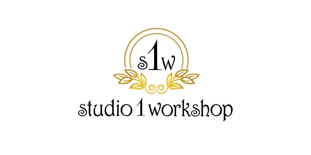
Personalized Handcrafted Frames Logo Design
Want to win a job like this?
This customer received 145 logo designs from 12 designers. They chose this logo design from hih7 as the winning design.
Join for free Find Design Jobs- Guaranteed
-
 US$200
-
 145 designs
-
 12 designers
Logo Design Brief
I am a small business owner based in Westfield Mass. called Studio 1 workshop. I work out of my home with plans to operate online. Studio 1 workshop is a laser engraving business that offers personalization on frames, glassware, plaques, signs, rubberstamps, ect. The majority of my orders is my custom made frames. These frames are cut, lacquered, laser engraved all in my workshop. My online business will only focus on "Birth Frames, Birth plaques, and special occasion frames, mostly centered around infants-children. Eventually I will alter my business to weddings ect. I would like a logo that contains the initials S 1 W with the 1 larger than the s and w. colors nothing too bright. CMYK color C52 M76 Y42 K21 was my first choice Not sure what it is in RGB. I am open for other ideas. Would like logo not to be defined to just children as my business might grow and change. I have designed and choosen the text for my business name. Font Harrington attached is my design
Updates
Would like to mention that the "S" in studio and "S" in workshop is the Capital letters in Harrington
Added Tuesday, January 06, 2015
To all designers,
To make things easier, I have uploaded studio 1 workshop image in SVG format and in corel draw
I didn't realize that I originally sent in pdf
I still would like S1W for logo
I would still like to keep the name in Harrington or something very close to it.
The reason why I uploaded image is although it's in Harrington…there was some minor adjustments in the text that I like to keep.
Example…the 3 "o" are actually rotated….. The two "s" are cap BUT sized down to other text.
The request that I would like is to keep the '1' as close to what was uploaded. It was not done in Harrington
I wanted to have the "1" be sharp and defined because some fonts make the '1 'look like 7's or I's
thanks
Added Thursday, January 08, 2015
Theres seems to be a issue with the uploads I have sent.
I hopefully corrected the problem
There should be 4 files. SVG, PDF, PSD, and Corel draw.
please note that I replaced the corel draw with the most current
Please update me if there is still problems. Thanks again
Added Friday, January 09, 2015
Target Market(s)
target customers women ages 25 - 55
Industry/Entity Type
Small Business
Logo Text
S 1 W
Logo styles of interest
Emblem Logo
Logo enclosed in a shape
Lettermark Logo
Acronym or letter based logo (text only)
Look and feel
Each slider illustrates characteristics of the customer's brand and the style your logo design should communicate.
Elegant
Bold
Playful
Serious
Traditional
Modern
Personable
Professional
Feminine
Masculine
Colorful
Conservative
Economical
Upmarket
Requirements
Must have
- the 1 should be larger than s and w
Nice to have
- something that goes with the font Harrington that is used for my business name
Should not have
- no bold colors