RC Mediation and Arbitration Group needs a logo design
Want to win a job like this?
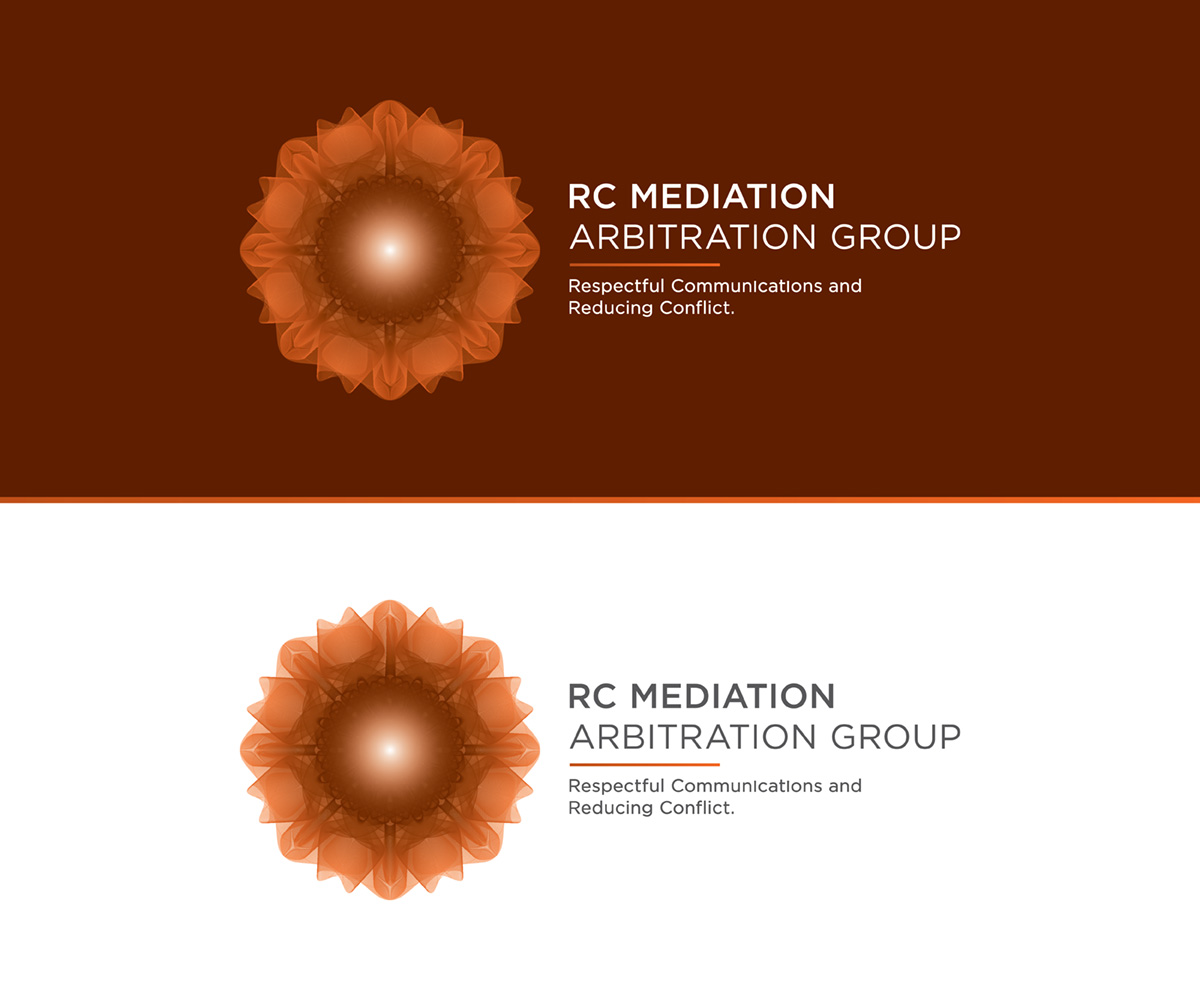
This customer received 148 logo designs from 59 designers. They chose this logo design from iamf as the winning design.
Join for free Find Design Jobs- Guaranteed
-
 C$320
C$320
-
 148 designs
-
 59 designers
Logo Design Brief
The new company is attempting to develop a mediation and arbitration services in family law, and eventually, in other areas of conflict. I envision the logo as having RC on the left side of the logo with Mediation and Arbitration Group on the right side with the two sides being separated with an image which would represent a situation of initial conflict with movement upward movement leading to two parallel lines moving forward representing a conflict-free situation. My thought was something like a line with a loop below the RC on the left side of the log - representing conflict, with line moving to the right below "RC" and then moving upwards and then separating into two lines above "Mediation and Arbitration Group". The line represents moving away from conflict and parenting in what is known as "parallel parenting.
The "RC" stands for "Respectful Communications" and Reducing Conflict".
I thought that these could be included on the right side of the logo. Not sure if this is proper to be in a logo or better to be included in letterhead but not as part of the logo. Do not want to have the logo be too busy.
Finally, I was thinking that there might be a color scheme that went from a darker color to a lighter color or shade as the color moved to the right. I see this as signifying moving from conflict to being conflict-free.
The bottom line is to have the logo show a movement from conflict to resolution.
Updates
Project Deadline Extended
Reason: I have like many of the ideas that have been presented. The early designs included Respectful Communications in the logo; I have decided that the logo should not include this term. Although I am satisfied with many of design concepts submitted, I am looking to have something in the logo that symbolizes the parties now working together by having respectful communications and reducing conflicts. I had proposed that a line that transcends the center of the logo and moves into a parallel line moving towards the right side of the logo be incorporated to represent this movement. In my mediation practice, I attempt to have the parties move forward, reduce conflict and work together. I would like to have something symbolize a movement from a low level of conflict to a higher level of cooperation (the two parallel lines).
Thanks for your efforts.
Added Wednesday, January 07, 2015
Target Market(s)
My clients will be husbands and wives going through separation or divorce, employers and employees in work disputes, and parties in legal litigation trying to resolve their issues outside of court.
Industry/Entity Type
Family Law
Logo Text
RC Mediation and Arbitration Group
Logo styles of interest
Pictorial/Combination Logo
A real-world object (optional text)
Abstract Logo
Conceptual / symbolic (optional text)
Colors
Designer to choose colors to be used in the design.
Look and feel
Each slider illustrates characteristics of the customer's brand and the style your logo design should communicate.
Elegant
Bold
Playful
Serious
Traditional
Modern
Personable
Professional
Feminine
Masculine
Colorful
Conservative
Economical
Upmarket
Requirements
Must have
- the logo needs to incorporate a design that symbolizes a movement from conflict to resolution.
To have Respectful Communications and Reducing Conflict being incorporated in the logo but as smaller print. Should not compete against the name of the company, being RC Mediation and Arbitration Group.
Nice to have
- The logo could have an element of being darker on the left and progressing to a lighter color on the right symbolizing going from conflict to resolution.
The logo could incorporate a line or other design that reflects going from conflict to resolution. Something like a line with a knot at the left end and moving towards the right of the logo, moving upwards and then splintering into two parallel lines moving to the right. This indicates the parties have moved away from the conflict.
Should not have
- The design should not have Respectful Communications and Reducing Conflict in the actual name of the company. The company is RC Mediation and Arbitration Group.