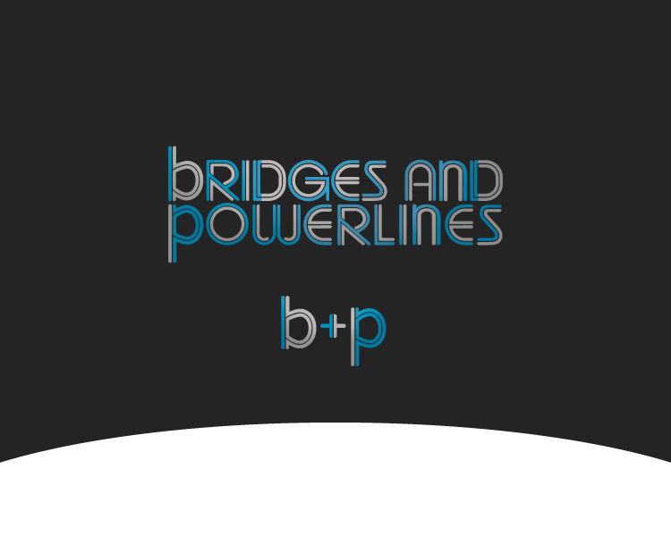
Logo Design for indie rock band
Winner
Want to win a job like this?
This customer received 38 logo designs from 16 designers. They chose this logo design from MrBranding as the winning design.
Join for free Find Design Jobs-
 US$400
-
 38 designs
-
 16 designers
Logo Design Brief
We need a logo for a brooklyn indie rock band called bridges and powerlines. The logo probably should have different colors for each letter, an array of grays, browns and a few more hopeful colors (some faded blues) and should be all lowercase.
would like a wordmark logo using the band name and a separate similar logo with the acronym b & p
the brand image / personality is: honest, hopeful, slightly quirky, somewhat nostalgic
Target Market(s)
ages 13-40, indie rock crowd (a bit hipster-y)
Logo Text
bridges and powerlines
Logo styles of interest
Wordmark Logo
Word or name based logo (text only)
Lettermark Logo
Acronym or letter based logo (text only)
Look and feel
Each slider illustrates characteristics of the customer's brand and the style your logo design should communicate.
Elegant
Bold
Playful
Serious
Traditional
Modern
Personable
Professional
Feminine
Masculine
Colorful
Conservative
Economical
Upmarket
Requirements
Must have
- convey the desired brand image: hopeful, honest, slightly quirky, nostalgic.
use the attached image, really like that design, ideally extremely similar.
the logo must have two things:
a text logo with "bridges and powerlines"
and an acronym logo with "b&p"
the text logo likely should be on two lines aka:
bridges and
powerlines
but not so sure about that.
can check out the music and art (to get a sense) at:
bridgesandpowerlines.com
soundcloud.com/bridgesandpowerlinesband
Files
JPG
photo-4 Tuesday, 05 February 2013 12:40:57
Tuesday, February 5, 2013
Payments
1st place
US$360
Participation payments x 2
US$20