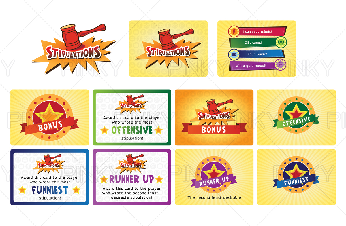
Logo and 2 card faces for a card-based party game
Want to win a job like this?
This customer received 13 graphic designs from 2 designers. They chose this graphic design from Pinky as the winning design.
Join for free Find Design Jobs- Guaranteed
-
 US$300
-
 13 designs
-
 2 designers
Graphic Design Brief
I'm launching a party game on Kickstarter soon and would like to get a more professional design for the cards and game. The game is about crushing other people's dreams and superpowers, so a clean and fun look is important. The game is titled Stipulations (learn more about the game here: https://www.thegamecrafter.com/games/stipulations) and includes two types of cards that I'd like you to design both front and back. The first type is the Stipulations cards that have 4 categories to choose from on each card face. I'd like a symbol for each of the 4 categories: superpower, occupation, lifetime supply, and fulfilled dream. I'm thinking maybe a bucket with a list in front of it for fulfilled dream, an infinity symbol on a packaging box for lifetime supply, a lightning bolt or something more creative (generic superhero emblem) for a superpower, and maybe a fireman's hat or something else that represents a job or occupation. There will be text going next to the symbols on the card face (see examples of the old design on the URL provided above or in the attached files), so just copy the text from any of those cards to make sure it fits. For the card back, I'd like you to design a logo for Stipulations. You could incorporate any of the following ideas: The word Stipulations being crushed in a vice or shattered by a gavel. The logo is the only thing needed for the back of the card, but please add a border, color, texture, etc. to make it look professional. The second type of card is the bonus point cards (examples of the old design can also be found at the URL provided above or in the attached files). The same logo could be placed on the back of these cards with something to make them stand out as bonus point cards instead of Stipulations cards (a color change, text, or whatever looks good). The face of the bonus point cards will need space for text (as seen in the old design), but has room for your creativity as well. Do whatever fits with the theme set by the Stipulations cards and make it look clean, fun, and professional. Here are a couple of inspiration pieces of design that I like for card games: https://www.kickstarter.com/projects/alxhague/monikers https://www.kickstarter.com/projects/andrewfederspiel/knee-jerk-the-party-game-of-instant-reactions If you win this contest, it is very likely that I will work with you one on one for additional needs, including design of the box for the game and an instructions booklet. Thank you!
Here's some of the feedback I provided to a submission that I thought might be helpful for all to see:
1. I'd prefer if the front of the card didn't prioritize one category over the others. All the same size would be ideal. I like the idea of the symbols and text being on banners, sort of like the Knee Jerk example link that I posted, although other ideas are welcome.
2. A design element that runs throughout the game and ties the front and back of the card together would be nice. Whether you use banners, a similar border, gradients, vector graphics, or whatever else is open to your design interpretation and expertise.
3. For the logo, I'd really like to see the name Stipulations being hit with a gavel or in something similar to a car crusher machine where it looks like it's being smashed.
Target Market(s)
20-30 year olds. College students and young professionals. Male and female. Enjoy social get-togethers, "hanging out", etc. Play drinking games, charades, and other party games.
Industry/Entity Type
Games
Look and feel
Each slider illustrates characteristics of the customer's brand and the style your logo design should communicate.
Elegant
Bold
Playful
Serious
Traditional
Modern
Personable
Professional
Feminine
Masculine
Colorful
Conservative
Economical
Upmarket
Requirements
Must have
- Full bleed on the poker-sized cards so that printer errors are minimized.
Nice to have
- The logo can be horizontal or vertical on the card back, but should match the direction of the text on the card face. Any creativity you can bring to the logo/card back that matches the theme of the game (crushing dreams, superpowers, jobs, etc.) is appreciated.
Should not have
- The bird that is in the old design. I'm moving on from that amateur look.