Community Lifestyles Logo
Want to win a job like this?
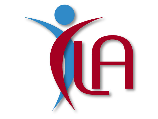
This customer received 57 logo designs from 21 designers. They chose this logo design from logo_works as the winning design.
Join for free Find Design Jobs-
 A$390
A$390
-
 57 designs
-
 21 designers
Logo Design Brief
Company Name: Community Lifestyles Agency Inc . Sometimes referred to as CLA
What We Do: We're a community organisation, which provides support services which empower people with disabilities and enables them to have and enjoy a quality of life as a valued member of the community. Our primary work is in supporting people in their homes, although we do also support individuals in their community.
________________________________________
Three Things to Communicate Through Our Logo Design:
#1 Professional
#2 Human touch
#3 Capable & well-established
It is preferable that the colour scheme for the logo be in the blue’s & red/brown
The image we currently have is a house with a hand but we feel this is outdated and very rigid and therefore does not reflect our progressive organisation. Having a logo that also portrays a house is optional, as we are not completely sure on this.
Updates
Thanks for your efforts. I just wanted to clarify that although CLA would be nice to have included, perhaps it doesn't need to be the central focus. PM me if you need more info. Regards Maree
Added Tuesday, March 08, 2011
Target Market(s)
1. Maryborough community
2. People with disabilities
Industry/Entity Type
Progressive
Logo Text
(None provided)
Logo styles of interest
Pictorial/Combination Logo
A real-world object (optional text)
Abstract Logo
Conceptual / symbolic (optional text)
Look and feel
Each slider illustrates characteristics of the customer's brand and the style your logo design should communicate.
Elegant
Bold
Playful
Serious
Traditional
Modern
Personable
Professional
Feminine
Masculine
Colorful
Conservative
Economical
Upmarket
Requirements
Must have
- The colours for the Agency (microsoft products)
165, 0, 33 A brown/burgandy colour
47, 137, 199 A Blue colour
We would like our logo to have a human look to it. We don't want a logo that is so professional that it looks "techie". We also don't want one that is very rigid.
Nice to have
- CLA lettering
Should not have
- reference to wheelchairs - abstract or otherwise