Coffee Purveyor logo and take-away coffee cup design
Want to win a job like this?
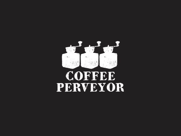
This customer received 115 logo designs from 38 designers. They chose this logo design from Hoopoe as the winning design.
Join for free Find Design Jobs- Guaranteed
-
 US$400
-
 115 designs
-
 38 designers
Logo Design Brief
Coffee Purveyor is a provider of take away coffee in the business area of the city in Singapore. It provides customers with a choice of their favourite roasters, much like walking up to a bar and having a different choice of vodka brand. This is what we are delivering to the coffee world......a choice of roasting brand. Coffee Purveyor is not a cafe but is rather a service bench on which there are three separate grinders with the different brands.
We need a logo for this new business. We want it to be a little edgy/ creative rather than to look like a franchise logo which is what we do not want.
Ideally we would like the logo to feature a grinder or several. It needs to be able to be used on business cards, promotion cards and importantly, printed onto the take away coffee cups. When people are walking around with a coffee purveyor cup we want it to be distinguishable and stand out to others so that others are able to notice the cup and over time understand that it is from Coffee Purveyor.
Updates
Project Deadline Extended
Added Tuesday, January 08, 2013
I have updated the brief.
Added Tuesday, January 08, 2013
Please note that I have updated the brief.
Added Thursday, January 10, 2013
Target Market(s)
Singaporean and International office workers who like really good coffee
Industry/Entity Type
Cafe
Logo Text
Coffee Purveyor
Logo styles of interest
Wordmark Logo
Word or name based logo (text only)
Look and feel
Each slider illustrates characteristics of the customer's brand and the style your logo design should communicate.
Elegant
Bold
Playful
Serious
Traditional
Modern
Personable
Professional
Feminine
Masculine
Colorful
Conservative
Economical
Upmarket
Requirements
Must have
- I want the word Purveyor to be as distinct as the word Coffee
Logo is to support "unique, original, authentic....creative, street smart, edgy, cool"
Not too many colours..... black and white and grey or another striking combination.
Nice to have
- I like the idea of the lettering not looking too stenciled.....so even free hand text. Nothing too flowering or feminine.
An idea might be to incorporate say three or so grinders into the logo as the idea behind the business is that there is more than one roast available.
I quite like the look and feel of the logos in the attached word document.
Should not have
- The pitch is the coffee grinder so no images of cups in the logo.