E- shot and newsletter design
Want to win a job like this?
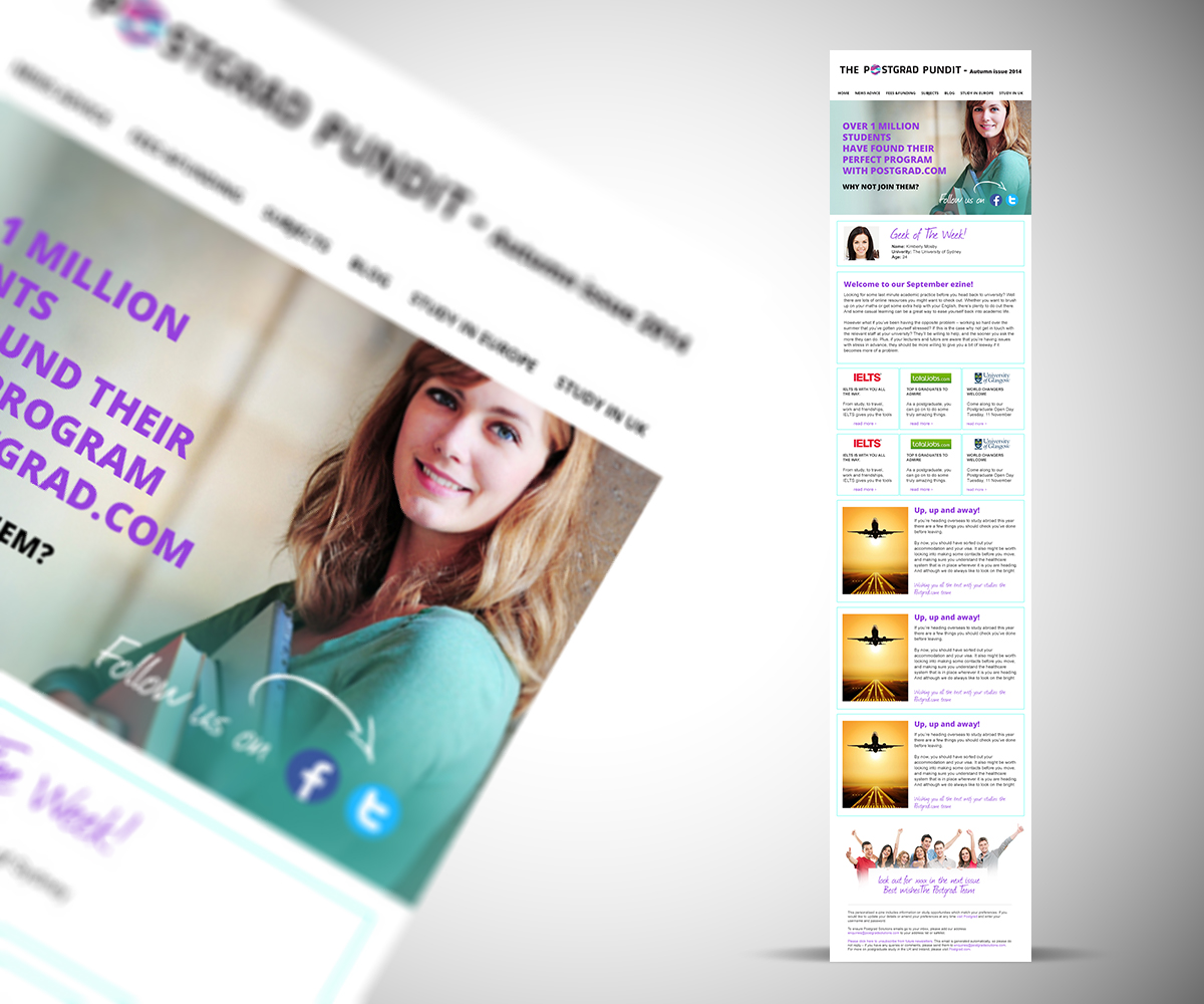
This customer received 9 newsletter designs from 4 designers. They chose this newsletter design from maZat as the winning design.
Join for free Find Design Jobs-
 £120
£120
-
 9 designs
-
 4 designers
Newsletter Design Brief
We are a leading website to help students around the world to choose the best postgrad program and institution to meet their needs see www.postgrad.com.
Student sign up on our website to receive postgrad new from us. This is slivered in the form of email shots i.e info paid for by an advertiser or in the form of our e- newsletter that is sent once a month. we wish to get a good design for the e-shot and to sort out the design of our e- newsletter too.
I have attached our present e-shot which you can use as sample content. This need to be brought in line with our new website branding as it it still uses our old logo and brand colours and brought up to are with a more cutting edge layout.
I have listed below things that need to be considered:
Brief for Solus email shot for postgrad.com
1)Top section: this needs to include the new logo, the new colours and the strap line 'The no 1 site for European Postgrad Courses''. I suggest it also includes links to all the top navigation items we have on our site underneath this (where at the moment we just have 'postgrad study', 'postgrad life' and ''check your details). I would like to see if we can find a way for all these to fit
Home,
News
Advice,
Fees &funding,
Subjects
Blog
Study in Europe,
Study in UK
This way the solus header becomes a bit like the header and top navigation of our home page and allows student to re- access different parts of the site.
2)We still need a section for the client logo. This needs to work well for the VERY random sizes of logos we have varying from long and thin to short and fat ones!! Their logo is secondary to the postgrad.com one but still important part of the solus email shot.
3) Include free form space for the content and photo etc. I suggest we might want to design a funkier way of showing the contact details at the end if the client wants to use this. On the one attached for Kaplan /Essex the contact detail element is pretty weak at the end and if we have a contact box predesigned they can use this which might help it look better etc. You might wish to use the 'Lets Go' circle on postgrad.com home page search box as an icon with 'contact us' in it instead - just an idea.
4) Check your details section at the end need to be re looked at. It has too much of an emphasis at the moment.
5) Colours: Please take a lead from the home page of our sites using the blues and purples etc.
E - newsletter:
This is sent once a month and contains up to 6 client teaser adverts/news stories. The sample only had 3. We want this to become a MUST read monthly newsletter and at present it just looks like a lot of adverts with an into and a close. sea are very happy to put in more work on objective content e.g. sample content could be:
Latest on Visas for International students coming to the UK
Top tips on making sure your application from is perfect
How to improve your english grade before applying etc
but we need to get creative to embed the paid for stories in the newsletter in a way they will get read and a way that it looks less advert heavy.
A copy of a recent e - newsletter has been watched . This need to be brought in line with the new branding as per the brief for the solus above. This e- newsletter the part of the work that is most important to get right as the solus should be straight forward.
Many thanks
Katherine