Logo Design Project
Want to win a job like this?
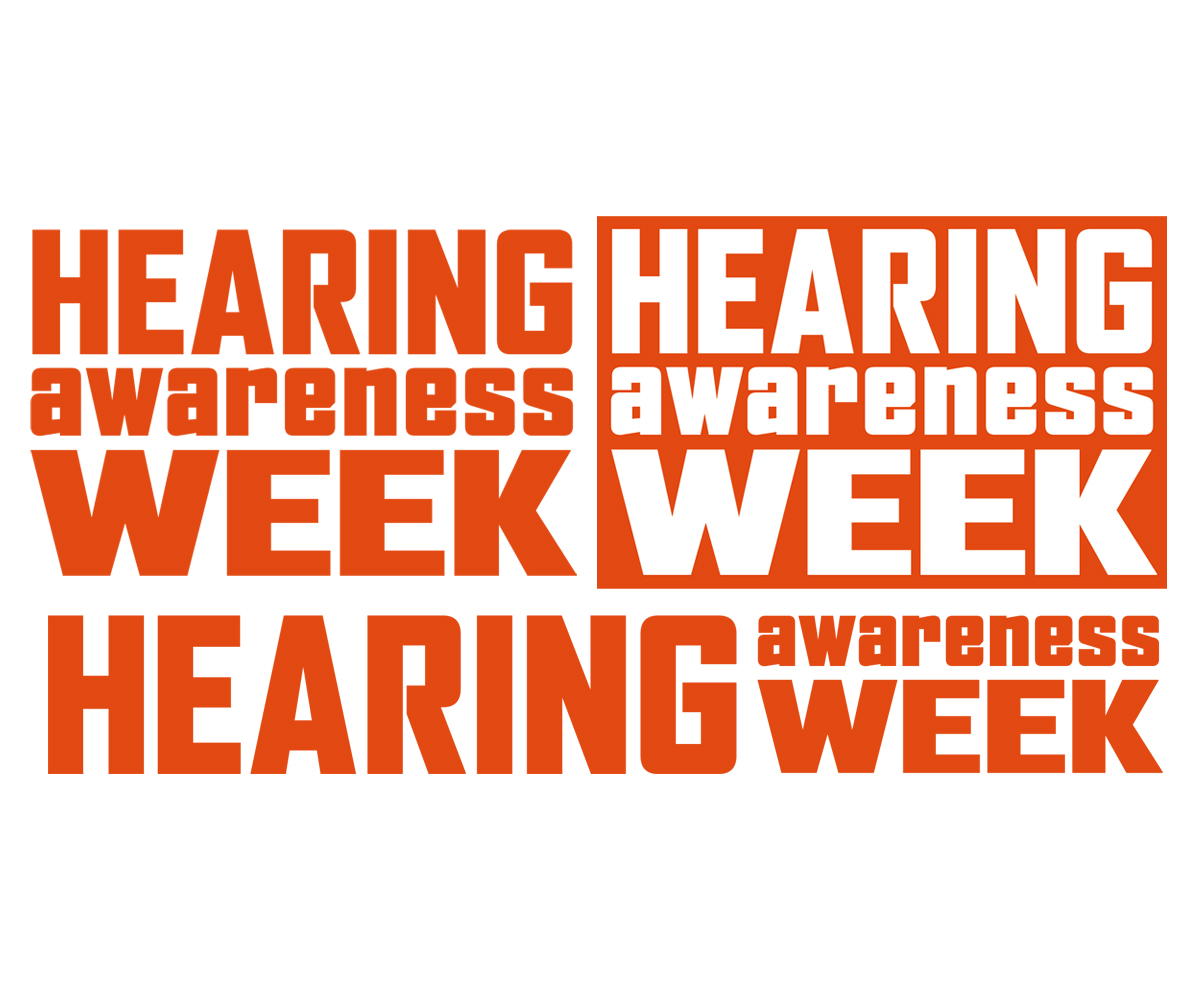
This customer received 19 logo designs from 11 designers. They chose this logo design from Philly Puddy as the winning design.
Join for free Find Design Jobs-
 A$200
A$200
-
 19 designs
-
 11 designers
Logo Design Brief
www.hearingawarenessweek.org.au
The Hearing Awareness Week (Australia) logo needs to be re-designed. The current version is looking dated, takes up too much space and the ear icon is dubious.
We are looking for a logo that don’t necessarily feature any stylized ear imagery.
Potentially the logo could consist of only the words ‘Hearing awareness week’ with no addition elements.
Ideally the logo will have a vertical version that fits into a square(ish) shape and a horizontal version. A reversed version is useful too.
The Hearing Awareness Week brand serves to promote events hosted by various Deafness and hearing health groups around the country.
Historically the logo has featured a dark orange and headline text has also been this colour. We are not committed to this or any other colour for the logo or other branding.
Updates
www.hearingawarenessweek.org.au
The Hearing Awareness Week (Australia) logo needs to be re-designed. The current version is looking dated, takes up too much space and the ear icon is dubious.
We are looking for a logo that don’t necessarily feature any stylized ear imagery.
Potentially the logo could consist of only the words ‘Hearing awareness week’ with no addition elements.
Ideally the logo will have a vertical version that fits into a square(ish) shape and a horizontal version. A reversed version is useful too.
The Hearing Awareness Week brand serves to promote events hosted by various Deafness and hearing health groups around the country.
Historically the logo has featured a dark orange and headline text has also been this colour. We are not committed to this or any other colour for the logo or other branding.
Added Wednesday, December 05, 2012
Target Market(s)
Appeal to adult Australians as individuals.
Industry/Entity Type
Events
Logo Text
Hearing Awareness Week
Logo styles of interest
Wordmark Logo
Word or name based logo (text only)
Look and feel
Each slider illustrates characteristics of the customer's brand and the style your logo design should communicate.
Elegant
Bold
Playful
Serious
Traditional
Modern
Personable
Professional
Feminine
Masculine
Colorful
Conservative
Economical
Upmarket
Requirements
Should not have
- No ear imagery. No light colours.