chambered nautilus - for orthodontist
Want to win a job like this?
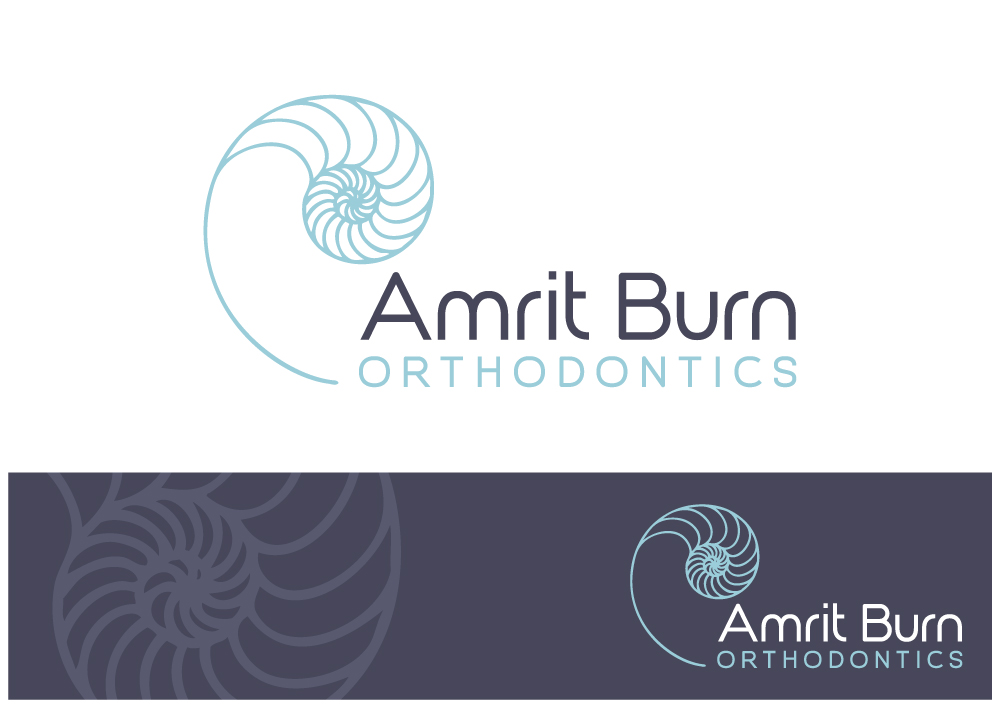
This customer received 80 logo designs from 30 designers. They chose this logo design from Nigel B as the winning design.
Join for free Find Design Jobs- Guaranteed
-
 US$470
-
 80 designs
-
 30 designers
Logo Design Brief
I would like to revisit my existing logo design for my orthodontic practice - Amrit Burn Orthodontics. Its a small, boutique-type private practice in Seattle, WA. The nautical/marine theme has always spoken to me - our office has a gorgeous salt water fish tank and we have used the attached logo (brown shell with scripty name) for about 5 years. There are decorative metallic angel fish on the wall and other nautical theme items in the office.
Lately, I have toyed around with changing the color of the shell to a teal color (see other file) and also I have made the name of our practice way easier to read. I like the combination of teal as the primary color on a white background with black text, but am open to your color interpretations on this project. The new font I played with is a little generic, don't you think? (century gothic). I would like our new logo to go well with common sans serif word processing fonts - as this logo will very often appear at the top of a letterhead.
What I would like to see is a redesign of the logo that takes these elements and makes them pop - something clean and elegant. We are projecting the image of a higher end orthodontic provider who focuses on quality and a superior patient experience. I like the chambered nautilus for its natural perfection, the golden proportions of the spiral mathematically. Subconsciously I would like to say that a potential client (patient) should expect to enhance their (or their child's) own natural beauty when they choose my practice. Orthodontic treatment puts the teeth and jaws into a more beautiful and naturally determined order, much like the natural order one observes with a chambered nautilus shell.
The target client is most often an adult female, typically a mom. She is seeking a trusted and quality provider for this service, usually for herself, her kids, or a man in her life. So it should appeal to a feminine audience BUT not be inaccessible to an adult male either. We have a growing number of those seeking treatment as well. The local demographic is tech/medical savvy and well educated. Its an urban location, with many competitors. Overall, the city has a nautical/marine/mountains/trees vibe.
Another important target audience is our referring dental offices. These dentists are 50/50 male/female, and are looking for a quality reputable orthodontist to refer their patients to. This referral relationship is the backbone of my business, as at least 1/2 of our patients are referred by a dentist. (The other 1/2 finds us online) The referring dentists' staffs are 99% female, and they are often our point of contact with correspondence, etc.
My first name (Amrit) is not obviously female - often people assume I am a male doctor before they meet me. Perhaps I have used the shell to give a more feminine hint as to the identity.
Also - probably something you designers already know: In a lot of lower case fonts, the "r" and "n" of my last name run together and look like a "m"
Which is unfortunate because it appears as Bum, instead of Burn. Please try to minimize this issue!
Last, I would like to see a design that would emboss well - I would like to use an embossed (colorless?) version of the logo to put on the front of a white pocketed folder with some printed material to give to the patient after their initial consultation.
Target Market(s)
The target client is most often an adult female, typically a mom. She is seeking a trusted and quality provider for this service, usually for herself, her kids, or a man in her life. So it should appeal to a feminine audience BUT not be inaccessible to an adult male either. We have a growing number of those seeking treatment as well. The local demographic is tech/medical savvy and well educated. Its an urban location, with many competitors. Overall, the city has a nautical/marine/mountains/trees vibe.
Another important target audience is our referring dental offices. These dentists are 50/50 male/female, and are looking for a quality reputable orthodontist to refer their patients to. This referral relationship is the backbone of my business, as at least 1/2 of our patients are referred by a dentist. (The other 1/2 finds us online) The referring dentists' staffs are 99% female, and they are often our point of contact with correspondence, etc.
Industry/Entity Type
Nautical
Logo Text
Amrit Burn Orthodontics
Logo styles of interest
Abstract Logo
Conceptual / symbolic (optional text)
Font styles to use
Colors
Designer to choose colors to be used in the design.
Look and feel
Each slider illustrates characteristics of the customer's brand and the style your logo design should communicate.