Flix in the Stix
Want to win a job like this?
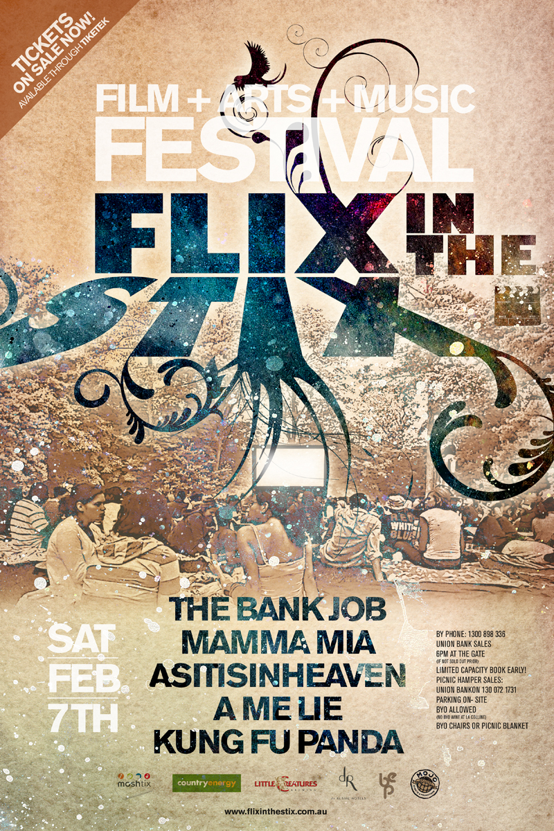
This customer received 21 poster designs from 8 designers. They chose this poster design from artdesignmx as the winning design.
Join for free Find Design Jobs- Guaranteed
-
 A$340
A$340
-
 21 designs
-
 8 designers
Poster Design Brief
Flix in the Stix is a regional tour of NSW, Australia featuring short films, live music and comedy in one-night only, outdoor events. It is a quality cultural entertainment experience for our audiences - our target of which are 35-50y.o. living regionally who enjoy new experiences, good food/wine, reasonably well off, white collar skew.
2015 will mark our 5th tour to date and will stop at 7 regional NSW locations.
I have attached tour posters from each tour to date as background, however we are seeking some fresh creative eyes for next year's tour poster design, elements of which will then be taken across our tour postcards, website, EDM template etc. We are after a contemporary, possibly quirky poster solution for next year all the while keeping in mind our target audience as outlined above. We have no set "brand colour" so the sky is the limit in this respect. If you require a past image from one of our events, then there are a selection of them that can be found at: http://www.flixinthestix.com.au/media
You will see from previous year's posters, the mandatory elements in terms of information. Being our namesake, we want to make the film component the priority next year (as opposed to what we may have done in the past). For the purposes of the exercise and due to entertainers not yet secured - please use last year's entertainment details in your design solution/s. You can also check out a short showreel of footage shot on our 2013 Tour here: https://vimeo.com/78232220
Target Market(s)
Regionally based adults aged 35-55y.o. medium-high level disposable income. Often travel to metro areas for concerts & cultural experiences. Enjoy good food & wine & new experiences. White collar skew.
Industry/Entity Type
Entertainment
Colors
Designer to choose colors to be used in the design.
Look and feel
Each slider illustrates characteristics of the customer's brand and the style your logo design should communicate.
Elegant
Bold
Playful
Serious
Traditional
Modern
Personable
Professional
Feminine
Masculine
Colorful
Conservative
Economical
Upmarket
Requirements
Must have
- This year I want to play down the individual entertainment elements and rely moreso on the brand "FLIX IN THE STIX" to sell the event. The film component (due to our namesake) should be the hero entertainment element if any (as opposed to previous years). Obviously we'll need to have a treatment for the event venue & date that we can change by location + a way to treat sponsor logos effectively ie. that makes them integrate into the overall design. We'll also need the website + a call to action ie. TICKETS ON-SALE NOW or similar....
Although Flix in the Stix is a regional event - the poster art does not really need to look overly regional (if at all). Patrons need to feel like they are buying tickets to a metro quality production, not what is sometimes perceived as a second class regional production....
Nice to have
- We've used images from past events for the last 2 years - prior to this we used a somewhat basic illustration to try & educate people what our event was about ie. relaxed, outdoors, great entertainment, sociable. While I think that's worked, I'm keen to see some different takes on it this year. If there's a way to communicate film, music & comedy then great however not at the expense of making the poster clunky or being too overt.
A few thought provokers are:
1. Gorgeous Festival (http://gorgeousfestival.com.au) poster design from last year is a good example of a base poster design which can be tweaked for various uses in relation to the event. I like their use of colours & the image treatment which conveys a sense of what their event is about. See 3 attachments....
2. Josh Pyke poster - see attached. Clean, simple, quirky (obviously I have more information than he needed to include).
3. On the Bright Side Festival poster - see attached 2 images. I like how the festival name is the hero but the core details are still nice & obvious & work in with the overall look & feel.
Should not have
- Anything overtly country or stereotypically country.