Logo for new Media Player Software Product
Want to win a job like this?
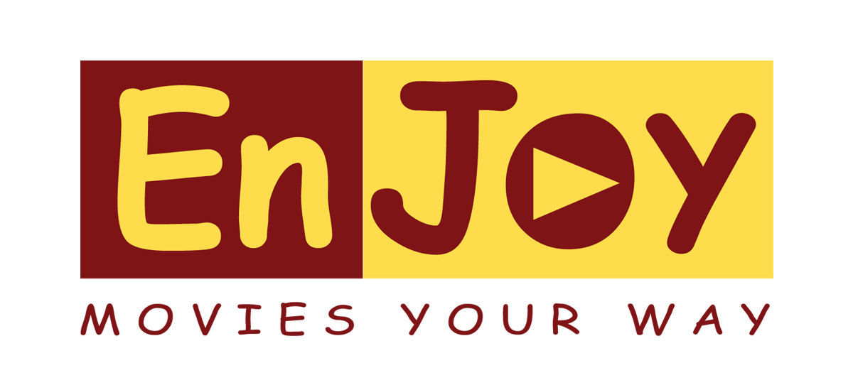
This customer received 62 logo designs from 25 designers. They chose this logo design from Halfull Media as the winning design.
Join for free Find Design Jobs- Guaranteed
-
 US$170
-
 62 designs
-
 25 designers
Logo Design Brief
The name of my new software product will be "EnJoy Movies Your Way." It is a media player for people to watch movies on their computer. It is a long name, but we will refer to it as "EnJoy" for short. I want the logo to emphasize the "Joy" part of the name. I envision the "EnJoy" text being large, with the phrase "Movies Your Way" underneath the "EnJoy" part. I want "En" and "Joy" to be in different colors and/or fonts. For the "Joy" part, I want the background to be in yellow, as if it is surrounded by light (happy, joyful). The foreground font of the word "Joy" should be a good contrasting color so that it shows up against the yellow background. I don't have any preference for color for the "En" part or the "Movies Your Way" part.
I don't have any preference for a graphic / picture. A picture is not necessary, but if one is used, it could be something like sunshine rays (something to emphasize light and happiness and joy) or something like film or a circle DVD, indicating a movie. Or, it could be a picture emphasizing "choice" (the "your way" part), like a road splitting off in two directions indicating that the person must make a choice. These are just ideas. I want to see what you can come up with.
Thank you for your interest in my project!
Updates
What a talented group of designers! I am so impressed. Thank you so much for submitting your ideas for my project. It really helps me to be able to see the logos, and then I know what I like and don't like. Here are a few generic suggestions:
The product name is spelled with capital E and a capital J, so any spellings with a lower case E and J were distracting to me. I know that's easily changed, but it's hard for me to visualize.
I changed my mind on the graphics / pictures. Every logo with a picture was distracting to me. I realized that I like simple. Some of you incorporated a very subtle picture and those were great, but the logos with separate pictures next to, above, or around the words were very distracting.
Regarding fonts, I like block letters more than cursive (feminine) fonts. Maybe the "movies your way" phrase could be in a feminine font, but I like the EnJoy to be in block-ish letters, with or without serifs. By "block-ish", I mean not very curvy (of course the J has a curve, but it doesn't have to be a loopy curve).
Regarding colors, I like yellow as the background color for Joy, not as the foreground (font) color for Joy. Then I talked about contrasting colors and I got a lot of purples and pinks, which I didn't like (too feminine). So I should clarify the color situation by saying that I would like to see the Joy in dark blue or dark green fonts, against a yellow background. The "En" part can be black or some other color, or it could also be green or blue. Some of you have put the whole word EnJoy over a yellow background, and some of you have put just the Joy part over a yellow background. Both are acceptable. It depends on the specific design as to which way looks better. Here are some values for the colors I am referring to:
Dark Blue and Navy look exactly the same to me, but I think Navy is a little darker. I don't care which one is used.
Dark Blue: Hex Value = 00008B, RGB value = 0 red, 0 green, 139 blue.
Navy: Hex Value = 000080, RGB value = 0 red, 0 green, 128 blue.
Dark Green: Hex Value = 006400, RGB value = 0 red, 100 green, 0 blue.
Yellow: Hex Value = FFFF00, RGB value = 255 red, 255 green, 0 blue.
Overall, I want the viewer's eye to be drawn first to the word "Joy", so if the "En" was in black and the "Joy" was in yellow, my eye was drawn to the "En" part, which is not what I wanted. Some of you had a yellow background with white letters for Joy, but that doesn't draw the eye either. If the "Joy" is too curvy, for some reason, it didn't attract my eye, but my eye focused first on the "En" part (especially if it was black and block-ish while the "Joy" part was slim and cursive).
I hope these suggestions are helpful. I plan to keep this project open until its deadline (January 7) and then email some friends for feedback, so that gives you some time to make changes if you are still interested in this project. Thank you for your time!
- Traci
Added Friday, December 24, 2010
(second post)
I looked at the designs again and I have three more comments.
1. I also didn't like dark borders around the whole logo. Only one logo did this, but I thought I should be specific for everyone. It was a purple line around the whole logo, against the yellow background, and I found that my eye was drawn towards the edges (the border) rather than to the word inside the border, so I think it's best not to put a black or colored border around the edges.
2. I didn't like the individual letters to be outlined in yellow. Instead, I was thinking of a solid yellow background, but not outlining the letters. I found the outlining distracting.
3. I liked the "movies your way" phrase to be underneath the word "EnJoy", not above it, and no period is necessary after the word "way".
Again, I hope this feedback is helpful. I am very impressed with each of your work and I appreciate your time!
- Traci
Added Friday, December 24, 2010
=====================================================
Hello Everyone,
Thank you for submitting logo designs for my project. I am impressed with the range of talent available on DesignCrowd. I have narrowed my selection down to two final logos and will not be accepting any new designs.
Thank you and best wishes!
=====================================================
Added Friday, December 31, 2010
Target Market(s)
The target market for my product will be conservative, religious parents of young children. The product name refers to watching (choosing to watch) good, clean family-friendly movies.
Industry/Entity Type
Software
Logo Text
EnJoy Movies Your Way
Logo styles of interest
Emblem Logo
Logo enclosed in a shape
Look and feel
Each slider illustrates characteristics of the customer's brand and the style your logo design should communicate.
Elegant
Bold
Playful
Serious
Traditional
Modern
Personable
Professional
Feminine
Masculine
Colorful
Conservative
Economical
Upmarket
Requirements
Should not have
- I don't want too many colors (4 max - includes background and foreground colors). I don't want cursive, fancy, feminine fonts.