iPhone App ICON, Start up Screen, Samples App Icons and Colour schemes
Want to win a job like this?
This customer received 9 app designs from 2 designers. They chose this app design from SmartAppsART as the winning design.
Join for free Find Design Jobs- Guaranteed
-
 A$160
A$160
-
 9 designs
-
 2 designers
App Design Brief
Hi
We have developed a new, very innovative, Mobile app that's programming is very solid and the App should be launched in Sept 2014.
The app already exits and I need you to create iconography to replace the current iconography in the same size but different styles or colours. I have attached 1 screenshot and because the app is already developed, it means I will be replacing its current elements (colour and icons) with your chosen designs - so sizes need to be exact.
We are looking for one or more designers to come up with the elements required to shape the new App's identity. The winning designers may be invited to work on the app interface, website and iconography of up to 100 elements.
What I need now;
- Application icon (modifying the existing one or creating a new one)
- Start up screen (modifying the existing one or creating a new one)
- The brands colour scheme (which will become a part of our corporate style guide) You can demonstrate your colour and effect choices any way you like - I have added a screen shot of the camera with some annotation on the screen and the colours will most likely be used in the apps interface that you see.
- 8 example icons that I will see in one page but if you win this then I will order the full suite from you (modifying the existing ones I have attached)
The App is called 'Photell' and its a new social camera application. It uses audio and speech to text, filters, contains sharing and posting capabilities new to the market.
It is a part utility project, part social project. The app will attract people between 14-34 and although it is defined as a camera, it is fun to use and connects people with the same camera socially... like Snapchat and is technically strong enough to be a better camera than the standard iPhone camera.
The new application is going to be unique to any app on the market and its patent pending technology will be added to the app in its next version, which is anticipated to be a huge success.
Be basic but brave with your designs and imagine it in the hands of many people in future.
Thank you and all the best
Updates
Hello Designers
I have decided to remove the requirement to create the brands logo in this project so now less elements are required.
I will post a Logo only contest after I have awarded the winning design in this project. This project is now only;
1. Icon design
2. Start up screen
3. Sample iconography (8 elements) and colour scheming of the the current app interface (1 page only)
The job is now smaller but it will allow me to find the designer that best fits this brief. And then I can ask a skilled logo designer to develop a logo based on the winning App concept.
Please review the brief and all attachments - it has changed for better output.
Regards
Sera
Added Monday, August 04, 2014
Target Market(s)
14-34 year old socially connected people that upload and share a lot of photography taken from their iPhone.
Industry/Entity Type
Utility
Look and feel
Each slider illustrates characteristics of the customer's brand and the style your logo design should communicate.
Elegant
Bold
Playful
Serious
Traditional
Modern
Personable
Professional
Feminine
Masculine
Colorful
Conservative
Economical
Upmarket
Requirements
Must have
- The icon and start up screen must be developed in the same size that ITunes Connect requires them - these icons and the startup screen current versions have been attached to the brief but I am not happy with them so please retro-fit your designs to replace these icons;
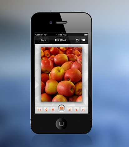
Please show me how you would design the icons so I can contact you to design the entire iconography suite - to demonstrate your skills please design all icons you see on the screenshot of my app I have attached - those icons are;
1. the 'save' button which is currently a disk
2. the send button which is currently the standard square with the arrow in it
3. the undo and redo buttons - which looks like curved arrows on the side of the screen
4. the Foursquare 'place' button
5. the calendar icon
6. the font icon that currently shows 'Aa'
7. the colour text button that is light blue in my app screenshot
8. The microphone button that you see in the bottom centre of the screen
Please ignore the screen shot of the app's interface with the App Icon shown in the centre - this will not be there for the finished product.
To stay in touch with this project connect at au.linkedin.com/in/seraawad/
Nice to have
- It is okay if the brand looks part utility part social. otherwise one or the other is okay too.
Should not have
- Do not copy the exact colours of other successfully app icons. I am trying to establish a new identity, not copy others.
Do not used italics or feminine text type, go for solid, bold typefaces please.