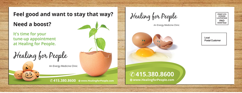
Reminder card

Want to win a job like this?
This customer received 48 graphic designs from 11 designers. They chose this graphic design from Sbss as the winning design.
Join for free Find Design Jobs- Guaranteed
Graphic Design Brief
We are an alternative health clinic. This project is for a postcard. The postcard is sent to our clients to remind them they have not been in the clinic for a long time and it's time for them to make an appointment. Our website is HealingforPeople.com
Updates
Project Deadline Extended
Reason: Extending deadline, thanks.
Added Wednesday, July 30, 2014
Target Market(s)
Our clients are usually adults between the ages of 35 - 55, 70% women, 30% men. These are educated, wealthy, people who are committed to their health. Our clients expect us to be professional and an authority in our field, but friendly, playful and open.
Industry/Entity Type
Health
Font styles to use
Other font styles liked:
- our name is blackjack and the rest of the website is open sans
Look and feel
Each slider illustrates characteristics of the customer's brand and the style your logo design should communicate.
Elegant
Bold
Playful
Serious
Traditional
Modern
Personable
Professional
Feminine
Masculine
Colorful
Conservative
Economical
Upmarket
Requirements
Must have
- The front of the postcard must have our logo and name (see attached).
The front of the post card must have this text:
Feel good and want to stay that way? Need a boost? It's time for your tune-up appointment at Healing for People.
The right side on the back of the card must be blank for an address and stamp.
The left side on the back of the card must have our phone number (415.380.8600) and website (HealingforPeople.com).
Nice to have
- We have an egg theme in our office. Our website is HealingforPeople.com and if you look at it, you'll see the pictures of them.
The postcard should be in the same style as the website in color and tone.
Should not have
- We want things to be playful, but not look like something for children.