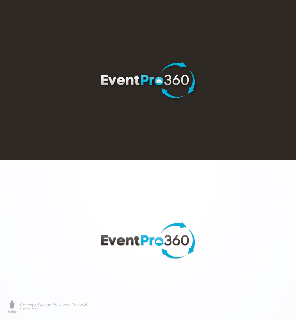
Logo for EventPro360 web based event management software

Want to win a job like this?
This customer received 221 logo designs from 35 designers. They chose this logo design from PenTool as the winning design.
Join for free Find Design Jobs- Guaranteed
Logo Design Brief
PLEASE SEE THE PDF FILE THAT WE UPLOADED - IT IS A SCAN SHOWING A ROUGH SKETCH OF WHAT WE ARE AFTER.
EventPro360 is in need of a logo. We provide web based event management software for professionals in the golf, banquet and catering industries.
Here are a few parameters for our logo design:
1. The logo should be focused on the text EventPro360. We would like to see the word Pro in bolder text than the other text.
2. We would like to see a circle made up of 3 arrows going around the 360 part of the text - but not all the way around it. We want to make sure the text has continuity so we don't want the arrows to come between the Pro and the 360. So the first arrow can start above the "o" of Pro and the last arrow can finish up just below the "o". Our preference is for arrows with a little bit of style to them - for example, arrows that start out thin and then get wider towards the end of the arrow.
3. We would also like to see a subtle cloud shape or part of a cloud shape somewhere in the logo. Specifically, the cloud shape could start just left of the E and wrap around the top of it, and end somewhere above the first few letters of Event. It does not need to be a full cloud - even just a single line in the right shape would do, or something that can show a cloud in negative space if you are looking for it.
4. We would prefer for the logo to be longer (left to right) as opposed to taller. We want to be able to fit the logo into title bars on top of web pages, like the DesignCrowd logo does on their web site.
5. We are passionate about providing cutting edge software that is intuitive, easy to use, and efficient. Our logo should be clean, modern, and not overly complex.
6. We are open to other color variations, but our preference is to have two color scheme versions of the logo: a white/blue version to go on dark backgrounds, and a dark gray/blue version to go on light backgrounds.
Updates
Project Deadline Extended
Reason: We did plan our original deadline date very well. One of our key company decision-makers is away on vacation this week, so we have decided to extend the deadline to next week. This way, we should be able to have a final design selected shortly after the deadline. Thank you for your patience,
EventPro360
Added Tuesday, July 08, 2014
Target Market(s)
Our customers are General Managers and other management-level staff at Golf Courses, Country Clubs, Resorts, Banquet Halls, and Catering Companies.
Industry/Entity Type
Software
Logo Text
EventPro360
Font styles to use
Colors
Colors selected by the customer to be used in the logo design:
Look and feel
Each slider illustrates characteristics of the customer's brand and the style your logo design should communicate.
Elegant
Bold
Playful
Serious
Traditional
Modern
Personable
Professional
Feminine
Masculine
Colorful
Conservative
Economical
Upmarket
Requirements
Must have
- Must have the text EventPro360 along with some other graphic element to give the logo some character.
Nice to have
- We would like to see some logos with one or both of the following graphic elements:
1. A series of 3-5 arrows that form a circle shape, which is representative of an event life cycle or sales cycle. This circle could be around the 360 portion of the text, or anywhere else you think looks good.
2. A subtle cloud shape, outline, or partial cloud shape. This could be located next to the text, or in amongst the text somehow. One idea would be to have the top line of a cloud shape above the text.