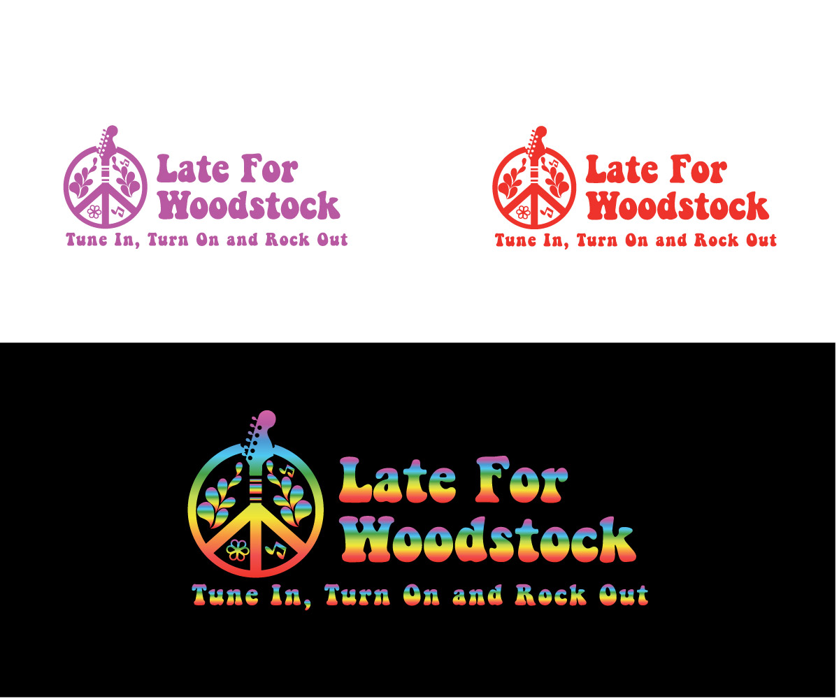
Late For Woodstock - Band Logo
Want to win a job like this?
This customer received 58 logo designs from 21 designers. They chose this logo design from niko as the winning design.
Join for free Find Design Jobs- Guaranteed
-
 A$200
A$200
-
 58 designs
-
 21 designers
Logo Design Brief
Late For Woodstock is a popular Australian Tribute Band playing classic rock music from the 60’s & 70’s. As the name implies, a lot of the rock legends they cover hail from the Woodstock era. The band is currently surging in popularity and is on an upward trajectory, playing to packed venues and energetic audiences. They’ve just finished recording a few songs to be released on an EP within the next month and with their territory on the live music circuit expanding at break-neck speed, they’re also developing a range of merchandise to broaden their revenue streams.
They’ve reached a point where ‘Branding’ has become a priority so they need a distinctive iconic logo to help them stand out from the crowd. The following outlines the key criteria for the brief -
1 We’re after a simple, yet distinctive and eye-catching logo which reflects the hallmarks of the era (peace, love, freedom, music, etc). Maybe think Nike swoosh, Rolling Stones red tongue – you get the drift?
2 The logo needs to identify with the Woodstock era (maybe through the use of some of the classic Woodstock icons) without breaching copyright (maybe a fun, creative twist on the attached pics).
3 The logo needs to be scalable (vector file) and able to be used for a variety of print and digital uses. Depending on the media and purpose, we’ll need to have the flexibility to be able to use the logo in either landscape or portrait format so a ‘square-ish’ shape overall would probably work better than ‘rectangular’.
4 Aside from marketing collateral (business cards, posters, fliers, etc), the logo will also be used online and on merchandise (CD cover, T-Shirts, stubbie coolers, etc) so if the logo design is full-colour, it will need to be able to translate to a single colour for some of these purposes without losing it’s impact and identity.
5 The font we’re currently using for the band’s name is Keep on Truckin – it’s freely available on the internet and we don’t have a fixed view on whether it needs to be incorporated with the logo or not but here’s a few things to bear in mind –
The text and logo may need to be able to be separated to accommodate space requirements depending on where it’s used and/or what it’s used on.
The tagline is ‘Tune In, Turn On and Rock Out’ and this may or may not always be used in conjunction with the logo and band name.
To help you get more of a feel for the band, what they’re about and the image they want to convey, here’s a link to their website – www.lateforwoodstock.com The website is a work in progress and is evolving on an ongoing basis. It includes the band’s bio, some photos, video clips, their song list and a range of iconic images from the Woodstock era so hopefully this will give you some further insight to help get your creative juices flowing.
Although we’ve outlined some thoughts and concepts, they’re not hard and fast and shouldn’t limit your design creativity and artistic flair – have some fun with it If you need any further clarification, don’t hesitate to ask.
Updates
Project Deadline Extended
Reason: A particular deadline we were working towards has been delayed by the party working on it so our need isn't quite as urgent as it was when we first posted the brief.
Added Monday, July 07, 2014
Logo Text
Refer to design spec