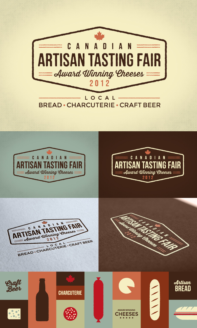
Canadian Artisan Tasting Fair Logo
Want to win a job like this?
This customer received 213 logo designs from 101 designers. They chose this logo design from BF as the winning design.
Join for free Find Design Jobs- Guaranteed
-
 US$240
-
 213 designs
-
 101 designers
Logo Design Brief
Canadian Artisan Tasting Fair 2012
Award winning Canadian cheeses.
Local bread, charcuterie and craft beer.
Our concept is a consumer oriented event to present Canada’s recent award winning cheeses to consumers. Bread bakers and charcuterie producers will be showcased as compliments to the cheese. Craft brewers and their beers will be paired with all of the foods. The focus will not be on alcohol, but the food. Tasting of all food will be an integral part of the show, and included in the price of admission.
The creation and planning of the event will be driven by Leslieville Cheese Market’s dedication to Canadian cheese and local fare.
Admission is $35, an average price for this kind of event. Included with admission is $20 of tickets to spend on snack sized food items and cheese to take home. Children under a certain age attend for free. Older children would be $10.
Attendees will receive a reusable cooler bag upon entry. It will include a strong paper plate and a biodegradable fork, and possibly a sampling glass.
Wychwood barns at St. Clair and Bathurst in Toronto is a beautiful indoor open space venue. The event will happen on Sunday December 2nd, from 11am to 4pm. We hope to have a shuttle bus to Christie Subway Station.
Our target market is any group of people who seek out good food and know a bit more than the average person. Based on the way this event will be promoted, they will expect to learn a little more while they try all of the samples available. Many of these people will have children. There will be a ballot distributed to children for a Kids’ Choice Award. This award will be advertised to ensure that adults know that this is a family oriented event.
Producers of artisanal cheese, bread and charcuterie are invited to come participate in the marketplace, which will provide a unique opportunity for them to connect with like minded consumers. Every attendee will have $20 in coupons to spend. With 1,000 attendees, $20,000 will be spent. This is a good assurance to vendors that they can not only publicise their product, but also have a profitable day.
Updates
Project Deadline Extended
Reason: I am extending this deadline by 4 days because I think that any logo will require revisions, and submissions won't be possible after the deadline. So please, still submit for the 5th.
Thanks, Michael
Added Monday, September 03, 2012
Project Deadline Extended
Reason: I am extending this deadline by 4 days because I think that any logo will require revisions, and submissions won't be possible after the deadline. So please, still submit for the 5th.
Thanks, Michael
Added Monday, September 03, 2012
Industry/Entity Type
Biodegradable
Logo Text
Canadian Artisan Tasting Fair 2012
Logo styles of interest
Emblem Logo
Logo enclosed in a shape
Look and feel
Each slider illustrates characteristics of the customer's brand and the style your logo design should communicate.
Elegant
Bold
Playful
Serious
Traditional
Modern
Personable
Professional
Feminine
Masculine
Colorful
Conservative
Economical
Upmarket
Requirements
Must have
- Canadian Artisan Tasting Fair 2012
Award winning Canadian cheeses.
Local bread, charcuterie and craft beer.
I would like to have not only the title, but the tag lines integrated in the logo. The title doesn't convey the scope of the event. The tag lines are essential to convey the sense of what the event will have to offer the public.
The title should work alone, but most of the time the tag lines will be with the title.
Nice to have
- If you look at the file that I have uploaded, you will see what I consider a trend in logos recently. They are illustrative with softened colours. They integrate the words with a background that paints a bigger picture.
The logos are all from similar product offerings of food and festivals.
Although my examples had a few round logos, I don't necesarily think that my logo should be round.
What I think we are discovering here with the first few submissions is that the words will not fit and be readable if they are following a circular path. I think the title works in a circular path because the font is so big.