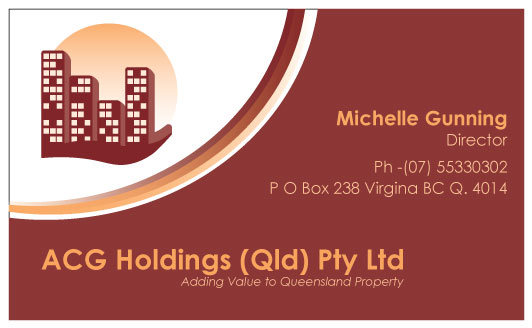
Property Developer Business Card design

Want to win a job like this?
This customer received 67 business card designs from 6 designers. They chose this business card design from isuruw as the winning design.
Join for free Find Design Jobs- Guaranteed
Business Card Design Brief
We need a business card design including a logo that will be used to create a brand for us. We are property developers and just starting out so we are small and not looking to be huge. We want to add value to existing property owners by way of developing their property. Typically this property would be the family home. We would like to see colors of Maroon and Cream with Maroon being the major color in the scheme. We note that the Pantone Color System colors are:
1815 Maroon CVC and 715 Cream CVC or in the computer color spectrum, the colors are as listed below.
Color Spectrum
Maroon Cream
0 127 24 255
236 1 240 191
60 2 163 91
Finally our tagline is the following (without the quote marks of course) "Adding Value to Queensland Property"
Industry/Entity Type
Computer
Contact Information for Business Card
Ann L Cooper, Director
0418 930 355
ACG Holdings (Qld) Pty Ltd
PO Box 238, VIRGINIA BC Q 4014
Font styles to use
Other font styles liked:
- Century Gothic
Requirements
Must have
- The color scheme and our tagline.
The Pantone Color System colors are:
1815 Maroon CVC and 715 Cream CVC or in the computer color spectrum, the colors are as listed below.
Color Spectrum
Maroon Cream
0 127 24 255
236 1 240 191
60 2 163 91
Finally our tagline is the following (without the quote marks of course) "Adding Value to Queensland Property"
Nice to have
- In the attached example of a business card, we quite like the design. There are 4 of us in the partnership so there should be 4 building blocks and not 3. The font is wrong, we rather like Century Gothic for clarity and ease of reading. Please replace the royal blue color with our Maroon color and replace the white and green color with our Cream color. Perhaps some of the white writing might look better left in, so please play with that idea. It is not a strong idea of ours, just a "perhaps". We like the swirl underneath the block of buildings. We like the little blocks of light that appear strewn across the bottom right hand corner and in other places. We like the added curve in deep color at the bottom going towards a lighter version towards the top of the card. We like the layout of the example of the text of one of our Directors but not the font.