LIFT digital marketing agency for local microbusinesses
Want to win a job like this?
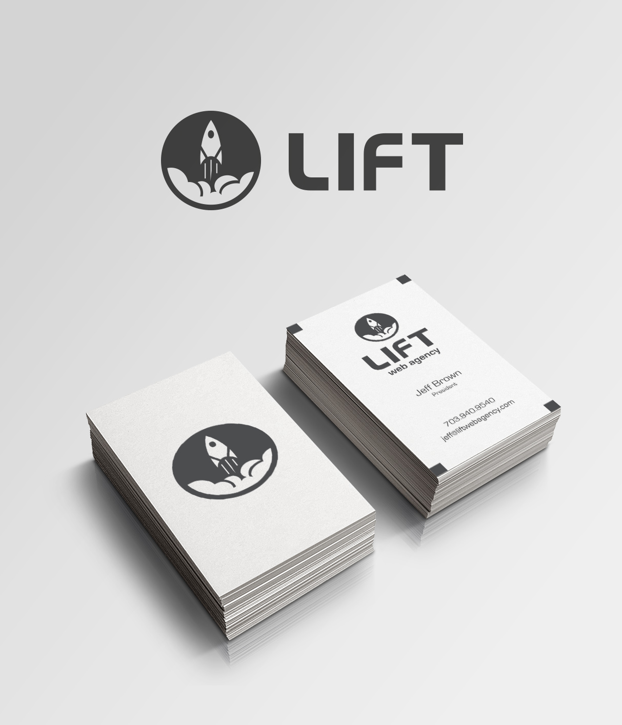
This customer received 241 logo designs from 68 designers. They chose this logo design from Enzzok as the winning design.
Join for free Find Design Jobs- Guaranteed
-
 US$870
-
 241 designs
-
 68 designers
Logo Design Brief
We are a nimble and resourceful team of web and marketing experts with top agency experience, dedicated to helping underdog microbusinesses succeed against large national corporations who aim to marginalize their brands, and take their market share. We fight for the little guys!
We are based in Northern Virginia, just outside of Washington D.C, near the Dulles Corridor and airport (http://www.metwashairports.com/dulles/dulles.htm), and the Udvar-Hazy National Space Center / Museum (http://airandspace.si.edu/visit/udvar-hazy-center), which houses some of world’s most advanced military aircraft.
Our primary services include:
• Furiously fast website refreshes and maintenance, and custom design and development;
• Super insightful digital marketing research, and strategy;
• Supportive and upLIFTing internet marketing coaching;
• Intelligent workflow automation, and “paperless office” conversions.
Our target customers are established local microbusinesses (http://www.investopedia.com/terms/m/microenterprise.asp) with less than 20 employees and revenues from $1-5 million. We are particularly interested in supporting family-owned companies, as we understand them intimately having grown up in successful small business families ourselves. We are targeting local retail stores and restaurants, trades (HVAC, plumbing, tailors, builders, mechanics), doctors, attorneys, consultants, and other service providers.
Small businesses power the American economy, yet they operate at a serious disadvantage in comparison to larger, monolithic corporations who can afford enterprise technology to advance their marketing strategies. We focus on bringing enterprise-grade solutions, insights, and performance to these small businesses, to LIFT them up and help them grow.
BRAND PROMISE
We will LIFT your business to new levels of performance online, and in your community.
BRAND PERSONALITY
Modern, hungry, eager, resourceful
BRAND VOICE
Respectful, honorable, supportive, encouraging: We work for the little guy because we care about him; we come from micro business families and backgrounds ourselves.
Energetic, enthusiastic, zealous: We are driven by small business’ success and potential for explosive growth.
CREATIVE DIRECTION
Positive, powerful, captivating: we like clean edges and imagery that communicating confidence, energy, and respect.
Modern, efficient, digital: we want something elegant to illustrate our efficient use of technology
Adventurous, energetic, upLIFTing: we want to come across as future-oriented and full of potential, eager to help small businesses reach new heights.
COLORS
BLACK
red and/or grey accents as necessary
TYPOGRAPHY
Crisp, sharp, and simple
IMAGERY
Rocket, rocket launching, lift-off, launch cloud from explosion
Space shuttle
Strong and fast air stream moving under and “LIFTING” up an airplane wing
Jet propulsion, turbine
1-UP, level-up, growth, acceleration
We LOVE simple and elegant negative space logos, and have uploaded some for your inspiration. The logo must be flat and work on both light (white) (necessary) and (ideally) dark backgrounds.
Thanks for participating—we can't wait to see what you come up with!
Updates
Whoa whoa whoa! Everybody slow down!
Added Friday, April 25, 2014
I'm beginning to feel that the rocket imagery has distracted you all. Most of the logos with rockets that have been eliminated were afterthoughts—I'm looking for something cohesive, not disjointed. All of the elements have to work together, not detract from each other. Unless you have a something original to submit.
Added Friday, April 25, 2014
Please stop submitting multiple iterations (colors, inversions, font type) of the same concept. You're wasting your time and my submission quota. If you do that, you will likely be IGNORED and I will have a more experience, thoughtful designer work with your concept.
Added Friday, April 25, 2014
Please stop submitting logos with stacked letters. It's rudimentary and has been tried and eliminated multiple times.
Added Friday, April 25, 2014
We're warming up—there are some REALLY cool designs on the table. Keep it up everyone, we're definitely getting somewhere now. Does anyone have any other non-rocket concepts to submit?
Added Friday, April 25, 2014
Wow—this is a very talented community; we'll definitely be running contests here again! We've had some remarkable concepts so far, but mostly just designs with rockets (which we emphasized in our brief). We have a few rocket finalists which we like very much; we're also waiting for one or two more revisions—you know who you are. However, we are curious if anyone has some clever and subtle wordmark concepts that don't include rockets or clouds or very obvious arrows. Great work everyone, and thanks for participating!
Added Saturday, April 26, 2014
Here's an example of a simple wordmark concept we like:
Added Saturday, April 26, 2014
Industry/Entity Type
Digital
Logo Text
Lift