Poster/Signage - Awards/Honour Board
Want to win a job like this?
This customer received 28 graphic designs from 7 designers. They chose this graphic design from Creative Type as the winning design.
Join for free Find Design Jobs- Guaranteed
-
 A$340
A$340
-
 28 designs
-
 7 designers
Graphic Design Brief
We are a professional organisation delivering general practice education and training in Australia.
We need to update our awards honour board.
It consists of two panels, which are encased in clear acrylic on a wall.
The design needs to incorporate both panels.
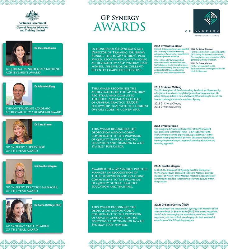
Attached is an example of a layout and the required content. It is just an example and doesn’t have to be laid out this way. It does however need to incorporate all content copy and elements provided in this example and be legible to read from at least 90cms distance.
Our corporate colours need to be used in the design and we would like to have some kind of background graphic that stretches across the two panels (and allows for the gap in between). Use of the dots in our logo is one possible option.
The design must be fresh, contemporary, clean, uncluttered and sophisticated.
PLEASE NOTE: The attached example is an example only, both in terms of design and layout. No design skills of any kind have been applied in this example! So go ahead and be creative!
Colours:
Green 1: R:0, G: 144, B: 68
Green 2: R:240, G: 160, B: 671
Size: (also see diagram attached)
Left panel: 800mm high x 210mm wide
Right panel: 800mm high x 450mm wide
Gap between panels: 800mm high x 73mm wide
Attached:
• Example layout with content (PDF & Word)
• Panel sizes diagram (PDF)
• GP Synergy logo
• Government logo (sub-logo)
• Images
Thanks and good luck!
Updates
Project Deadline Extended
Reason: Hi
Thanks to all designers who have made submissions within the requested deadline.
We have decided to extend the deadline by 5 days as in reflection closing on the weekend wasn't ideal in terms of being able to review designs and provide feedback.
Regarding designs so far, we are hoping for a contemporary, fresh, clean look that maximises 'white space'. We realise there is a lot of information to be included in a small space, and at the same time achieve readability, so getting a lot of 'white space' may be difficult. Basically we are hoping the design will look very clean and uncluttered, but sophisticated.
In terms of colour palette, please use the logos colours where you can, but feel free to incorporate lots of whites, greys or other neutrals.
Using dots from the logo in some form would also be good.
Thank you again, and I will be in touch next week with further feedback once I confer with my colleagues.
Kate
Added Saturday, April 05, 2014
Industry/Entity Type
Graphic Design