

 Refresh
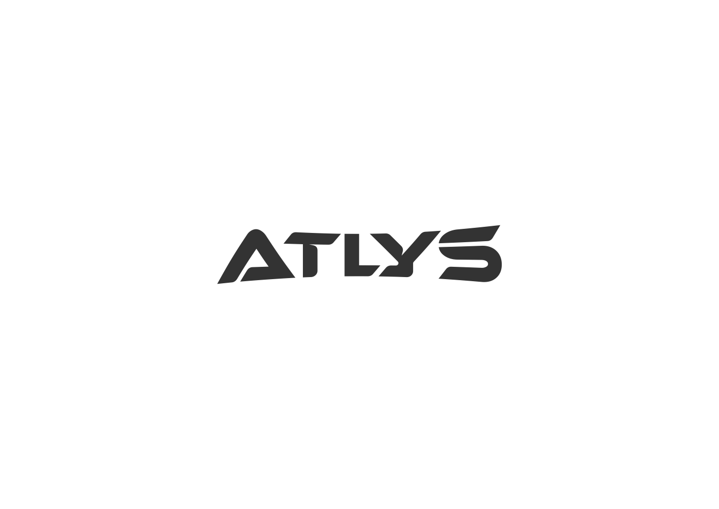
ATLYS WATER BOTTLE UPDATED LOGO
Want to win a job like this?
This customer received 598 logo designs from 256 designers. They chose this logo design from comic_art as the winning design.
Join for free Find Design Jobs
- Guaranteed
-
 US$150
-
 598 designs
-
 256 designers
Logo Design Brief
We want ATLYS to be drawn as a custom wordmark, not simply typed in an existing font. The overall direction should be bold, geometric, modern, athletic, and highly refined.
We like the design philosophy seen in Allan Peters’ identity work: starting with simple geometry, finding relationships between shapes, and creating clever visual connections that make a logo feel inevitable rather than overly designed.
Apply that thinking to the typography itself. Look for opportunities for the five letters to interact—shared angles, matching cuts, repeated proportions, negative space, connected strokes, or subtle modifications that create harmony across the entire word. We’d like to avoid much related to the Greek god ATLYS, or water itself.
We especially like the idea of one clever visual idea being carried throughout the wordmark, rather than having one unusual letter surrounded by four generic ones. The A, T, L, Y, and S should feel like they were designed together as one object.
The wordmark should be bold and relatively tight, with substantial stroke weight and consistent visual spacing. It should feel powerful and athletic without becoming an aggressive “esports” logo. Avoid overly futuristic, sci-fi, or generic sports typography.
We want the finished result to look simple at first glance, but reveal thoughtful construction when examined closely. It should be distinctive enough that even individual letterforms could eventually become recognizable as ATLYS.
We also want a standalone brand mark that feels naturally connected to the ATLYS wordmark. Explore simple geometry, negative space, interlocking letterforms, or an AT/A monogram with subtle meaning tied to movement, spray, hydration, or performance. Avoid generic water droplets or sports icons. The mark should be bold, simple, recognizable, and use the same visual language as the wordmark.
Target Market(s)
Athletes
Industry/Entity Type
Water bottle, athletic accessories.
Logo Text
ATLYS
Logo styles of interest
Pictorial/Combination Logo
A real-world object (optional text)



Abstract Logo
Conceptual / symbolic (optional text)



Wordmark Logo
Word or name based logo (text only)


Font styles to use
Other font styles liked:
- Custom
Colors
Designer to choose only greyscale colors for use in the design.
Look and feel
Each slider illustrates characteristics of the customer's brand and the style your logo design should communicate.
Elegant
Bold
Playful
Serious
Traditional
Modern
Personable
Professional
Feminine
Masculine
Colorful
Conservative
Economical
Upmarket
Requirements
Must have
- Custom typography , subtle hidden meaning or an “aha” moment within the lettering, clever use of negative space or shared geometry, and a signature design element that becomes uniquely recognizable as ATLYS.capital letters, harmony between letters, simplicity, stand alone brand mark.
Nice to have
- Ideally, the brand mark should feel derived from the wordmark, with subtle references to movement, spray, hydration, or performance without being overly literal.
Should not have
- generic or stock-looking fonts, overly futuristic or esports-style typography, unnecessary complexity, thin or delicate lettering, inconsistent geometry between letters, or obvious/cliché symbols like water droplets, bottles, mountains, or generic athletic icons. Avoid anything that sacrifices readability just to look unique.
