Honey Label Design (145 × 55 mm) – Premium / Minimal Style
Want to win a job like this?
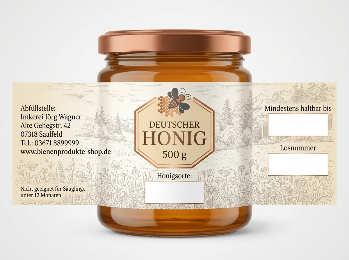
This customer received 61 graphic designs from 14 designers. They chose this graphic design from milan12 2 as the winning design.
Join for free Find Design Jobs- Guaranteed
-
 €170
€170
-
 61 designs
-
 14 designers
Graphic Design Brief
Project Description
I am looking for a professional label design for a 500 g honey jar (twist-off, copper-colored lid).
The design should look premium, elegant, and minimal, reflecting natural quality and regional authenticity.
I expect two design proposals from each designer:
One concept based strictly on my color and style guidelines
One completely free creative concept (designer's own interpretation)
⚠️ Important: The layout and positioning of all elements must follow my specifications exactly (see below). Creativity is welcome in style, colors, and typography—but not in layout structure and content.
Label Size and Constraints
Final size: 145 mm × 55 mm (landscape)
All elements must remain fully within the label area
No part (especially the hexagon) may extend beyond the label boundaries
Design Style
Minimal, clean, premium
No clutter, no excessive colors
Preferred colors:
Warm natural tones (honey, beige, brown)
Inspired by the branding of: www.bienenprodukte-shop. de
Subtle copper tone accents (to match the lid)
Background
Very subtle illustrated/sketched background
Motif:
Wildflower meadow (foreground)
Mixed forest (background)
Style should be fine line / sketch style, not photorealistic
The background must remain very soft so text remains clearly readable
Central Element (Mandatory)
A hexagon (honeycomb shape) centered on the label
Inside text:
“GERMAN HONEY”
“500 g”
The hexagon must be:
Fully inside the label (no overlapping, my example is wrong)
Visually balanced and centered
Left Text Block (Important)
The following content (in german) must be placed left-aligned (not centered!):
Bottling point:
Jörg Wagner Beekeeping
Alte Gehegstrasse 42
07318 Saalfeld
Tel.: 03671 8899999
mail@bienenprodukte-shop.de
Typography must be clean and clearly structured.
Mandatory White Fields (Very Important)
There must be exactly 3 white boxes:
Size:
Each: 28 mm × 12 mm
No visible border
Positioning (must follow exactly):
Bottom center
Completely blank (for honey type)
Right side – upper field
Text above: “Best before:”
Right side – lower field (directly below)
Text above: “Lot number”
⚠️ All three fields must:
Be identical in size
Be perfectly aligned
Match the layout shown in the reference image
Layout Rules (Strict)
The arrangement of elements is fixed and must not be changed
Center field must be directly below the hexagon
Right-side fields must be vertically aligned
Left text must remain left-aligned
goal
The label should communicate:
High quality / premium honey
Regional trust and authenticity
Clean and professional print-ready design
Reference
A reference image is provided showing:
exact placement of all fields
general layout structure
⚠️ The reference is for layout guidance only — not for copying design style.
Updates
All mandatory information must be in German like the address
Bottling point:
Jörg Wagner Beekeeping
Alte Gehegstr. 42
07318 Saalfeld
Tel.: 03671 8899999
www.bienenprodukte-shop.de
Added Tuesday, June 2, 2026
Target Market(s)
Germany
Font styles to use
Other font styles liked:
- Montserrat, Open Sans, Libre Baskerville
Colors
Colors selected by the customer to be used in the logo design:
Look and feel
Each slider illustrates characteristics of the customer's brand and the style your logo design should communicate.
Elegant
Bold
Playful
Serious
Traditional
Modern
Personable
Professional
Feminine
Masculine
Colorful
Conservative
Economical
Upmarket
Requirements
Must have
- Mandatory Information on Honey Labels (Germany / EU) (Product Name, Country of origin, Net quantity, Minimum durability date (placeholder), Name and address of the food business operator, Batch / lot identification (placeholder), Special warning for infants “Not suitable for infants under 12 months”