Premium Firearms Brand Logo – “Westfield” (WF Monogram Focus)
Want to win a job like this?
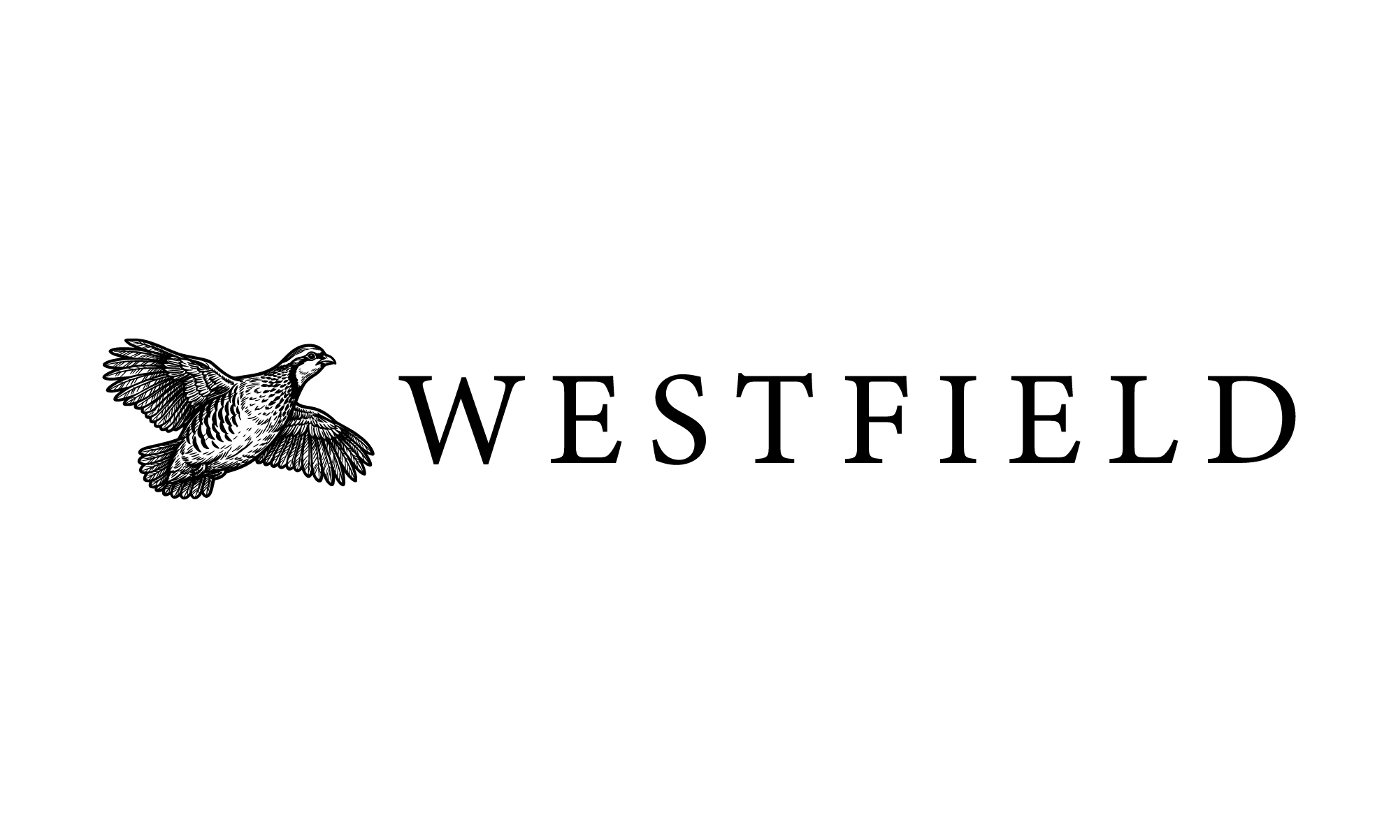
This customer received 319 logo designs from 110 designers. They chose this logo design from Md Hasin Israk as the winning design.
Join for free Find Design Jobs-
 US$150
-
 319 designs
-
 110 designers
Logo Design Brief
Update:
Hi everyone,
First off — thank you all for the incredible submissions so far. We’ve received many strong concepts and truly appreciate the creativity and effort from everyone.
After reviewing the designs, we want to refine and clarify the direction for the final phase of the contest.
⸻
🔥 Primary Focus: Wordmark Logo
We want the logo to be centered around:
👉 “Westfield” fully spelled out
• Strong, elegant serif typography
• Clean, timeless, premium feel
• Not overly modern or trendy
• Should feel like a high-end outdoor / sporting brand
The wordmark is the most important element.
⸻
🐦 Quail in Flight (REQUIRED ELEMENT)
We would like to incorporate:
👉 A single quail in flight
🚨 Important (non-negotiable):
• Quail must be in flight ONLY (wings extended)
• No standing or perched birds
• No grounded birds
⸻
🎯 Composition Direction
We are aiming for a clean, premium layout where:
• A single quail in flight is placed to the left of “Westfield”
• The quail acts as an accent, not the main focus
• The typography remains dominant
• The overall look is balanced, minimal, and refined
Project Description
We are creating a premium shotgun brand called Westfield, focused on high-end field and sporting shotguns.
This brand should sit alongside luxury firearm manufacturers like:
• Beretta
• Perazzi
• Blaser
We want a logo that feels timeless, iconic, and high-end — something that could live on a shotgun for decades.
⸻
Design Style (VERY IMPORTANT)
We are inspired by:
• Browning (strong, iconic symbol)
• Beretta (clean, historic emblem)
We want:
• Simple and bold
• Instantly recognizable
• Works as a standalone icon
• Classic, not trendy
⸻
Logo Direction
Primary Concept:
A “WF” monogram logo
• Creative, stylized use of W + F
• Could be:
• Interlocking
• Symmetrical
• Abstracted into a symbol
The goal is to create something that could become an icon, not just letters.
⸻
Optional Ideas (if done subtly):
• Precision / craftsmanship
• Field / sporting heritage
Avoid obvious gun imagery
⸻
Style Keywords
• Premium
• Minimal
• Strong
• Masculine
• Heritage
• European-inspired craftsmanship
⸻
Where the Logo Will Be Used
VERY IMPORTANT:
This logo will be used on:
• Shotgun engraving (metal)
• Wood stocks
• Barrels
• Apparel
👉 Must work in 1 color
👉 Must be clean and not overly detailed
👉 Must still look great when very small
⸻
Color Preferences
• Black / white (primary)
• Metallic tones (silver, steel, gold)
No reliance on color — design must stand on its own.
⸻
Typography
• Optional
• If used: classic serif or custom
• Clean and premium
⸻
What We DO NOT Want
• Tactical / military style
• AR-15 / aggressive gun branding
• Cartoonish or illustrative logos
• Overly complex crests
• Trendy startup-style logos
⸻
Deliverables
• Icon / symbol (most important)
• Full logo (with Westfield text)
• Black & white versions
• Vector files (AI, EPS, SVG)
⸻
Final Note to Designers
We are looking for a logo that could stand next to Beretta or Browning and feel like it belongs there.
Focus on creating a simple, powerful, iconic WF mark.
Attached a few ideas for Westfield that we like and also the browning and beretta logos for inspiration
Updates
Hi everyone,
First off — thank you all for the incredible submissions so far. We’ve received many strong concepts and truly appreciate the creativity and effort from everyone.
After reviewing the designs, we want to refine and clarify the direction for the final phase of the contest.
⸻
🔥 Primary Focus: Wordmark Logo
We want the logo to be centered around:
👉 “Westfield” fully spelled out
• Strong, elegant serif typography
• Clean, timeless, premium feel
• Not overly modern or trendy
• Should feel like a high-end outdoor / sporting brand
The wordmark is the most important element.
⸻
🐦 Quail in Flight (REQUIRED ELEMENT)
We would like to incorporate:
👉 A single quail in flight
🚨 Important (non-negotiable):
• Quail must be in flight ONLY (wings extended)
• No standing or perched birds
• No grounded birds
⸻
🎯 Composition Direction
We are aiming for a clean, premium layout where:
• A single quail in flight is placed to the left of “Westfield”
• The quail acts as an accent, not the main focus
• The typography remains dominant
• The overall look is balanced, minimal, and refined
We are specifically looking for:
✅ Realistic / natural quail
✅ Inspired by traditional sporting or engraving illustrations
✅ Some feather detail is okay, but keep it clean
✅ Must scale well and work in engraving
🚫 DO NOT submit:
• Silhouettes
• Flat icons
• Abstract or geometric birds
• Cartoon-style illustrations
• Birds that are not clearly in flight
👉 The quail should look like a real bird in motion (mid-flight).
⸻
⚠️ Important Design Notes
• Black & white only (no color)
• Must work in one color
• Keep design clean and not overly detailed
• Must scale well for:
• Engraving on firearms
• Apparel (hats, shirts, etc.)
• Small applications
⸻
🔤 WF Monogram
The WF concept is now:
• Secondary / optional
• Not required in the main logo
• Can be explored separately if desired
⸻
⭐ Feedback System
We will:
• Rate designs with strong typography 3–5 stars
• Use those as the base direction
👉 If your design has already been rated, please revise it by:
• Keeping your typography
• Adding a quail in flight (as described above)
⸻
🎯 Goal
We are aiming for a logo that is:
• Timeless
• Premium
• Clean and iconic
• Suitable for both firearms and apparel
A design that feels at home alongside brands like Beretta and Browning.
⸻
🚨 Final Note
👉 Any designs with quail not in flight (wings extended) will not be considered.
Preference will be given to designs where the quail feels like a refined, realistic illustration — not a simplified logo icon.
⸻
Thank you again — we’re excited to see the next round of concepts.
Added Wednesday, 08 April 2026
Logo Text
Westfield and/or a WF type of logo
Look and feel
Each slider illustrates characteristics of the customer's brand and the style your logo design should communicate.