Hand-Lettered Logo for Wellness & Self-Discovery Brand
Want to win a job like this?
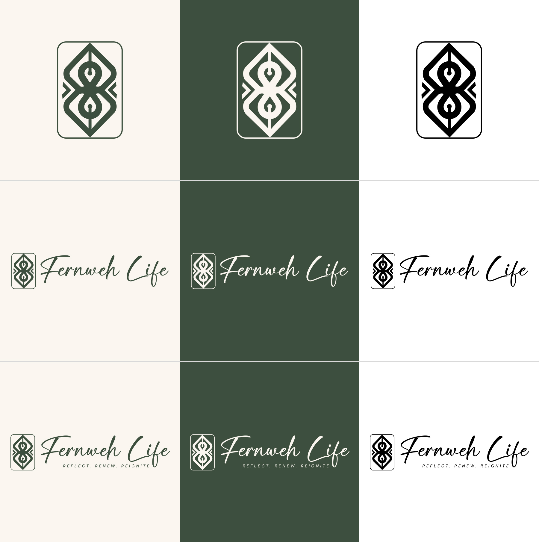
This customer received 180 logo designs from 57 designers. They chose this logo design from IDesign1606 as the winning design.
Join for free Find Design Jobs- Guaranteed
-
 US$400
-
 180 designs
-
 57 designers
Logo Design Brief
Fernweh Life is a lifestyle and self-discovery brand built around the words Reflect, Renew, Reignite. Through journaling, guided exercises, and retreats, we help people explore the world within and around them. The name draws from the German concept of Fernweh, a longing for distant places, but this is not a travel brand. It lives at the intersection of stillness and movement, self-knowledge and open horizons.
We need a logo that feels calm and grounded, yet pulls you forward. Something that sparks curiosity without shouting. Minimalist, timeless, and human, with hand-lettered or organic typography rooted in a sage green and natural tone palette.
We have been through previous rounds and have not found the right fit. Too generic, too disconnected from the brand's true spirit. We are looking for a designer who responds to the concept first, and reaches for the obvious visual metaphor last.
A full creative brief with brand colors has been uploaded as FernwehLife-DesignCrowd-Brief-v4.docx and please read it before submitting a concept.
Updates
Initially received a large number of designs though 95% were AI slop and no one had read the creative brief that this was suppose to be a icon logo with the company name. I spent a lot of time going back over the designs and giving real feedback. Then more designs came but they were more AI slop, I even posted 2 messages on the project board to give overall feedback and an idea that people could use. I would like more time cause I expected the platform to weed bout the AI slop entries.
Need a couple of days before selecting a winner
Target Market(s)
Likely skewing adult women, 25-45, though not exclusively. People who are drawn to intentional living, personal growth, and self-reflection. Not necessarily in crisis, but carrying a weight they're ready to start putting down. They're drawn to things that feel considered, authentic, and real — not trendy wellness aesthetics or prescriptive self-help. They've probably tried the generic stuff and it didn't stick.
Industry/Entity Type
Wellness & Self-Discovery Brand
Logo Text
Fernweh Life
Logo styles of interest
Pictorial/Combination Logo
A real-world object (optional text)
Abstract Logo
Conceptual / symbolic (optional text)
Font styles to use
Other font styles liked:
- Hand-lettered or organic style preferred. Should feel crafted and human, not like a standard script font pulled from a library. A custom or semi-custom letterform treatment is welcome. Please refer to the typography section of the uploaded brief.
Look and feel
Each slider illustrates characteristics of the customer's brand and the style your logo design should communicate.
Elegant
Bold
Playful
Serious
Traditional
Modern
Personable
Professional
Feminine
Masculine
Colorful
Conservative
Economical
Upmarket
Requirements
Must have
- Hand-lettered or organic typography — no clean geometric or corporate fonts Works on both dark (black) and light (white) backgrounds without losing quality or legibility Minimalist and timeless — no trends, no decorative elements that don't earn their place Feels calm and grounded while still pulling you forward — the brief explains this in detail Full file deliverables including vector files, transparent PNGs, and print-ready versions Please read the uploaded brief before submitting — it explains the feeling and concept we are designing toward
Nice to have
- A subtle nod to the Fernweh origin (a longing for distant places) without being literal A mark or icon that feels inseparable from the wordmark rather than added on Negative space used with intention Something that feels like it could only belong to Fernweh Life — not interchangeable with another brand
Should not have
- Overly literal travel imagery — no mountains, suns, planes, globes, maps, suitcases, or decorative compasses Generic wellness or yoga-adjacent aesthetics — lotus flowers, mandalas, abstract human silhouettes in poses Trendy design styles that will feel dated in a few years Clipart-style icons or symbols that feel borrowed rather than designed for this brand Busy or overcrowded compositions — if it needs to be explained, it has too much in it Purely AI-generated designs — we want human creative intention behind every concept submitted Sage Green (#B7CDB7) used on a white or light background for any logo version — contrast is insufficient and the logo will disappear Clay (#C4946A) used as a primary color in the logo — it is an accent only and should never dominate