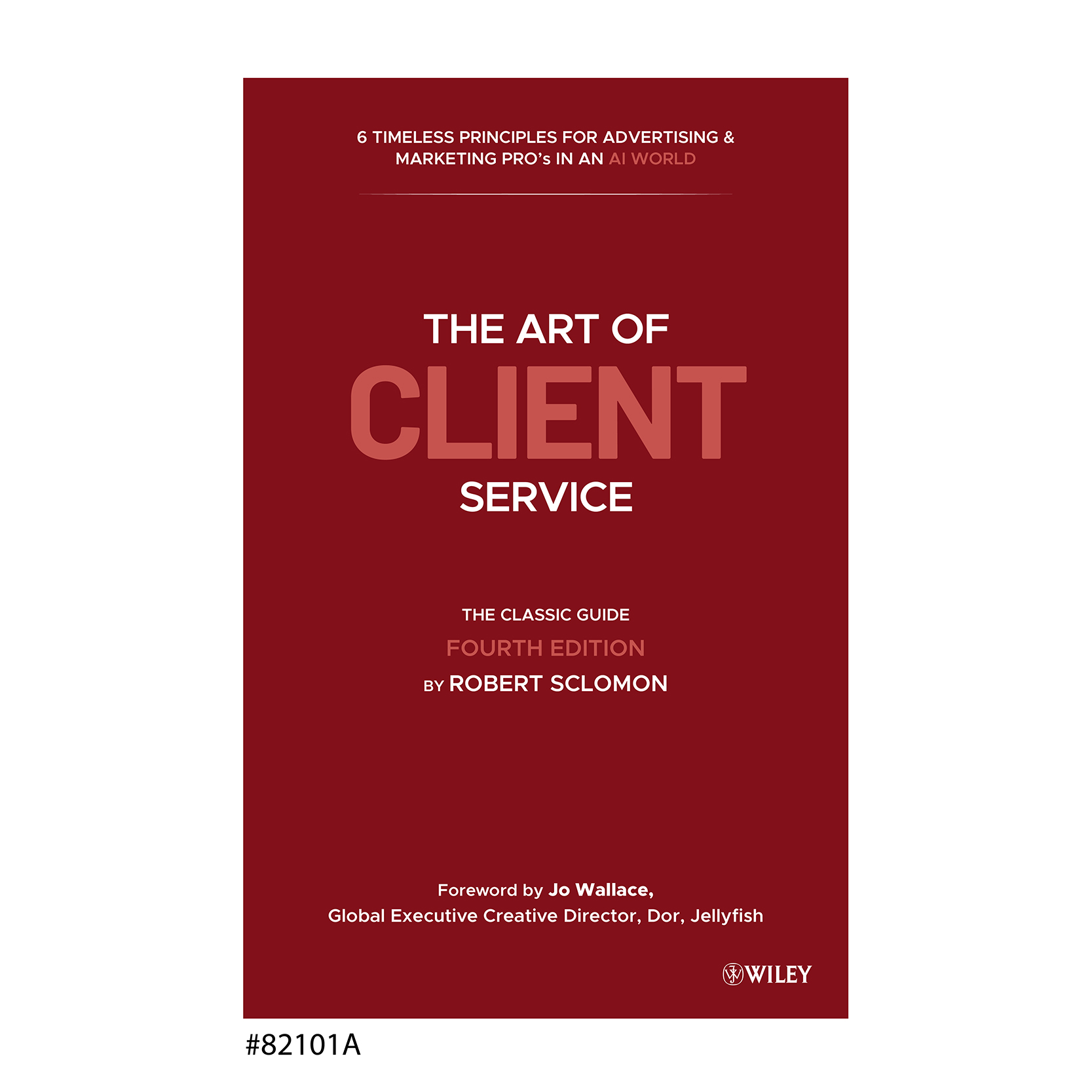
"The Art of Client Service," fourth edition cover design
Want to win a job like this?
This customer received 119 book cover designs from 33 designers. They chose this book cover design from creativeoutline as the winning design.
Join for free Find Design Jobs- Guaranteed
-
 US$150
-
 119 designs
-
 33 designers
Book Cover Design Brief
Later this year, my publisher, John Wiley & Sons, will issue a fourth, substantially revised edition of "The Art of Client Service," following the 2016 publication of the third edition and the second and first versions that were issued earlier.
To distinguish this new edition from previous ones, I need a cover design that visually connects and is consistent with what has preceded it, while signaling this is a new and different, worthy of prospective readers/buyers’ attention.
Attached are three different verbal approaches to the new cover; these are NOT MEANT to serve as actual designs, but rather will give you a sense of how language is to be deployed:
The first emphasizes “ART” as the key visual word in the book title;
The second emphasizes “CLIENT SERVICE” as the key visual words in the book title; and,
The third emphasizes just the word "CLIENT" in the book title.
A top-of-the-page is a pre-head that applies to all three versions:
“6 TIMELESS PRINCIPLES FOR ADVERTISING & MARKETING PRO’s
IN AN AI WORLD"
There's a mid-page sub-head for all three versions:
“THE CLASSIC GUIDE,” followed by
“FOURTH EDITION BY ROBERT SOLOMON
And there's a one-line, bottom-of-the-page designation:
“Foreword by Jo Wallace, Global Executive Creative Director, Jellyfish"
The pallette for the previously published third edition was black with red as an accent color on a field of white; I've attached a sample for reference, so you can see how it was executed. For this new fourth edition, I'd like to change the accent color from red to either Wedgewood blue, or British racing green, or an alternative that is assertive and color saturated -- think of primary colors -- that contrast sufficiently with the base of black. As an alternative, you can consider a cover that used either Wedgewood blue, British racing green, or another possibility as a full-bleed field, with copy content either revered out or surprinted.
Lastly, while the new cover largely is meant to be typographically driven, if you can come up with a visual metaphor that illustrates and builds on the book's title, that would be very helpful. By way of reference, the third edition's book cover attempted to do this by introducing a visual element at the end of the book's title that's meant to represent an artist's paint splatter (although I admit it didn't work as well as it should).
Target Market(s)
Prospective purchasers of the book who might discover copies at a bookstore, but more likely will encounter it through online distributors such as Amazon, Barnes & Noble, and Powell’s.
Industry/Entity Type
Advertising and marketing
Font styles to use
Other font styles liked:
- A mix of serif and san-serif typefaces is okay. for the examples I shared, I relieid on "Arial Rounded Bold" but you need not be weeded to this. If you opt to mix in a serif font, I am partial to Cambria as a typeface.
Look and feel
Each slider illustrates characteristics of the customer's brand and the style your logo design should communicate.
Elegant
Bold
Playful
Serious
Traditional
Modern
Personable
Professional
Feminine
Masculine
Colorful
Conservative
Economical
Upmarket
Requirements
Must have
- To achieve the goal of being “connected with but distinct” from previous editions, the new cover should be: Largely typographic, but displaying a color palette different from the previous editions’ black-plus-red-accent on a canvas of white. Any new accent color selected for use should be vibrant, strong, and highly saturated; think “British racing green,” “Wedgewood blue,” or their equivalents. In addition to a powerful, “billboard” approach to type and color, consider other visual metaphors that are likely to engage the readers. The winning cover design will stand out from other books, while connecting with the previously published third edition.
Nice to have
- If you can find way to illustrate the book's title through a visual metaphor, that would be ideal.a
Should not have
- Anything that is frivolous or non-sensical