Specialist Medical Services Group - Logo Redesign
Want to win a job like this?
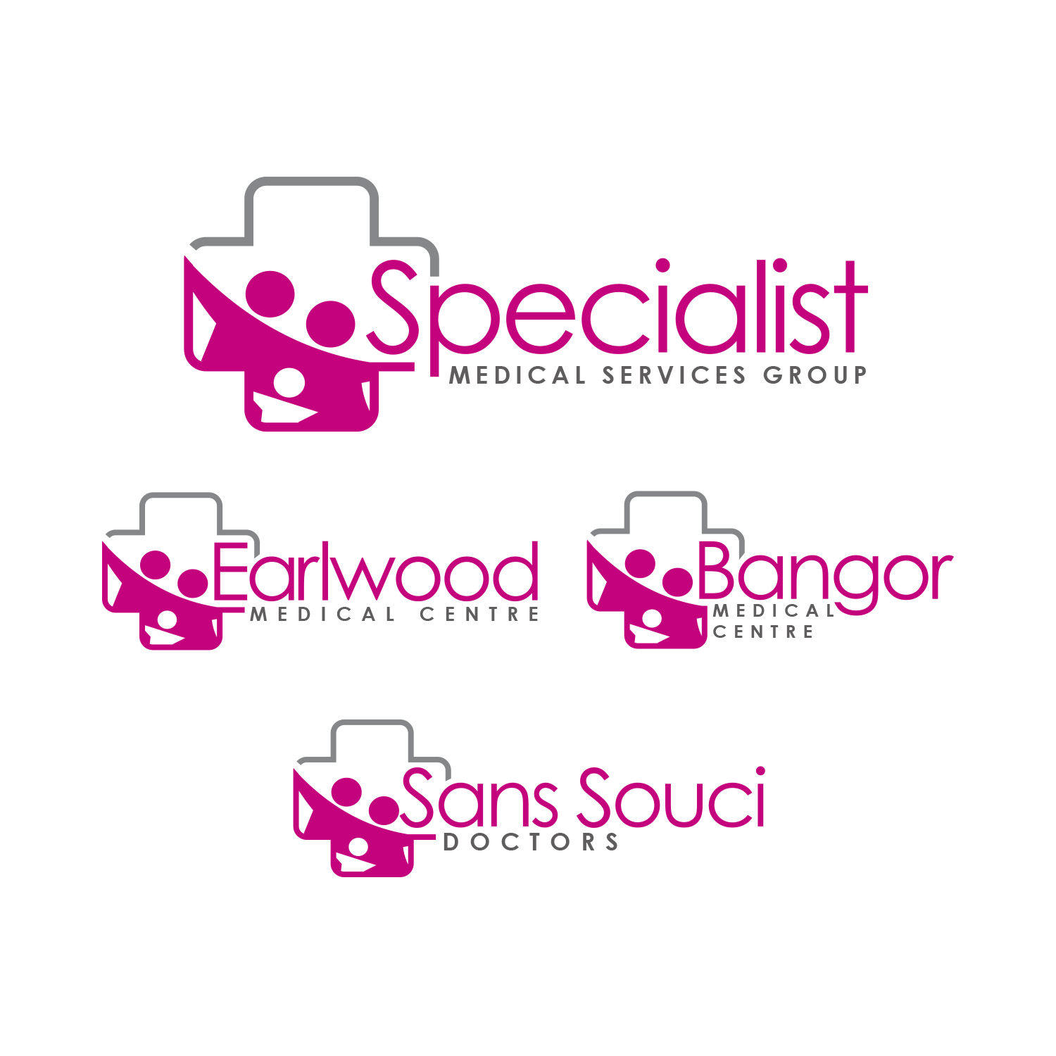
This customer received 209 logo designs from 61 designers. They chose this logo design from Ahsan Designs as the winning design.
Join for free Find Design Jobs-
 A$150
A$150
-
 209 designs
-
 61 designers
Logo Design Brief
Brand: Specialist Medical Services (Master Brand)
Sub-Brands: Sans Souci Doctors, Bangor Medical Centre, Earlwood Medical Centre
We are seeking a complete modern redesign of our existing logo system. The current branding feels outdated, visually heavy and somewhat clunky, and the existing colour combinations do not feel refined or contemporary. Overall, the logo no longer reflects the level of professionalism, quality and cohesion we aim to represent across our practices. We would like to elevate the brand into something sleek, elegant and timeless, while still maintaining enough familiarity to preserve recognition across all locations.
The refreshed identity should feel upscale, polished and contemporary. Our signature pink must remain a core brand colour, however we would like it paired with more refined supporting tones such as grey, charcoal, white or other soft neutrals. The updated palette should feel cohesive and sophisticated rather than bold or mismatched. Yellow does not need to be retained. The overall aesthetic should be lighter, cleaner and more minimal, moving away from bulky shapes and dated styling.
In terms of design direction, we are looking for sleek lines, balanced proportions and a streamlined composition. The brand should feel confident and established without appearing overly corporate or cold. The current hand, cross and family silhouettes feel heavy and outdated, so we are open to a more refined or abstract interpretation of care, health or connection. Subtle medical references are preferred over literal symbols. Thin linework or monoline elements would be ideal, and we are open to a mark that integrates seamlessly with the typography rather than sitting as a separate, dominant icon.
Typography should play a key role in elevating the brand. We are open to modern, elegant sans-serif fonts, with thoughtful uppercase and lowercase combinations to create hierarchy and visual balance. Spacing and alignment should feel intentional and premium. If appropriate, subtle refined detailing or script-inspired elements may be explored, provided the overall look remains professional and highly legible.
Importantly, we require a flexible and cohesive logo system that works across all branches. This includes a master brand logo for Specialist Medical Services and consistent sub-brand variations for Sans Souci Doctors, Bangor Medical Centre and Earlwood Medical Centre. The structure should remain uniform to maintain brand unity, while clearly differentiating each centre by name. The final system must translate seamlessly across signage, digital platforms, print materials and uniforms.
This is not a minor adjustment but a considered refresh to modernise the brand, improve its visual presence and create a more elegant and enduring identity across all touchpoints.
Updates
We would like to provide further clarification on the direction for the redesign of our main logo. The core concept we would like to retain is the idea of family support and medical care working together. The existing health cross/plus symbol is important to us, as it clearly conveys medical support, while the surrounding form represents family unity and protection.
Moving forward, we are seeking a sleek, modernised interpretation of this concept. The updated logo should feel clean, contemporary and refined, while still symbolising care, trust and support for families. It should communicate both professionalism and warmth — striking the right balance between medical credibility and approachability.
We are not looking for a complete departure from the existing meaning, but rather an elevated evolution. The cross/medical symbol should remain clearly recognisable, and the representation of family support should feel subtle, cohesive and thoughtfully integrated rather than overly literal or busy.
Overall, the redesign should result in a more streamlined, timeless and versatile logo that reflects who we are today — a trusted provider of medical care that supports families at every stage of life.
Added Saturday, 21 February 2026
Logo Text
Specialist Medical Services + Sub Brands: Earlwood Medical Centre | Bangor Medical Centre | Sans Souci Doctors
Look and feel
Each slider illustrates characteristics of the customer's brand and the style your logo design should communicate.