UPDATED: Hoedown for Hope - Festival Promo Poster
Want to win a job like this?
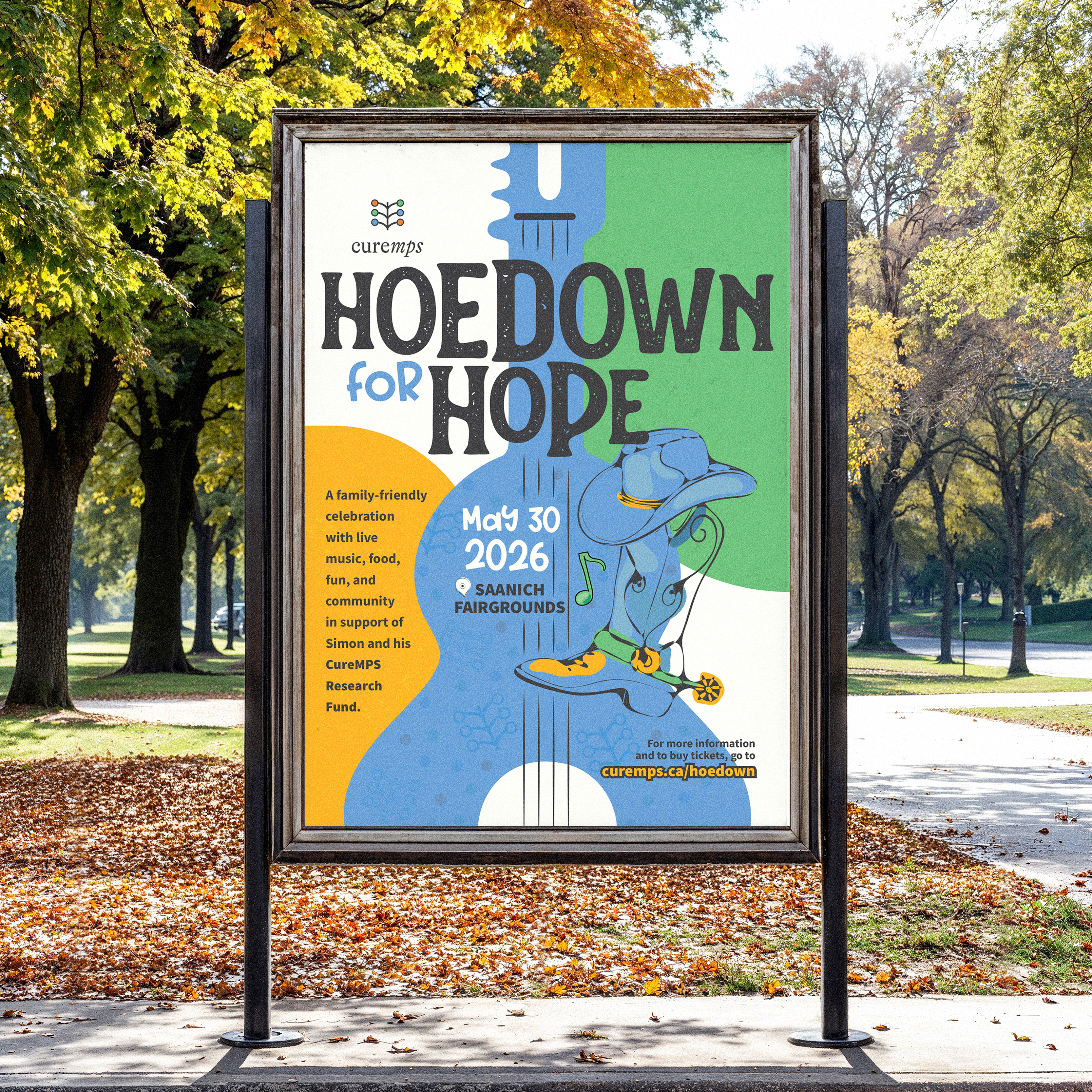
This customer received 48 flyer designs from 20 designers. They chose this flyer design from Ozlem Ozturkoglu as the winning design.
Join for free Find Design Jobs- Guaranteed
-
 C$200
C$200
-
 48 designs
-
 20 designers
Flyer Design Brief
Hi designers! 👋
We’re heading into the final couple of days and wanted to share a quick update.
We’re really enjoying seeing different directions come in so far, but we are still very open to new concepts and encourage fresh designers to jump in. This is not a locked-in contest — there’s definitely room for bold, creative takes.
A few things that might help if you’re joining late:
Open to creative layouts and unexpected approaches
Don’t be afraid to lean fun / energetic / eye-catching
This contest is guaranteed, and we’ve set a budget to attract top designers — we’re excited to see what else comes in before close. Taking the top ideas to our committee tomorrow so submit soon if you're planning to.
Thanks so much to everyone participating — we’ll be actively reviewing submissions right up until the end!
Project Brief: Poster Design
Event: CureMPS Hoedown for Hope – Second Annual
Date: May 30, 2026
Location: Saanich Fairgrounds
Organization: CureMPS (charitable nonprofit)
Overview
We are seeking a compelling, modern, and brand-aligned poster for the second annual CureMPS Hoedown for Hope — a family-friendly fundraising event that combines live music, community, and hope.
This poster will be used primarily for digital promotion (social media, website, email), with some printed uses (posters, signage, and event materials). The design must scale well and remain highly legible on mobile.
Tone should feel inclusive, joyful, and trustworthy — not childish, not clinical.
Creative Direction
Vibe: Fresh • Hip • Hopeful • Music-forward • Family-friendly • Modern rustic
We want this to feel like: A small music festival with heart — not a rodeo, not a medical fundraiser, and not a children’s fair poster.
Visual Preferences
Strong emphasis on live music
Guitar imagery is encouraged (acoustic preferred; illustrated, silhouetted, or stylized)
Warm, uplifting feel
Modern design sensibility
Colour & Typography
Typography should feel hip and contemporary, with excellent readability
Must work well on phones and social feeds
Required Text (Hierarchy Matters)
Please prioritize text in this order:
CureMPS Hoedown for Hope
May 30, 2026
Saanich Fairgrounds
Supporting line (optional):
A family-friendly celebration with live music, food, fun, and community in support of Simon and his CureMPS Research Fund.
Deliverables
Poster design suitable for digital and print
Final files to include:
Editable source file (AI, PSD, or similar)
Print-ready PDF
Web-optimized version
Inspiration / Reference
Last year’s event leaned fresh and music-focused, using guitar imagery and hip typography. We’d like to build on that energy while making this year feel polished, confident, and established as a second-annual event.
What Will Stand Out
Strong emotional pull without being sentimental
Clean, confident layout
Clear hierarchy that reads instantly on social media
A design that families and sponsors alike feel good sharing
Designers with experience in music events, nonprofit branding, or family-friendly festivals are especially encouraged to participate.
Inspo: https://www.pinterest.com/pin/7248049396237857/ and also attached last year's poster for reference. Note we want something totally different for 2026.
Target Market(s)
General public, Instagram @curemps followers, families with children (all ages welcome) People who care about a meaningful cause and want a fun, upbeat experience Community-minded attendees and potential donors
Industry/Entity Type
community-based fundraiser
Look and feel
Each slider illustrates characteristics of the customer's brand and the style your logo design should communicate.
Elegant
Bold
Playful
Serious
Traditional
Modern
Personable
Professional
Feminine
Masculine
Colorful
Conservative
Economical
Upmarket
Requirements
Must have
- Warm, uplifting feel, Modern design sensibility
Should not have
- Avoid: Cartoonish “western” or novelty country graphics; Medical imagery or awareness-ribbon visuals; Overly busy layouts or too many fonts