Exec Conference Design Concept
Want to win a job like this?
This customer received 41 email marketing designs from 13 designers. They chose this email marketing design from pb as the winning design.
Join for free Find Design Jobs- Guaranteed
-
 US$490
-
 41 designs
-
 13 designers
Email Marketing Design Brief
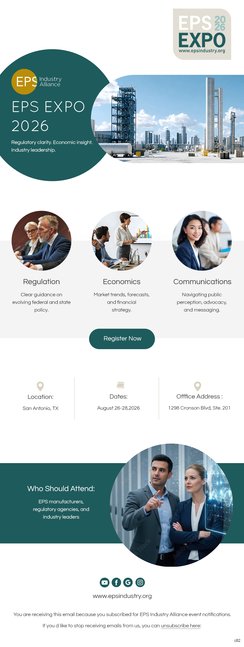
We need to refresh & update nonprofit association graphic design for annual meeting. The graphics will be used to promote the event primarily through digital communications & social media. Other materials we generate for this event are the agenda & billboard content. You can view the existing design at www.epsindustry.org under Events.
The target audience is primarily male, ages 35-60 in executive positions in C-Corps. The conference topics center on manufacturing regulations, marketing trends, and the economy. This conference has been around almost 30 years so we need something to invigorate potential registrants that will get their attention. It still needs to be professional and business-like.
In addition to a new design concept we would like to update the color palette. We’ve attached some mood boards with potential color & font suggestions. Our company logo is also attached and is the only design element tied to our branding that cannot be changed.
Designs should be energetic and sophisticated. Ideally, we would like the designs in Adobe Indesign or Photoshop. However, we can work with Illustrator.
Target Market(s)
Male business executives age 35-60.
Industry/Entity Type
Polystyrene manufacturing industry supply chain.
Font styles to use
Other font styles liked:
- I usually prefer sans serif
Look and feel
Each slider illustrates characteristics of the customer's brand and the style your logo design should communicate.
Elegant
Bold
Playful
Serious
Traditional
Modern
Personable
Professional
Feminine
Masculine
Colorful
Conservative
Economical
Upmarket
Requirements
Must have
- Focus points to draw attention to higher level informational units. For example, some people will only read the headers and not detailed copy.
Nice to have
- Ways to insert bonus content that don’t over power other content. I like to see a good use of white space to enhance readability.