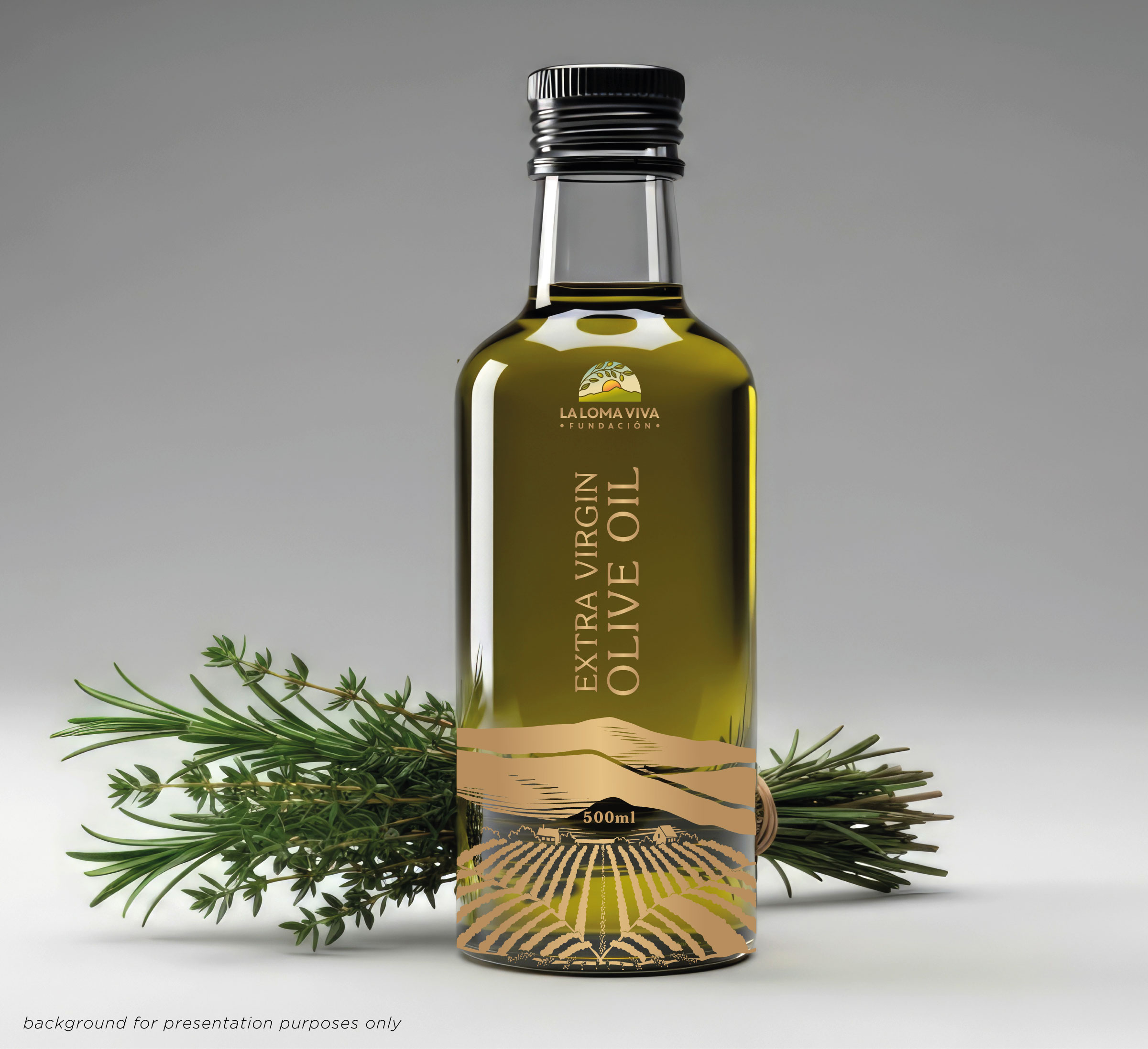
Label design for ecological olive oil from an innovative farm in Spain
Want to win a job like this?
This customer received 47 graphic designs from 21 designers. They chose this graphic design from Birdcage as the winning design.
Join for free Find Design Jobs- Guaranteed
-
 €100
€100
-
 47 designs
-
 21 designers
Graphic Design Brief
LA LOMA VIVA - Olive Oil Label
La Loma Viva is a small farm in southern Spain dedicated to regenerative, ecological and syntropic agriculture. We are launching a new extra virgin olive oil and, alongside it, a renewed brand identity that reflects our relationship with land, life and earth.
Our farm works as a living food forest: diverse, dense, colourful and abundant. This is not industrial organic farming — it is ecosystem regeneration in action. We are looking for a label that feels:
* Lush, abundant and alive
* Nature-connected and animist (the land as a living being)
* Sunny Mediterranean (southern Spain, warmth, light, joy)
* Upbeat and playful, not austere or “eco-serious”
* Slightly rebellious, non-corporate, non-industrial
This is an olive oil for people who care deeply about the planet, but who also love beauty, colour and pleasure.
We are particularly drawn to designs that express the visual richness and lushness of our syntropic food forest:
* Dense, layered plant life
* Multiple tree species growing together
* A sense of abundance
* A “window into a living world” feeling
Tree species present on the farm include:
* Olive
* Citrus
* Pomegranate
* Fig
* Almond
We welcome designs with illustrative approaches that feel hand-drawn, painterly or slightly retro. We are open to interpretation — the goal is to transmit aliveness, not literal realism.
We currently use Montserrat font and are happy to continue with it or something similar.
We are also open to retro-inspired or softer typefaces, provided they feel natural, warm and not corporate.
We want to avoid plastic labels. The design should work with:
* Uncoated/organic paper labels, or
* Direct printing or screen printing onto glass
The label should feel tactile and natural.
We have uploaded :
* Final front and back label text (Spanish + English)
* Logo
* Reference images (AI explorations, farm photos, landscape, food forest)
The olive oil will be sold in Spain and internationally, so bilingual clarity is important.
Our business logo should be used but does not need to dominate the front label.
It may work better subtly placed, possibly on the back label or integrated quietly into the design.
A successful label will feel like:
* A living landscape captured on a bottle
* Something joyful, rooted and contemporary
* A product of land, care and imagination — not marketing
We want people to feel, instinctively:
This oil comes from a place that is alive.
Updates
Went on vacation/holiday
Sick
Font styles to use
Colors
Designer to choose colors to be used in the design.
Look and feel
Each slider illustrates characteristics of the customer's brand and the style your logo design should communicate.