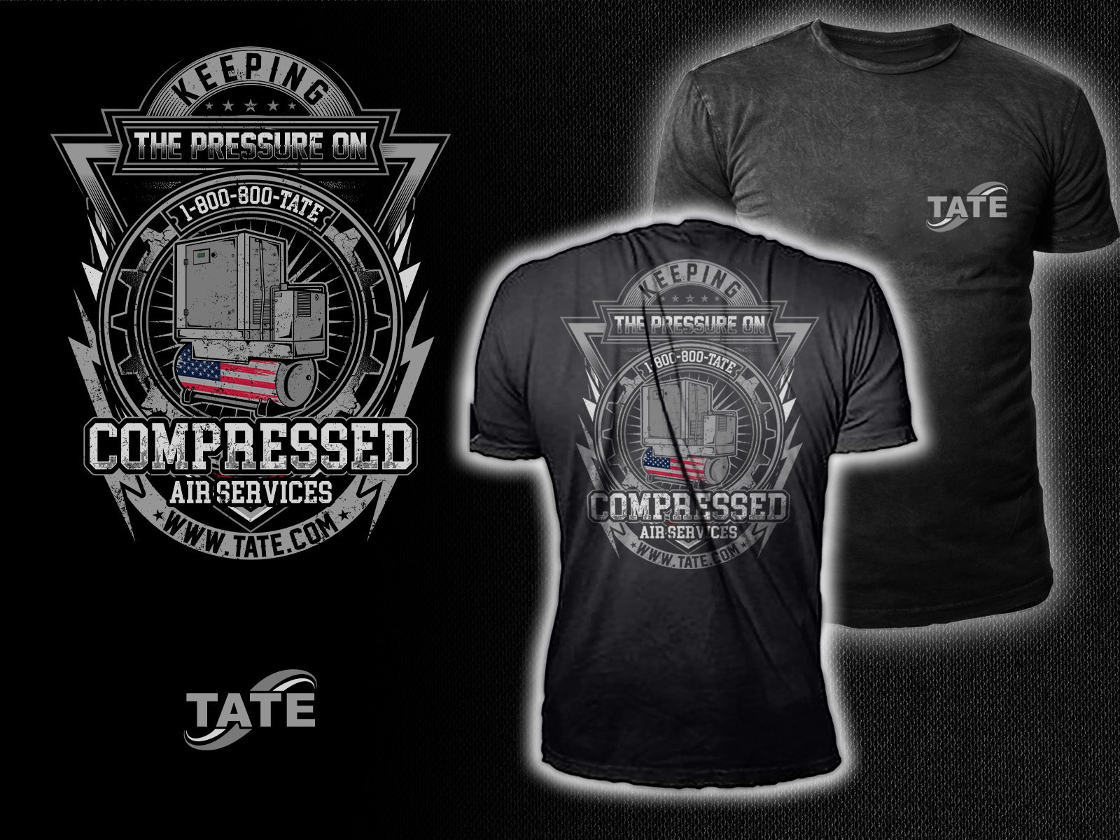
Tate Compressor T-shit Desing - "Keeping The Pressure On"
Want to win a job like this?
This customer received 37 t-shirt designs from 20 designers. They chose this t-shirt design from HNS Graphic as the winning design.
Join for free Find Design Jobs-
 US$190
-
 37 designs
-
 20 designers
T-shirt Design Brief
Bold, rugged, high-impact illustration for a T-shirt
The look should feel industrial, gritty, patriotic, and field-tech approved, with a bold central compressor graphic and strong typography.
Primary Visual Elements
1. Detailed Compressor Illustration
- Industrial air compressor in a high-contrast, thick-outline art style
- Prominent TATE branding on the compressor
2. American Flag Integration (Optional but preferred)
- Flag pattern wrapped across the compressor tank, similar to the boiler flag design
- Feel engineered, not cartoony
- Red/white stripes and blue stars applied in a mechanical-styled way
3. Air/Pressure Effects
- Air bursts
- Pressure lines
- Faint speed/movement streaks
- These should mimic the boiler shirt’s dynamic smoke effect but in an “air” style.
4. Supporting Graphic Elements
- EST. 1924 badge or placement
- Grit-textured or distressed styling
- Circular or arched text frame
- Optional stars under the text for balance
Typography & Layout:
- KEEPING THE PRESSURE ON
- Compressed Air Services
- Tate Mechanical Services
- 1-800-800-TATE
- www.TATE.com
Typography should match our current shirt line:
- Industrial block lettering
- Serif or slab-serif similar to your existing merch
- Slightly distressed edges to match the gritty feel
Color Palette - Stay on Tate brand:
- Tate Navy (#003A70)
- Tate Green (#43B02A)
- White and black for contrast
- Red/white/blue for the flag integration
- Minimal gradients — mostly flat ink for screen printing
Shirt Recommendation
- Black shirt (best contrast)
- Alternate options: Navy or Charcoal
Font styles to use
Look and feel
Each slider illustrates characteristics of the customer's brand and the style your logo design should communicate.