Logo for: Coaching and Advisory for Founders
Want to win a job like this?
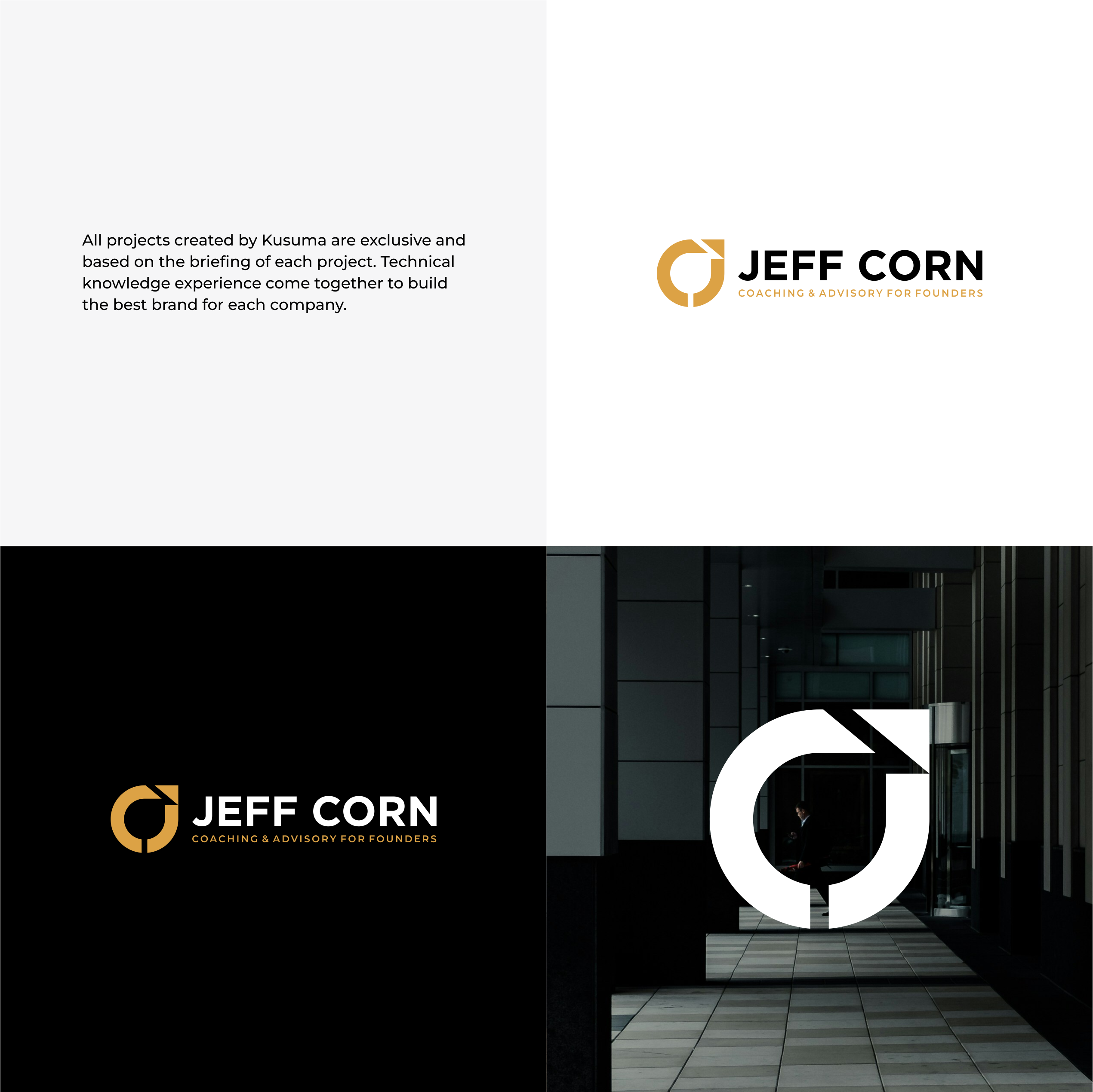
This customer received 200 logo designs from 90 designers. They chose this logo design from Kusuma Studio as the winning design.
Join for free Find Design Jobs-
 US$150
-
 200 designs
-
 90 designers
Logo Design Brief
I’m looking for a modern, minimalist logo for my personal coaching and advisory brand, Jeff Corn.
I work with entrepreneurial founders who want more freedom: preparing their businesses for exit or realigning operations so the company supports their life instead of consuming it.
The logo should be:
Clean, professional, and timeless
A balance between stoic/minimal and energetic/passionate
Built around a subtle “J” path inside a “C” that visually suggests a founder’s journey and exit, while representing the initials "J" and "C" subtly.
About the business
Name: Jeff Corn
Descriptor / Tagline: Coaching & Advisory for founders– I’m open to slight wording tweaks if the layout demands it)
What I do:
Coaching and advisory for founders and scaling organizations
Helping them design and execute toward freedom: exit readiness, restructuring, and better alignment between business and life
Audience:
Founders of service and tech-enabled businesses (roughly 7–8 figure range)
Smart, driven, often stressed or trapped in their own business
They care about strategy, clarity, and options, not hype or “bro coaching”
Brand personality
Think:
Stoic, grounded, calm
But with clear upward energy (movement, momentum, possibility)
Strategic, thoughtful, and high trust
No fluff, no clichés
Keywords: clarity, path, exit, freedom, optionality, intentional design.
Core logo concept:
I already have a direction I like. I want designers to start from this concept and refine/interpret it well.
Icon concept:
The icon should combine:
A subtle “J” that represents a path
A “C” that is essentially a circle around that path
The path / J:
Starts low on the left side
Curves upward and to the right
Exits through the top-right area of the circle
Ends in a point, not a sharp arrowhead (no triangle arrowheads)
The path should be thicker, clearly visible and confident
The C / circle:
Should read first as a circle, but with an open gap at the top-right where the path exits
That open gap should make it clear this is a C, not just a perfect closed circle
The circle stroke can be slightly thinner or equal to the path stroke, but they must feel cohesive
Overall feel:
The viewer should first see a clean circular mark with an upward path exiting the boundary, and only then notice the subtle J+C initials.
This is not a literal letter logo; it is a symbol of the founder’s journey and exit.
If you want to propose small variations on this concept (different angles for the path, different circle gaps, etc.), that’s great. But every submission must include at least one version that clearly follows this J-path + C-circle idea.
Typography
Use a modern sans-serif that feels professional and approachable. Think in the realm of:
Avenir / Avenir Next
Gotham / Proxima Nova / Inter
Or similar clean, geometric/humanist typefaces
Primary text: JEFF CORN
Prefer all caps
Slightly heavier weight (Medium/Bold)
Secondary line:
Subtext: Coaching and Advisory for Founders
Smaller size, lighter weight
Layout options:
Horizontal lockup: icon on the left, “JEFF CORN” to the right, tagline below the name
Stacked version: icon above, then “JEFF CORN”, tagline below
Please provide both a horizontal and a stacked version if possible.
Color direction
I’d like a palette that feels serious but warm, not cold corporate.
Preferred direction:
Primary: deep navy / charcoal background or text
Accent: warm muted gold / amber for the icon or key elements
Sample ranges (you don’t have to use these exact hex codes, but they show the vibe):
Dark navy: somewhere around #0B1220 – #111827
Warm gold/amber: somewhere around #D4A65A – #C8923A
Requirements:
The logo must also work in:
One-color dark (e.g., solid charcoal/black)
One-color light (white on a dark background)
Avoid neon, overly bright colors, or heavy gradients. Subtle shading is fine, but the logo should be strong in flat color as well.
Please avoid the following:
Obvious, generic arrow logos (big arrow heads, growth charts, stock “up-and-to-the-right” graphics)
Cliché business icons (handshakes, light bulbs, generic abstract swooshes)
Overly playful fonts or script fonts
Complex, detailed illustrations that won’t scale well to small sizes
Too many colors; this should feel refined, not busy
Deliverables
For the winning design, I’ll need:
Primary logo (horizontal lockup)
Icon + “JEFF CORN” + tagline
Stacked version
Icon above name and tagline
Icon-only version
Just the J-path + C-circle mark
Color variations:
Full color on light background
Full color on dark background
One-color dark
One-color light
File formats:
Vector: AI and/or EPS
High-res PNG with transparent background
SVG if possible
How I’ll judge the designs
I will prioritize:
How well the J-path + C-circle concept is executed
Clarity and minimalism – does it still look great at small sizes (e.g., social avatar, email signature)?
Balance of stoic and energetic – it should feel calm but clearly moving forward/upward
Originality – I don’t want a template logo; this should feel custom and ownable
Target Market(s)
Business Founders, Entrepreneurs
Logo Text
JEFF CORN - Coaching and Advisory for Founders
Logo styles of interest
Abstract Logo
Conceptual / symbolic (optional text)
Wordmark Logo
Word or name based logo (text only)
Lettermark Logo
Acronym or letter based logo (text only)
Font styles to use
Colors
Colors selected by the customer to be used in the logo design:
Look and feel
Each slider illustrates characteristics of the customer's brand and the style your logo design should communicate.