Men's Clothing Brand - The Common Donkey
Want to win a job like this?
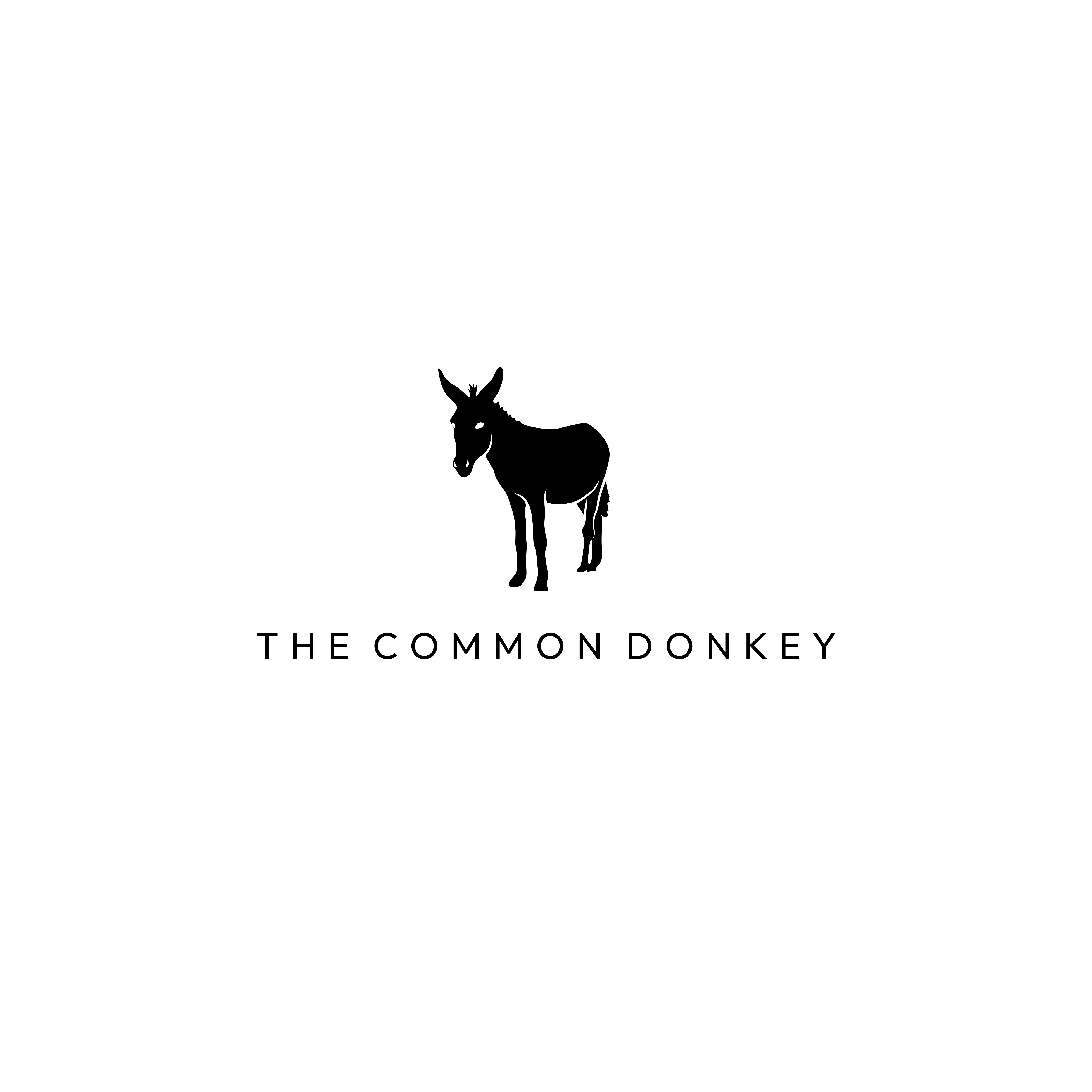
This customer received 219 logo designs from 91 designers. They chose this logo design from Morni Design as the winning design.
Join for free Find Design Jobs- Guaranteed
-
 NZ$300
-
 219 designs
-
 91 designers
Logo Design Brief
The Common Donkey — Designer Brief
Overview
Brand name: The Common Donkey
Positioning: everyday wardrobe essentials for no-nonsense men aged 35–55. Clothes built for real life — hardworking, comfortable, durable, but most importantly quietly stylish. A relatable NZ/AU brand with dry, cheeky humour and a straightforward buying experience.
Objective: Create a visual identity, product direction and assets that communicate reliability, hardworking, stylish comfort, and a touch of humour.
Audience:
Primary: Males, 35–55, mid-to-upper income, family-focused or working professionals. Often time-poor, they “hate shopping” would prefer their Wife/Girlfriends to shop for them. Prefer clear, minimal choices. They care more about fit, comfort, durability and ease than fashion trends but do like to look good.
Brand Personality & Tone
Personality traits: Hardworking, dependable, honest, unpretentious, quietly witty. Like to look effortlessly good.
Tone of voice: Straightforward, slightly cheeky (kiwi/oz humour), human, pragmatic. Avoid jargon and hyperbole. Use short sentences and modest claims (“Built to last”, “Fits like it should”).
Visual Identity Guidance
Logo: Simple, clean, modern font, Not too bold, words and picture logo (illustrative donkey head silhouette or a geometric donkey mark, think a playful cheeky version of Ralph Lauren Polo.). Emblem must scale well for labels and badges. Avoid cute/cartoonish, prefer sturdy and slightly cheeky but not twee.
Brand Assets & Deliverables (for designers)
Logo Versions:
1. FULL LOGO - Primary logo (full): horizontal and stacked versions; white/colour/monochrome files (SVG, PNG).
2. EMBLEM ONLY Secondary emblem mark (badge): icon for labels and favicons.
3. WORDS ONLYS (2 VERSIONS) one full wording “The Common Donkey”, second abbreviation using TCD.
Brand colour palette and typography kit (web and print).
we want to use predominantly Black white greys in the logo but open to a hint of fluorescent colour use (minimal though)
Packaging mockups: garment bag/box, woven label, swing tag (include cheeky microcopy options).
Target Market(s)
NZ/AUS Men 35 - 55
Industry/Entity Type
Men's Clothing/Apparel
Logo Text
The Common Donkey (& TCD option)
Logo styles of interest
Pictorial/Combination Logo
A real-world object (optional text)
Font styles to use
Colors
Designer to choose colors to be used in the design.
Look and feel
Each slider illustrates characteristics of the customer's brand and the style your logo design should communicate.
Elegant
Bold
Playful
Serious
Traditional
Modern
Personable
Professional
Feminine
Masculine
Colorful
Conservative
Economical
Upmarket
Requirements
Must have
- donkey logo- cool not too cartoon looking.
Nice to have
- like a playful ralph lauren polo logo
Should not have
- want it to be cool not too cartoon or too twee