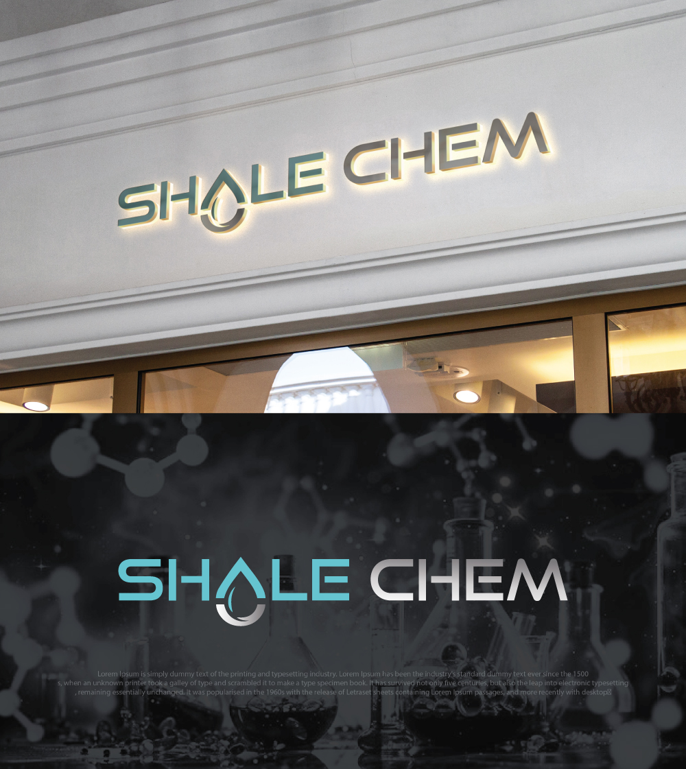
Corporate Logo for Shale Chem – Specialty Chemicals in Oil & Gas & Water Treatment
Want to win a job like this?
This customer received 200 logo designs from 99 designers. They chose this logo design from GTO design as the winning design.
Join for free Find Design Jobs- Guaranteed
-
 C$150
C$150
-
 200 designs
-
 99 designers
Logo Design Brief
Business Overview:
The name shale chem comes from shale rock formations targeted in oil and gas and chem for chemistry used in the production
Shale Chem is a specialty chemical company serving the oil & gas and industrial water treatment sectors. We provide proprietary blends of scale inhibitors, corrosion inhibitors, iron control products, and other production chemistry solutions. Our brand represents technical expertise, reliability, and results in demanding field environments.
Logo Requirements:
• Style: Clean, simple, and professional.
• Colors: Solid, bold colors (no gradients). Should work in both color and black & white formats.
• Versatility: Must look strong and recognizable across all applications — business cards, letterhead, websites, product labels, safety sheets, and large signage.
• Memorability: Should be easy to remember and convey strength, precision, and trust.
• Industry Relevance: Subtle nod to chemistry, water, or energy is acceptable, but avoid overly complex graphics.
• Typography: Clear, modern, and professional — should complement the icon/mark.
Inspiration:
Think strong, industrial, and technical — but clean enough to present on corporate material. A design that balances the science of chemistry with the toughness of field operations.
Updates
Gathering more feedback
Target Market(s)
Oil and Gas engineers, Field operators and executives
Industry/Entity Type
Oil and Gas, production chemistry
Logo Text
Shale Chem (or) SHALE CHEM (or) shale chem
Logo styles of interest
Abstract Logo
Conceptual / symbolic (optional text)
Font styles to use
Look and feel
Each slider illustrates characteristics of the customer's brand and the style your logo design should communicate.
Elegant
Bold
Playful
Serious
Traditional
Modern
Personable
Professional
Feminine
Masculine
Colorful
Conservative
Economical
Upmarket
Requirements
Must have
- Clean logo with the name
Nice to have
- 1. Visual Symbolism • A subtle nod to chemistry, water, or energy without being cliché (e.g., not just a beaker or flame). • Abstract iconography that suggests precision, flow, or molecular structure. 2. Typography Treatment • Strong, modern sans-serif font (clean and professional). • Emphasis on readability — even when scaled down on business cards or safety sheets. • Potential to style “Shale” and “Chem” slightly differently for balance (but still cohesive). 3. Color Direction • Solid, bold colors (blue, black, gray, green are safe industrial tones). • Should also look good in a single color / black-and-white format for technical documents. • Avoid overly bright neon tones — keep it corporate, strong, and trustworthy. 4. Versatility • Logo should work both with the icon + wordmark together and as a standalone icon (for stamps, product drums, or safety labels). • Horizontal and stacked versions would be great. 5. Style Inspiration • Industrial strength + scientific precision (think oil & gas meets chemistry lab). • Memorable but minimalist (avoid clutter or excessive detail). 6. Future-Proofing • Logo should be timeless and not tied to one product line. • Needs to carry across oil & gas, industrial water, and potential expansion into mining.
Should not have
- 1. Overly Literal Imagery • No cartoonish beakers, test tubes, flames, or water droplets. • Avoid cliché oil rigs, pump jacks, or chemical hazard symbols. 2. Complexity & Clutter • No busy details that won’t scale down well. • Avoid thin lines or intricate gradients that get lost on business cards, drums, or labels. 3. Trendy / Gimmicky Styles • No gradient-heavy “web 2.0” effects or shadows. • Avoid script fonts, playful fonts, or futuristic sci-fi looks. 4. Color Pitfalls • No neon or overly bright colors (not professional). • Avoid palettes that clash or feel too “consumer brand” instead of industrial/scientific. 5. Unprofessional Vibes • Avoid logos that look like clipart or stock icons. • No mascots or character-style marks. • Stay away from symbols that could confuse the brand with pharma, food, or casual consumer goods. 6. Industry Misfit • Don’t make it look like a pure oil & gas driller (too narrow). • Don’t tie it to one chemical (like just a droplet) — it needs to represent breadth of chemistry + water + industrial strength.