Logo Refresh for a Superalloy Recycling Co – Keep Core, Modernise Design
Want to win a job like this?
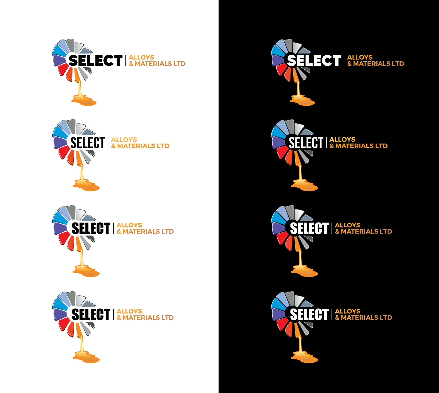
This customer received 882 logo designs from 255 designers. They chose this logo design from WB NAG as the winning design.
Join for free Find Design Jobs- Guaranteed
- Bundled Project 1
-
 £670
£670
-
 882 designs
-
 255 designers
Logo Design Brief
We want a refreshed version of our existing logo — not a complete change, but a modern update that keeps our recognisable logo which is a ring of angled, colourful rectangular shapes arranged in a circle with a hollow centre — one blade appears to be melting and dripping effect. The logo should feel fresher, more polished, and less flat/cartoon-like, with subtle depth or shading.
We’d like the updated icon to replace the “O” in “Alloys” within the text. The word “Select” should stand out more than the rest, with “Alloys & Materials Ltd” in a smaller or lighter style. We’d like to keep our current colour palette (mix of blues, greys, reds, and orange) but are open to text colours that complement the icon.
We’d love to see creative layout ideas, like using coloured dashes instead of a plain black line, or the drip from the icon falling into a letter in “Materials” to link the design elements.
The new design will be used for our website, paperwork, signage, uniforms, and marketing, so it must be clean, professional, and versatile.
Target Market(s)
Remelting companies
Industry/Entity Type
Superalloy recycling
Logo Text
Select Alloys & Materials
Logo styles of interest
Pictorial/Combination Logo
A real-world object (optional text)
Abstract Logo
Conceptual / symbolic (optional text)
Font styles to use
Colors
Designer to choose colors to be used in the design.
Look and feel
Each slider illustrates characteristics of the customer's brand and the style your logo design should communicate.
Elegant
Bold
Playful
Serious
Traditional
Modern
Personable
Professional
Feminine
Masculine
Colorful
Conservative
Economical
Upmarket
Requirements
Must have
- Keep the circular fan like icon and melting drip effect. • Icon replaces the “O” in “Alloys.” • Emphasis on “Select” in the text. • Include “Ltd” in the design. • Current colour palette for the icon.
Nice to have
- • Drip falling into a letter in “Materials.” • Coloured dashes that match the logo colours instead of a black line. • Subtle shading/gradient for a modern feel.
Should not have
- • Completely new icon concept. • Flat or cartoonish style. • Overly busy, cluttered design.
Files
Download all files - 0.1 MB
Payments
Total
£670
Project Deadline
11 Jul 2025 12:10:25 UTCProject Upgrades
Bundled project(s)
- offering £29 business card design to winner