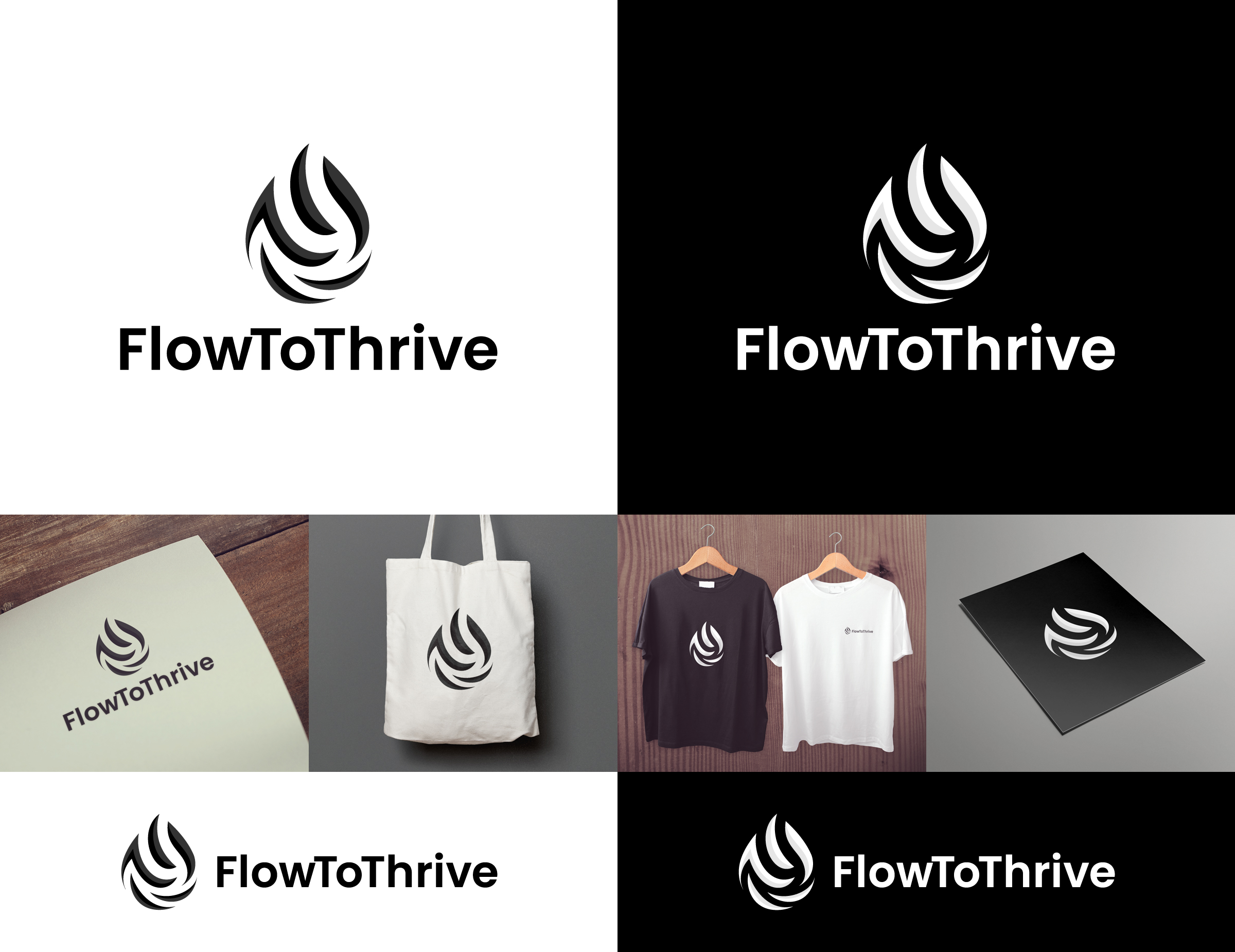
Logo Design for FlowToThrive – Empowerment Brand Blending Mindset, Movement & Mastery
Want to win a job like this?
This customer received 235 logo designs from 97 designers. They chose this logo design from NineOwl as the winning design.
Join for free Find Design Jobs- Guaranteed
-
 C$150
C$150
-
 235 designs
-
 97 designers
Logo Design Brief
Overview: FlowToThrive is a wellness and personal empowerment brand rooted in movement, mindset, and martial arts. Our mission is to help people grow stronger—mentally, physically, and spiritually—through self-mastery, resilience, and elevated daily practice.
The logo should embody a sense of fluidity, transformation, and leveling up in life.
Task Description for Designers:
We are looking for a clean, modern, and meaningful logo for the FlowToThrive brand. The design should feature a flame- or wave-inspired symbol (see reference image but need 5 flames not 4), made of five upward-flowing curved slices, forming a shape that resembles both a drop and an arrow pointing upward—symbolizing evolution, elevation, and personal power.
The symbol should feel smooth, dynamic, and balanced. It must express fluidity (like water or breath) and intention (like an arrow rising).
Logo Symbol & Style: The core icon should consist of five flame-like or wave-like slices.
The arrangement should flow upward, forming a shape that reads as a drop of energy or upward flame/arrow.
The curves should feel organic and smooth, not mechanical or harsh.
Avoid literal martial arts imagery—focus instead on symbolism of mastery and personal elevation.
Color Variations Required (4 versions):
Brazilian Jiu-Jitsu Belt Version: Each of the five slices should represent a belt color:
White
Blue
Purple
Brown
Black
These should be visually harmonious and rich in tone—no pale, neon, or pastel shades. Arrange from outermost to innermost or in upward progression.
All-Black Version:
Clean, flat black for print and minimalist use.
All-White Version:
For dark backgrounds (with transparent background).
Old Gold Version:
Warm, sophisticated gold (matte or brushed texture preferred—not glossy or yellow).
Typography:
We invite designers to propose a typeface that complements the fluid, rising symbol. It should:
Evoke flow, resilience, and clarity.
Be modern, clean, and sans-serif.
Appear as FlowToThrive (CamelCase).
Harmonize with the symbol so the brand name feels integrated—not separate or generic.
The name and symbol together should communicate elegant power, upward momentum, and inner transformation.
Updates
Gathering more feedback
Slow in providing feedback
Target Market(s)
FlowToThrive serves a diverse, growth-oriented audience ranging from motivated youth to midlife professionals—typically between ages 16 to 55. Our community includes: Teens and young adults developing resilience, confidence, and mindset mastery through movement and mindfulness Adults aged 25–55 who are committed to personal growth, physical wellness, and spiritual elevation Practitioners of yoga, Brazilian Jiu-Jitsu, martial arts, fitness, and breathwork Individuals drawn to mental strength training, journaling, coaching, and holistic healing People who value personal evolution, emotional empowerment, and living with intention Our audience spans students, creatives, wellness professionals, and purpose-driven individuals who want to level up in life—on and off the mat.
Industry/Entity Type
Health and Wellness, Personal Development, Fitness & Lifestyle, Coaching & Mentoring, Yoga / Meditation, Spiritual / Holistic Service,s Education & Training , Sports & Recreation
Logo Text
FlowToThrive
Logo styles of interest
Abstract Logo
Conceptual / symbolic (optional text)
Font styles to use
Other font styles liked:
- Open to designer font suggestions within the Sans Serif family. Must feel modern, clean, and harmonious with the fluid flame symbol. Suggested styles: Montserrat, Raleway, Avenir, Poppins, or similar.
Look and feel
Each slider illustrates characteristics of the customer's brand and the style your logo design should communicate.
Elegant
Bold
Playful
Serious
Traditional
Modern
Personable
Professional
Feminine
Masculine
Colorful
Conservative
Economical
Upmarket
Requirements
Must have
- Flame/wave symbol with 5 clearly defined upward-flowing slices Accurate belt color version (white, blue, purple, brown, black) Text must read FlowToThrive Symbol should suggest energy, movement, and self-elevation Clean, professional design that works across print and digital
Nice to have
- Slight 3D or layered depth in the flame slices Logo works well in square format and horizontal layout Font and symbol feel harmonious, even when stacked Can be easily embroidered or printed on merchandise Optional subtle symbolism embedded (e.g., rising path, breath, light)
Should not have
- No literal martial arts imagery (e.g., fists, belts, people fighting) No cartoon styles or overly rounded bubble fonts Avoid harsh or jagged shapes that break the sense of flow Do not use all lowercase or all uppercase (use CamelCase: FlowToThrive) No gradients that are hard to replicate in print