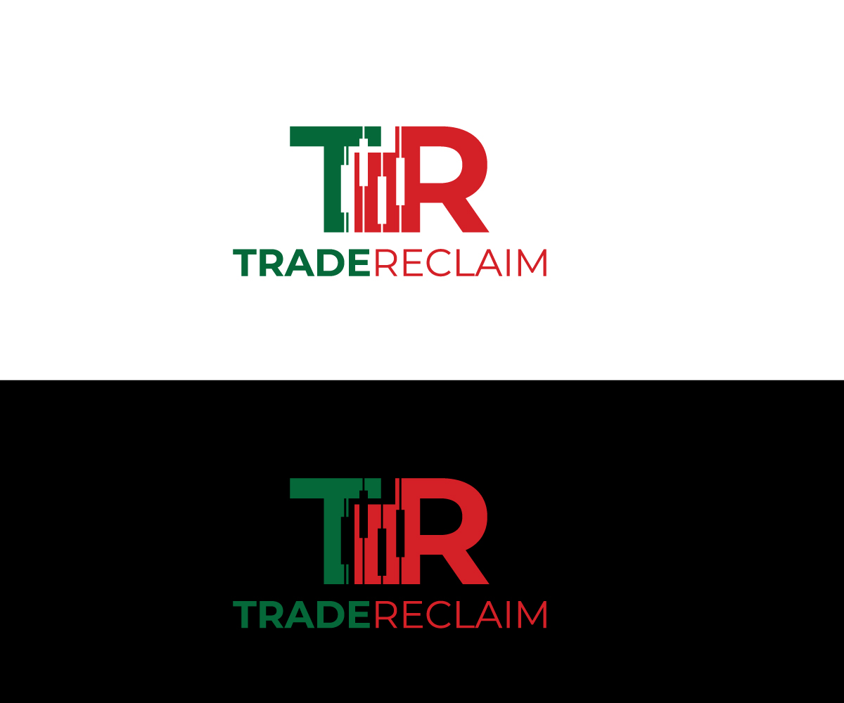
Logo for a trading company

Want to win a job like this?
This customer received 39 logo designs from 14 designers. They chose this logo design from RS_Design as the winning design.
Join for free Find Design JobsLogo Design Brief
logo should be kept simple, not too many elements, should look more clean.
the logo idea is about reclaiming trading fees when people trade on stock exchanges.
company name we had the idea for "TradeReclaim" or something like this.
first idea:
i want this kind of candlesticks in the middle of the recycling circle, but the recycling arrow should be a bit better.
the background should be dark / black or keep it as this blue which it has now in it. Use Lucent Blue (#2473FF) and Radiant Yellow (#FFC82C) as bold highlights
second idea:
please also try the logo as "TR" or something like this. I attached a picture what I have tried but not sure if this visualizes our project what we are doing.
EDIT:
i uploaded a example, maybe we can keep the logo simple and combine the candlesticks with the letters? so we would not have to put too many elements by side?
Logo Text
just logo, no text
Look and feel
Each slider illustrates characteristics of the customer's brand and the style your logo design should communicate.