Power Point Presentation or Canva Slides
Want to win a job like this?
This customer received 9 flyer designs from 6 designers. They chose this flyer design from HamzaMalik as the winning design.
Join for free Find Design Jobs-
 A$110
A$110
-
 9 designs
-
 6 designers
Flyer Design Brief
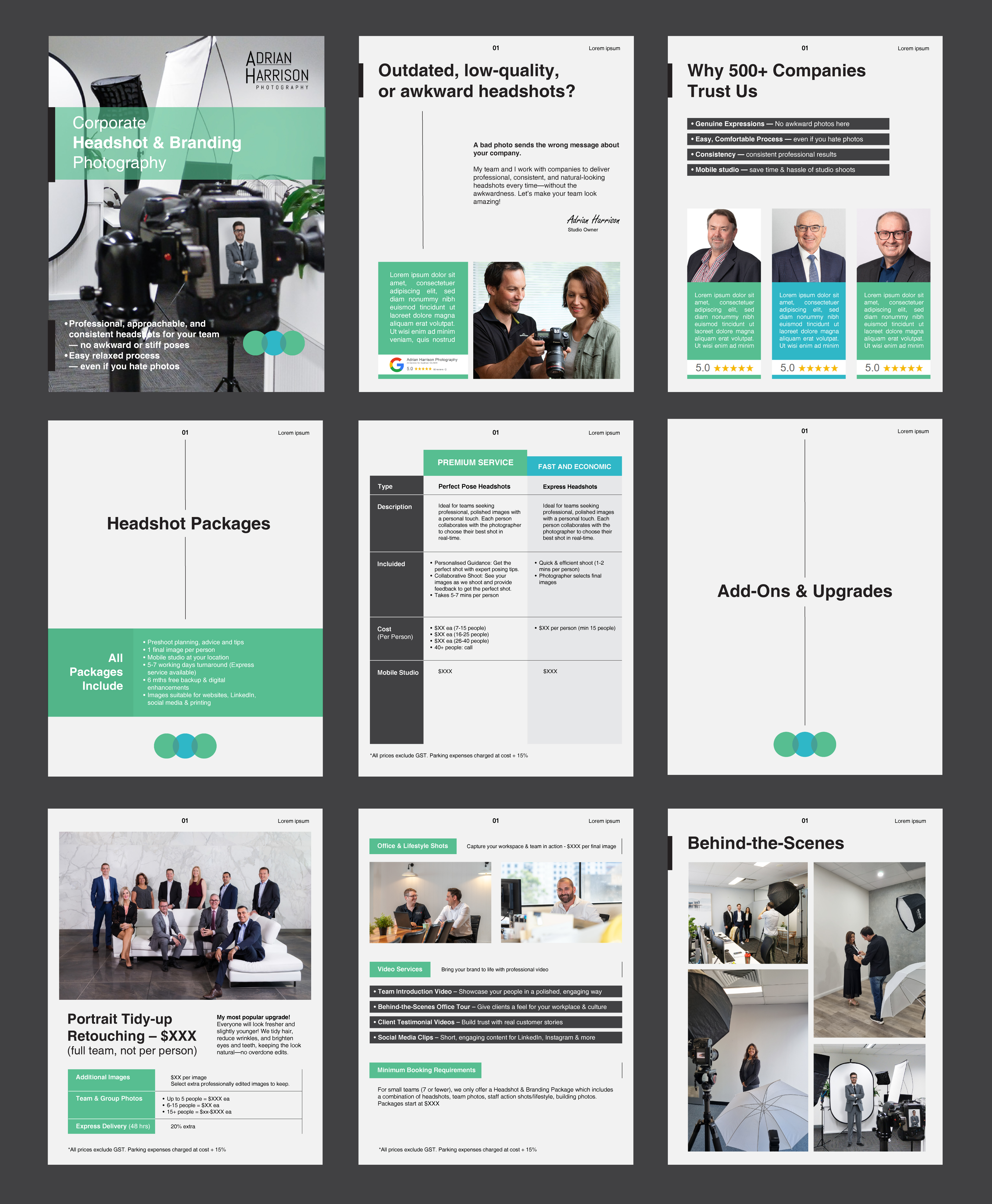
Project: Photography Brochure (10-12 pages, A4 size)
Objective: To create a clean, high-end, and easy-to-read PDF brochure showcasing headshot packages for corporate clients, emphasizing value, quality, and a stress-free process.
Project content, logos, brand colours and images can be found here: https://drive.google.com/open?id=13zAw60SdyrnFwoSNwWKHz2ol9eOTrlSJ&usp=drive_fs
Design Direction
* Overall Style: Minimal, sophisticated, and modern.
* Use plenty of whitespace to create a breathable layout.
* Professional yet approachable tone.
* High-end look to convey quality and professionalism.
* Ensure text is easy to skim with clear headlines, subheadings, and icons where applicable.
Key Focus Areas:
* Emphasize value the client receives (not just prices).
* Ease of process and genuine expressions are key selling points.
* Testimonials should be scattered throughout as visual callouts, not in blocks.
* Make sure every page looks visually appealing with an appropriate balance of text and images.
Target Market(s)
Businesses - business owners, marketing managers, executive assistants, 50% male and 50% female
Industry/Entity Type
Commercial photography
Font styles to use
Other font styles liked:
- Helvetica
Look and feel
Each slider illustrates characteristics of the customer's brand and the style your logo design should communicate.
Elegant
Bold
Playful
Serious
Traditional
Modern
Personable
Professional
Feminine
Masculine
Colorful
Conservative
Economical
Upmarket
Requirements
Must have
- Minimal, high-end aesthetic (clear, polished, easy to skim), Consistent typography, spacing, and alignment for a professional look Strong emphasis on value for the client (not just listing features), Breathing room in the layout (not text-heavy or overwhelming), Brand consistency (uses provided colors, fonts, and logos correctly)
Nice to have
- A mix of text + visuals for an engaging layout
Should not have
- generic stock feature images (use the supplied images - stock images are OK ONLY if blurred and used as a background with overlay), ), Overcrowded or cluttered pages, Generic, overused Canva templates that feel cheap, Excessive colors or flashy design elements that distract from the message