Pharmacy Logo/Lettering Design
Want to win a job like this?
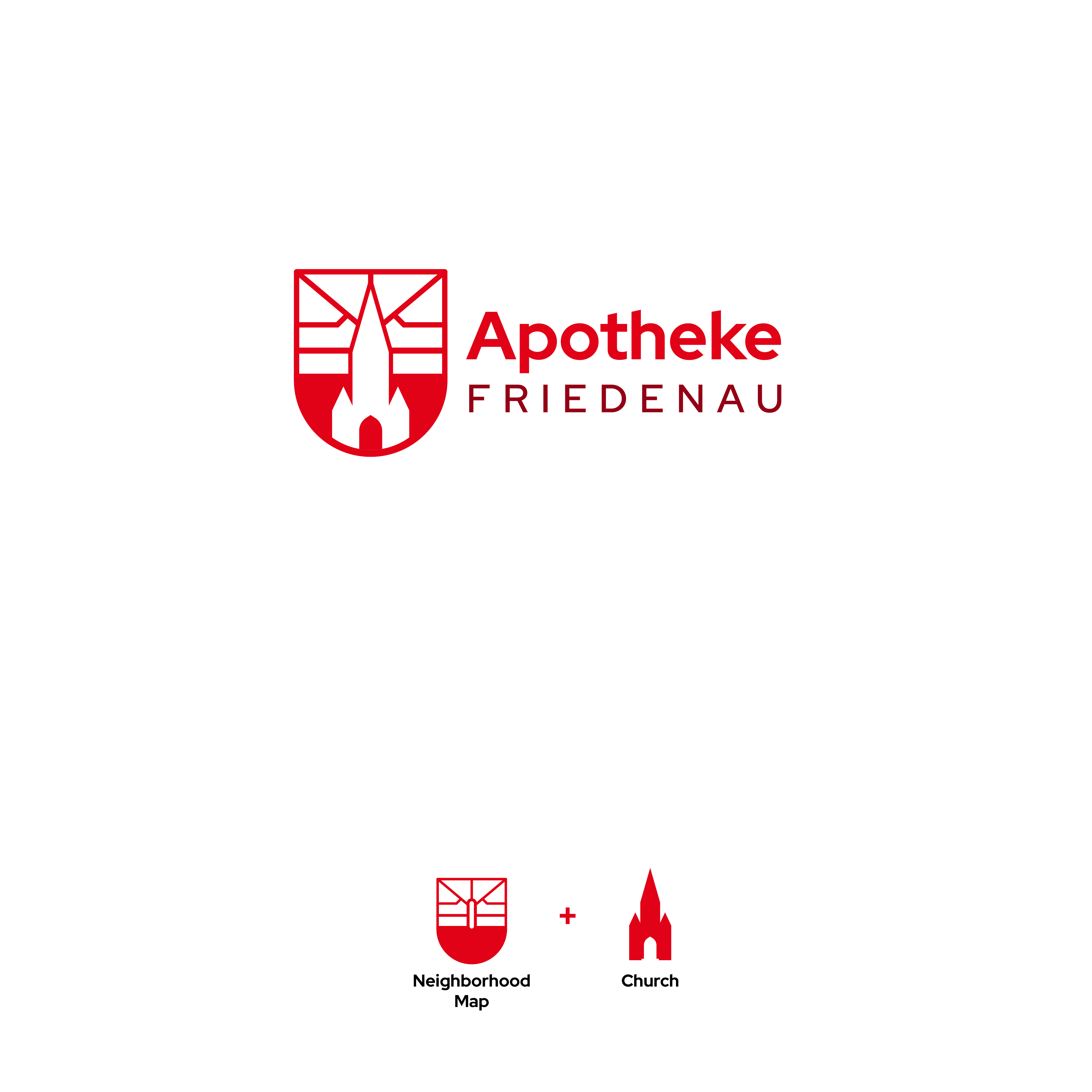
This customer received 9 logo designs from 3 designers. They chose this logo design from PaoloP as the winning design.
Join for free Find Design Jobs- Guaranteed
-
 €80
€80
-
 9 designs
-
 3 designers
Logo Design Brief
I need a logo/lettering design for an old fashioned pharmacy store in Berlin-Friedenau, an old quarter in Berlin West. The pharmacy's customers are mostly residents in the neighborhood, but a new few measures are necessary to also adress younger people and raise the pharmacy to a modestly modern standard. The quarter has a certain geometric shape, that has potential to be used in a logo (see attachments) but it is not necessary. Another point of interest in the neighborhood is the tall church („Zum guten Hirten“/„Good Shepard’s Church“) vis-a-vis to the pharmacy and placed in the middle of the former town center (picture provided).
The new name is supposed to take credit of the quarter, „Apotheke Friedenau“ or „Friedenau-Apotheke“ to represent and incorporate the neighborhood appropriately. Another possibility would be „Hirten-Apotheke“ in reference to the church.
The style can be modern/clean, serif/fractur/italic fonts or a mix of both.
Target Market(s)
Adults with an emphasis on the elderly and families.
Industry/Entity Type
Pharmacy, Health
Logo Text
„Apotheke Friedenau“ or „Hirten-Apotheke“
Logo styles of interest
Pictorial/Combination Logo
A real-world object (optional text)
Wordmark Logo
Word or name based logo (text only)
Font styles to use
Look and feel
Each slider illustrates characteristics of the customer's brand and the style your logo design should communicate.
Elegant
Bold
Playful
Serious
Traditional
Modern
Personable
Professional
Feminine
Masculine
Colorful
Conservative
Economical
Upmarket
Requirements
Must have
- The word „Apotheke“
Nice to have
- A pictograph of the church would be great!
Should not have
- Any change or covering of the big red „A“. it is a protected symbol in germany and must not be altered.