Design a logo for our new charity!
Want to win a job like this?
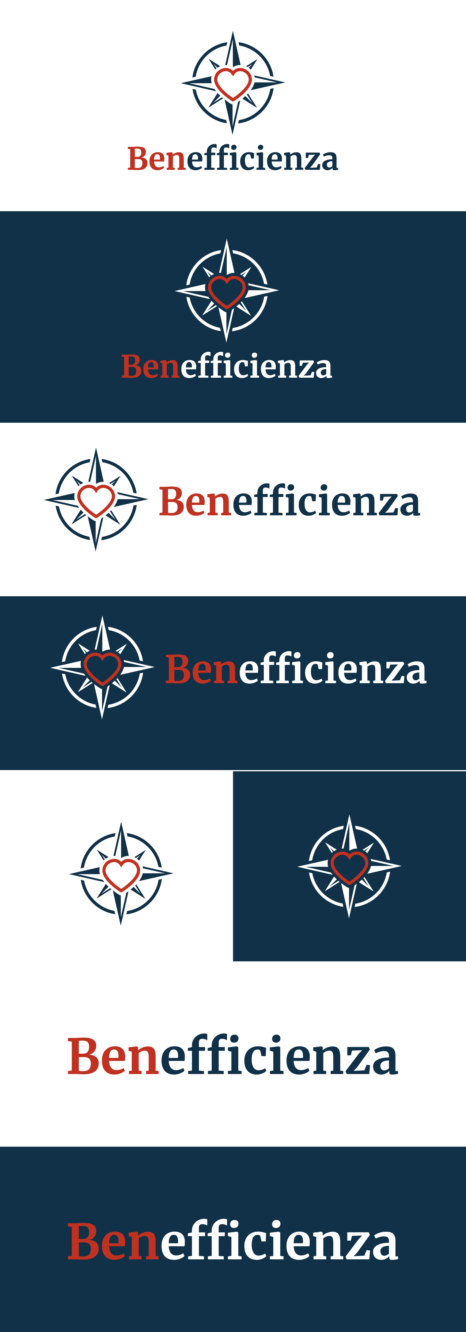
This customer received 213 logo designs from 61 designers. They chose this logo design from Deejah as the winning design.
Join for free Find Design Jobs- Guaranteed
-
 €110
€110
-
 213 designs
-
 61 designers
Logo Design Brief
About the charity: Benefficienza
Effective giving is a fantastic (and often underrated) way to improve others’ lives. In essence, giving effectively involves taking action on the basis of where our charitable giving can do the most good, rather than some or a little bit of good.
There’s reason to believe that choosing where to give can be more important than choosing how much to give. Charities often differ considerably in how efficient they are in transforming the donations they receive into positive outcomes: the best charities can be even 100 times more efficient than the average! So it’s important to take the time to research which can produce the greatest benefit with each dollar.
Our new charity will promote the idea of effective giving in Italy, will provide information on which charities are most efficient, will fundraise for the most efficient charities worldwide, and will provide tax benefits to Italian donors who donate to those charities. Our mission is to help Italian donors to not waste their generosity, but have the biggest positive impact they can through their charitable giving.
About our name: “Benefficienza” is a word play that combines “beneficenza” (charity) and “efficienza” (efficiency).
Target audience: Our geographic focus is Italy, and viewers of the logo will be Italian-speakers. In particular, we want to appeal to (1) analytically-minded professionals, often with university degrees in quantitative fields like STEM or economics, (2) entrepreneurs and business owners, (3) altruistic people who care a lot about a specific cause, such as climate change or animal welfare, and (4) very rich people. Therefore, our brand needs to be both trustworthy/institutional and modern.
Objective: Design a logo to appear on our website, social media, fundraising/marketing materials, and in correspondence with donors, charities, and influential figures in Italy (ambassadors, celebrities, intellectuals, journalists,...).
Preferred format: SVG. Or high-resolution PNG (>2000px in each dimension). Please provide rectangular (for the website header, with the name to the right of the logo image) and square (for the social media profile photos) versions for both light and dark backgrounds.
Subject preferences: It is not required that the charity’s purpose is understood from the logo alone, but a graphic that somehow reinforces what the charity does is preferred. We want a combination of logo, org name and 1-line slogan to leave a clear understanding, so the logo has its part to play. It would be nice to have some literal inspiration or interpretation; for example, the combination of (1) something related to charity/altruism, like a heart, hands, or a smile, and (2) something related to efficiency/guidance, like a compass, a magnifying glass, or a graph with an upward trend. But the logo can be more abstract/not literal.
Style preferences: Simple, minimalist, clean. Simple color palette, eg. 1-4 colors. Should work on white and dark backgrounds.
Charity name inclusion: Not as the core of the logo itself, but the name should be positioned alongside in complementary color and font. To make the word play clearer (and avoiding people thinking our name contains a grammatical error), we’d like some difference between “Ben” and “efficienza” (e.g., they can be of different colors or different fonts, or there could be a line break. Other creative ways to to show intentionality and reduce confusion are also encouraged).
Colors: please see the attached PDF with a set of palettes that we like, but don’t be limited by them: but are open minded toward other suggestions.
Here are examples of other logos liked/disliked.
IMPORTANT - please don't reuse design elements from these directly: we list them to give an idea of general style only.
CHARITIES WITH OUR SAME MISSION
LIKE: doneereffectief.nl - a simple design that’s comfortable to look at and describes the organization’s core mission well
DISLIKE: effectiefgeven.be - while we like how visually simple and clear it is, it is not representative of the “efficiency” part
DISLIKE: lahjoittaminen.fi - Too cartoonish / not serious and trustworthy
DISLIKE: effektiv-spenden.org - Brand color and font alone without a graphic is too sparse, missing opportunity to indicate what the charity does.
OTHER ORGANIZATIONS
LIKE: ambitiousimpact.com - Simple, evocative design
LIKE: animalcharityevaluators.org - Very well-designed, although a bit too complex.
LIKE: maternalhealthinitiative.org - a simple design that’s comfortable to look at and describes the organization’s core mission well.
LIKE: British Heart Foundation, visually simple and clear, more distinctive than “just” a heart shape, reinforces the org purpose.
DISLIKE: gosh.org - less keen on the childish drawing style
DISLIKE: rotaryitalia.it - Overly complex. Don’t like the writings inside the logo.
DISLIKE: caritas.it - Too corporate / impersonal
Logo Text
Benefficienza