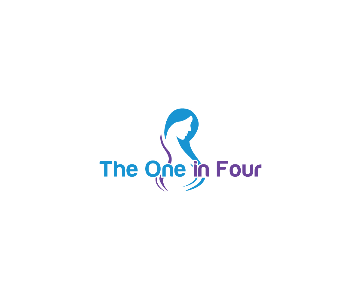
Logo for blog focused on pregnancy loss and infertility
Want to win a job like this?
This customer received 137 logo designs from 61 designers. They chose this logo design from Spark Design as the winning design.
Join for free Find Design Jobs- Guaranteed
-
 US$150
-
 137 designs
-
 61 designers
Logo Design Brief
The website's name will be The One in Four (theoneinfour.com), a stat reference on the number of miscarriages for each pregnancy. We will aim to be a resource for those who suffered a miscarriage and those who know someone who is going through it.
My initial thought is to create something with 4 hearts (or circles), where one is not colored, but that's a bit rudimentary in design. I'd really like to get creative with it.
Another idea, instead of 4 separate shapes, is to use a pie graph circle with 1/4 of it different, to signify the 1 in 4. But again, hoping to get a bit more creative with it.
In addition, I'd like it either oriented in a way that social media can use it, or have a variation of entry for social media.
As for colors, this is the website's color palette https://coolors.co/palette/edafb8-f7e1d7-dedbd2-b0c4b1-4a5759
Logo Text
The One in Four
Font styles to use
Colors
Designer to choose colors to be used in the design.
Look and feel
Each slider illustrates characteristics of the customer's brand and the style your logo design should communicate.
Elegant
Bold
Playful
Serious
Traditional
Modern
Personable
Professional
Feminine
Masculine
Colorful
Conservative
Economical
Upmarket
Requirements
Must have
- Represent "1 in 4"
Nice to have
- The logo would tie into pregnancy
Should not have
- A visual that directly illustrates miscarriage or death