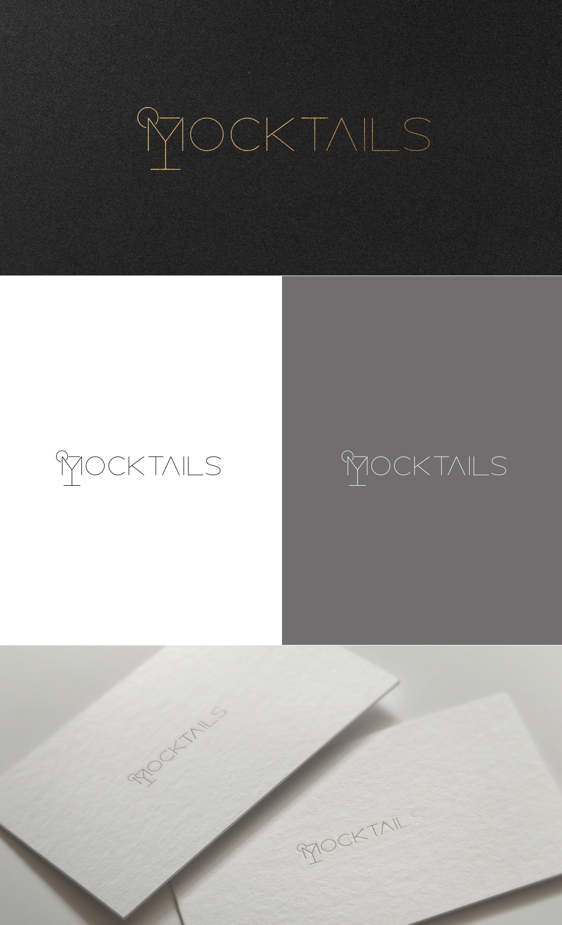
new branding The Mocktail Club
Want to win a job like this?
This customer received 19 label designs from 7 designers. They chose this label design from GLDesigns as the winning design.
Join for free Find Design Jobs- Guaranteed
- Bundled Project 1
-
 €90
€90
-
 19 designs
-
 7 designers
Label Design Brief
The Mocktail Club is a Belgian brand of ready to serve mocktails. We're looking for a rebranding of the labels on our bottles (8 different flavours)
Our mocktails are low in sugar, 100% natural and completely alcohol-free. They are also 'ready to serve': gently shake the bottle, serve with ice cubes, finish and your mocktail is ready in no time!
Besides being the ideal aperitif, you can also serve them during brunch or dinner. Thanks to the different flavors, you can pair each mocktail with a dish.
Please visit our website to see the current look&feel: the mocktailclub.com - https://themocktailclub.pixieset.com/
Target Market(s)
people looking for a premium alcoholfree alternative - premium market
Industry/Entity Type
Mocktails (our mocktails have unique flavors, it's not the non-alcoholic version of a cocktail)
Colors
Designer to choose colors to be used in the design.
Look and feel
Each slider illustrates characteristics of the customer's brand and the style your logo design should communicate.
Elegant
Bold
Playful
Serious
Traditional
Modern
Personable
Professional
Feminine
Masculine
Colorful
Conservative
Economical
Upmarket
Requirements
Must have
- Our brand should be more visible, more recognizable, bolder, without losing the premium and refined character. Base colors should be white, black and silver. The brand should be put more foward. Keep number concept (every mocktail has its number) Put the ingredients/flavours/combinations a bit more forward. make the brand more confident and mature. The eight bottles should become a family. PREMIUM EXPRESSION
Nice to have
- We want to work with a white label. Ideas for the shape of the label Some ideas for the label: Play with shapes, cut outs, texture and number of labels. We like the frosted look and the combination of print & label . Working with 2 labels gives it more dynamic, not one big block Clean label. Working with a cut out shape, can be the logo or the numbers ? Working with 2 labels makes it easier to create an importance of messages. Working with an organic shape makes it unique and give a natural touch Working with a cut out can give a color pop on the white label The label can have parts coming out of the square shape
Should not have
- No crazy stuff, finishes etc should be feasible/realistic
Payments
Total
€90
Project Deadline
18 Jan 2024 13:39:42 UTCProject Upgrades
Bundled project(s)
- offering €45 logo design to winner